
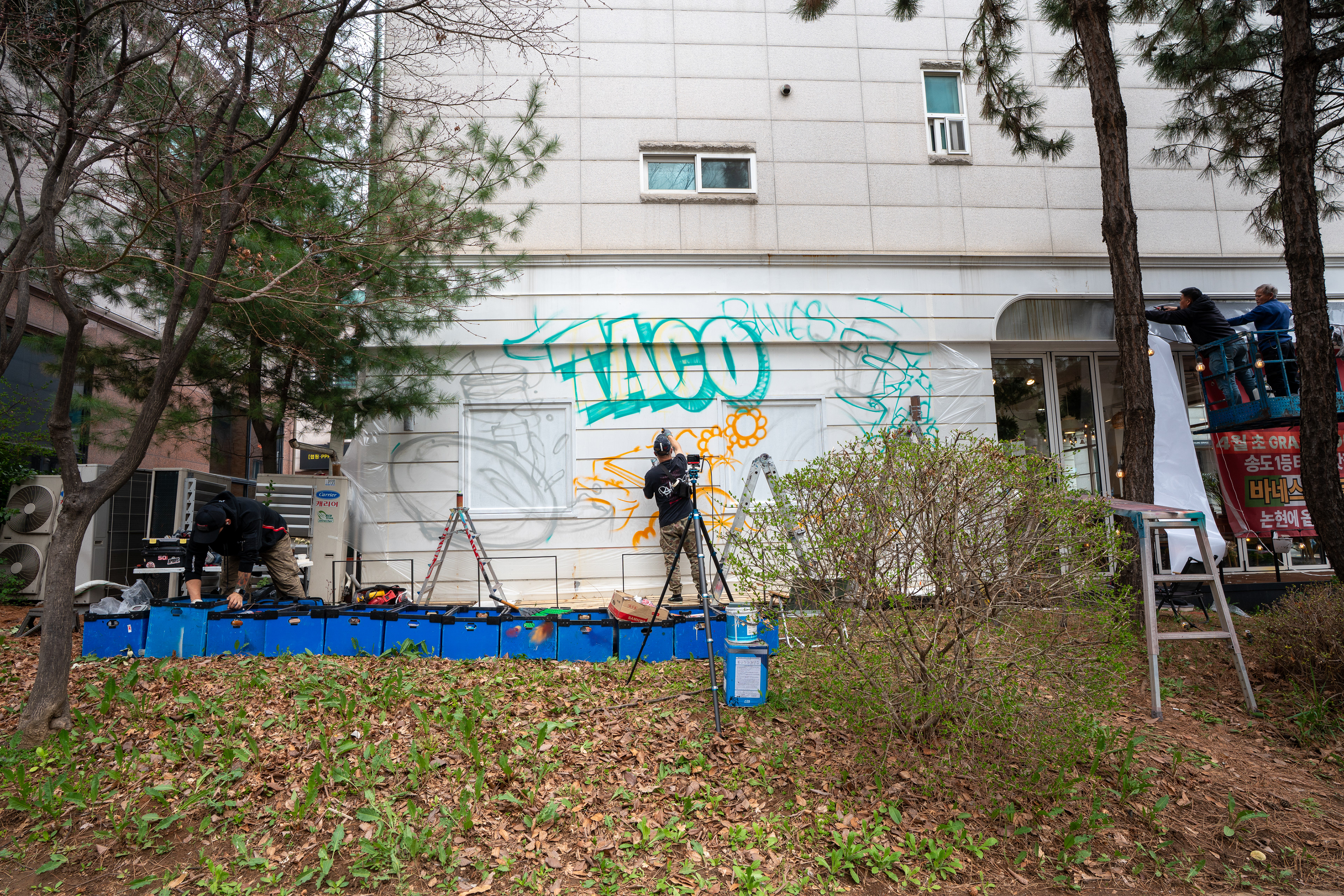
바네스타코 인천 논현점 외부 벽면에 진행한 그래피티 프로젝트다. 대로변에서 먼저 보이는 흰 외벽을, 업종과 분위기가 즉시 읽히는 브랜드 노출면으로 전환하는 것을 목표로 했다.
This graffiti project was created for the exterior wall of Banes Taco in Incheon. The goal was to transform a blank roadside facade into a readable brand surface that communicates the identity and atmosphere of the restaurant at first glance.
This graffiti project was created for the exterior wall of Banes Taco in Incheon. The goal was to transform a blank roadside facade into a readable brand surface that communicates the identity and atmosphere of the restaurant at first glance.
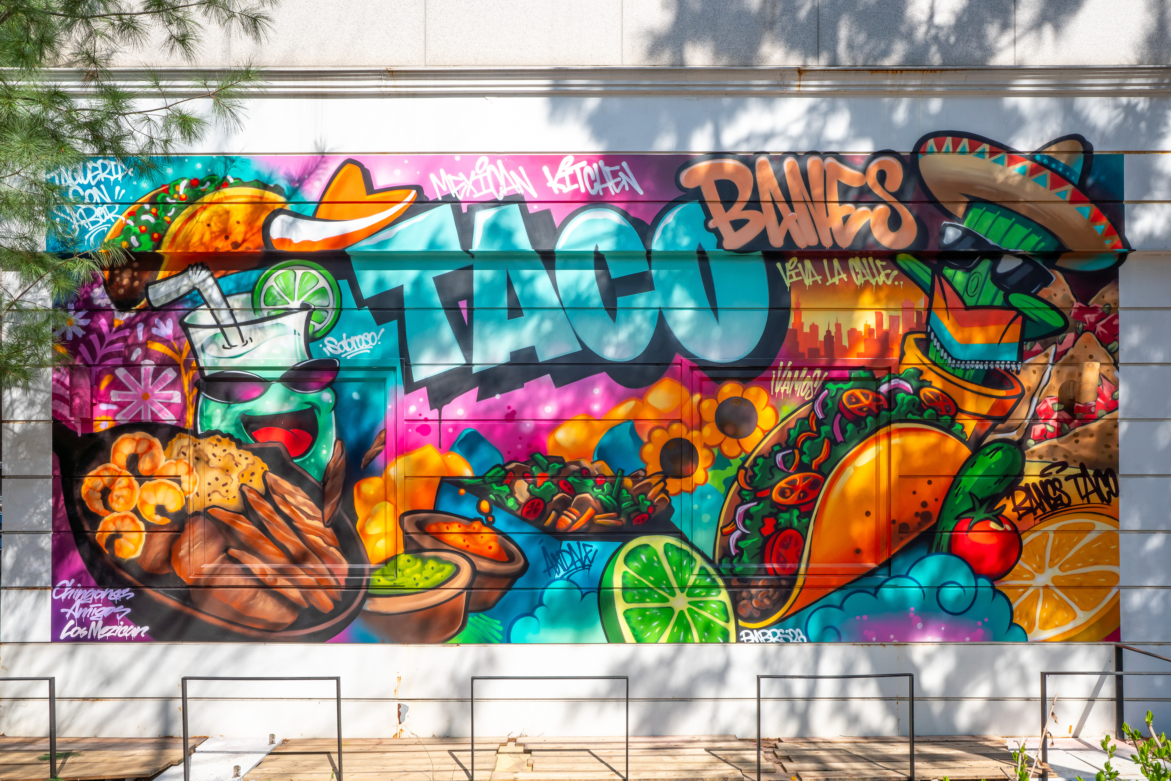
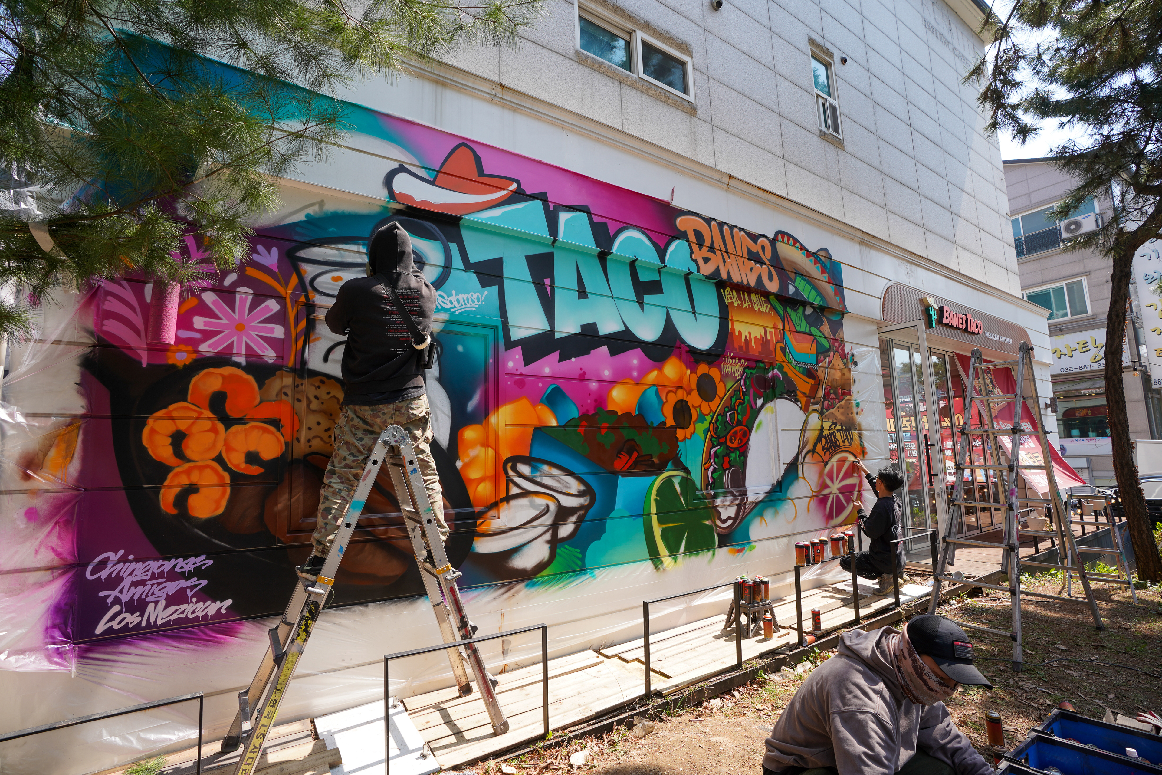
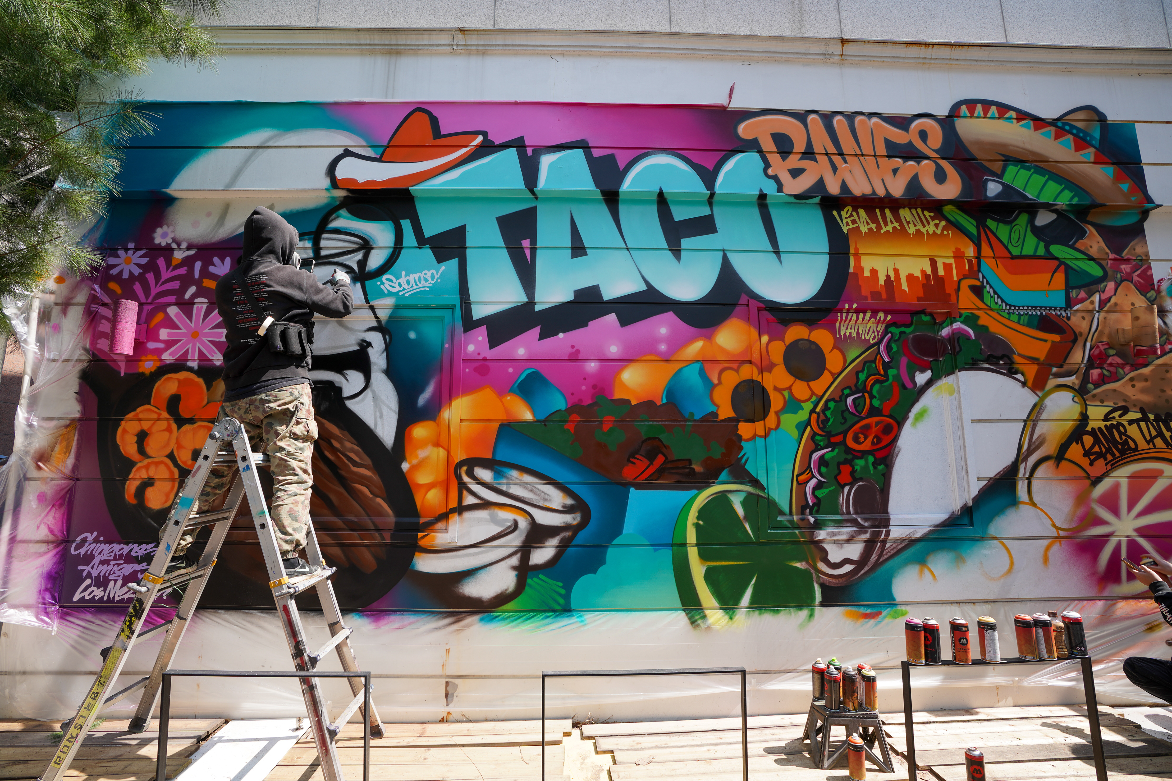
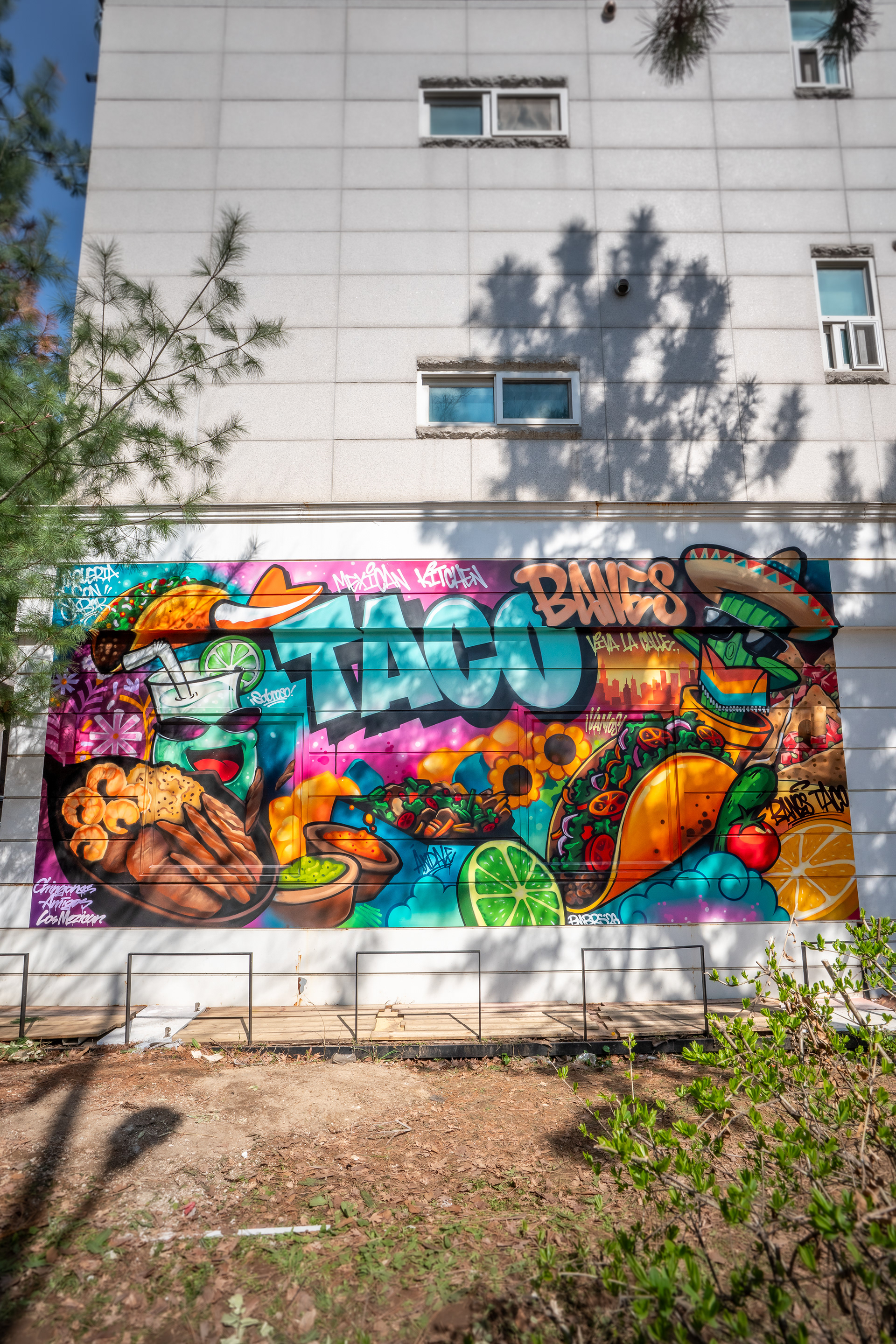
바네스타코 외부 그래피티 전경 / Exterior mural view of Banes Taco
이 작업은 단순한 외벽 장식이 아니라, 매장 오픈 전 외부 인지성과 브랜드 아이덴티티를 동시에 확보하기 위한 상업 공간 브랜딩 작업으로 기획되었다. 향후 테라스와 가든 형태로 조성될 외부 공간과 함께 작동할 수 있도록, 그래피티를 하나의 콘텐츠 면이자 포토 포인트 배경으로 설정했다.
This project was conceived not as decoration, but as a commercial branding intervention designed to improve exterior visibility before opening while establishing a clear brand identity. The mural was planned to work together with the future terrace and garden setting, functioning as both a content surface and a photographic backdrop.
This project was conceived not as decoration, but as a commercial branding intervention designed to improve exterior visibility before opening while establishing a clear brand identity. The mural was planned to work together with the future terrace and garden setting, functioning as both a content surface and a photographic backdrop.
클라이언트가 전달한 초기 레퍼런스를 그대로 따르기보다, 바머스의 시각 언어로 다시 정리하는 방향을 택했다. 핵심은 멀리서 무엇이 먼저 보여야 하는지, 가까이에서 어떤 정보가 이어져야 하는지를 분리해 화면의 우선순위를 만드는 것이었다.
Rather than directly reproducing the client’s initial references, the composition was restructured through BMBRS’s own visual language. The key decision was to separate what needed to read first from a distance and what should unfold at closer range, establishing a clear visual hierarchy.
Rather than directly reproducing the client’s initial references, the composition was restructured through BMBRS’s own visual language. The key decision was to separate what needed to read first from a distance and what should unfold at closer range, establishing a clear visual hierarchy.
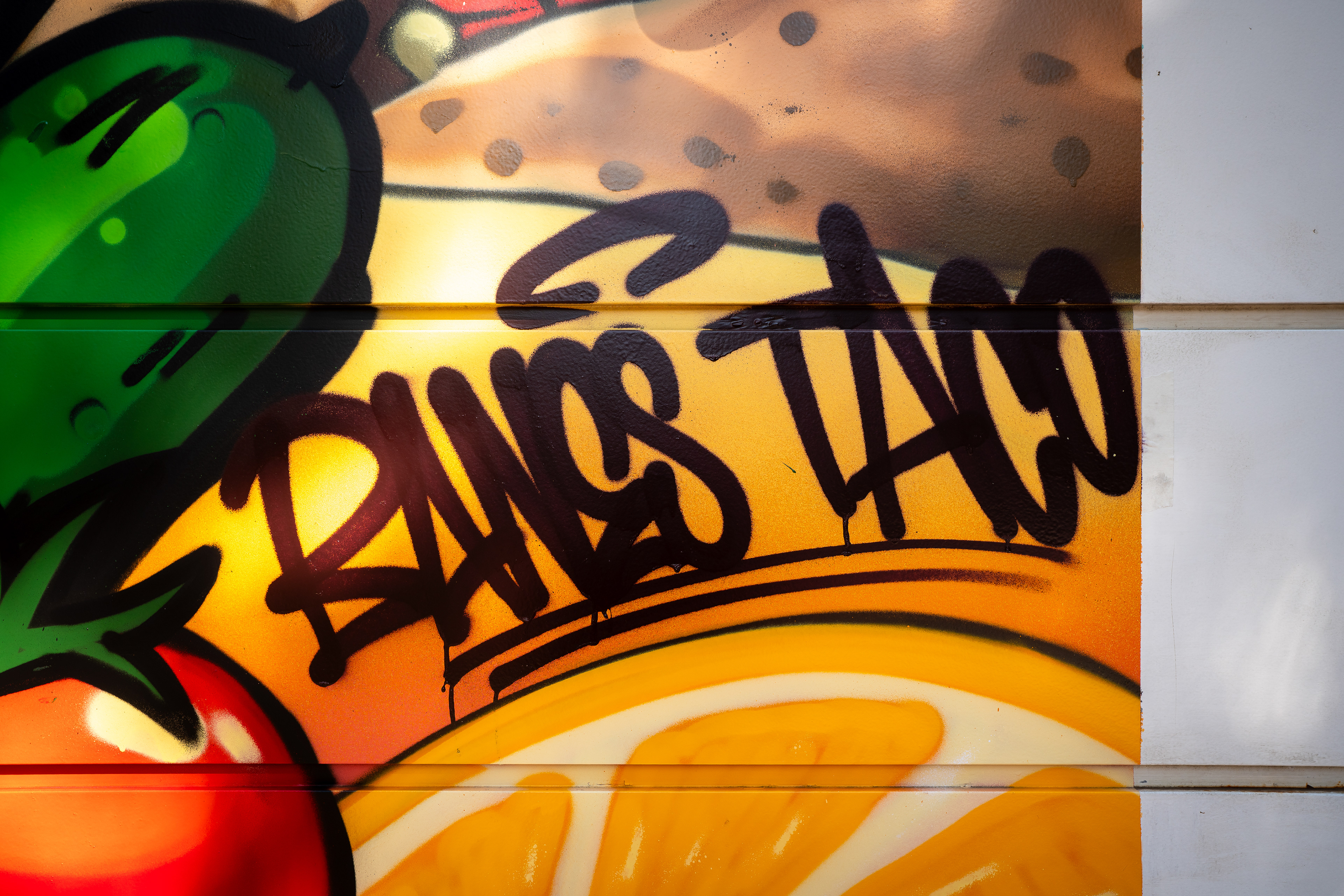
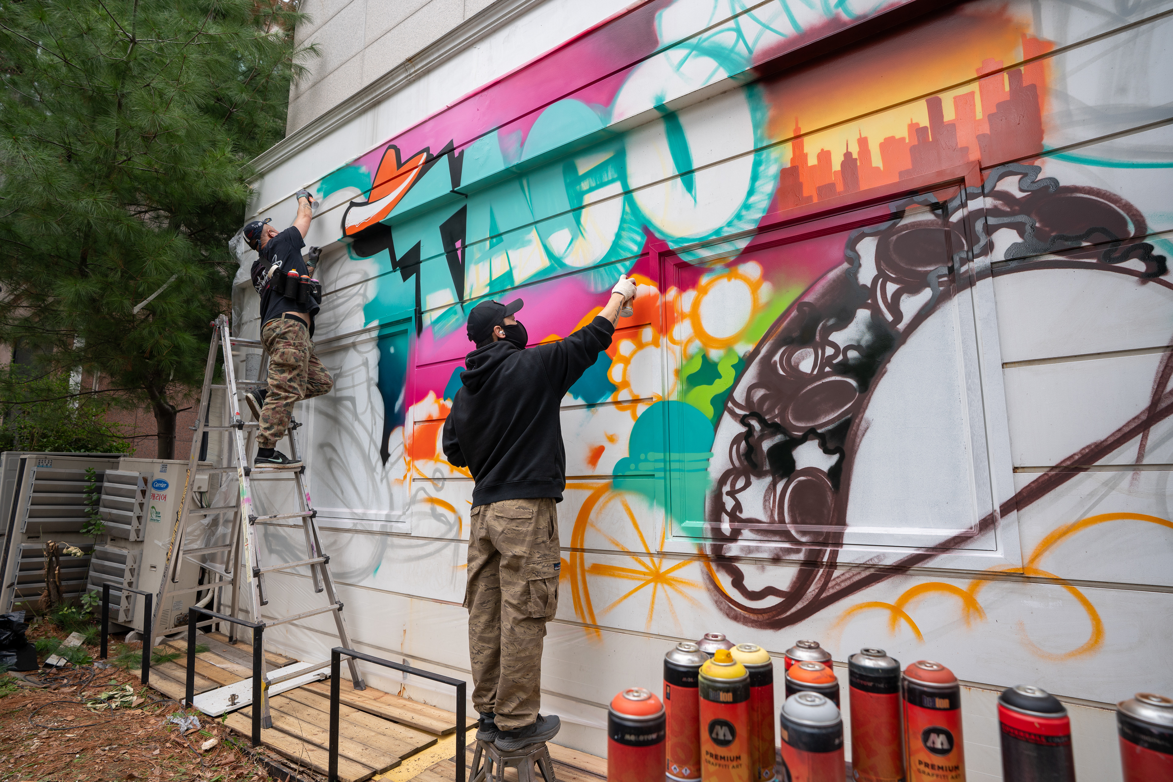
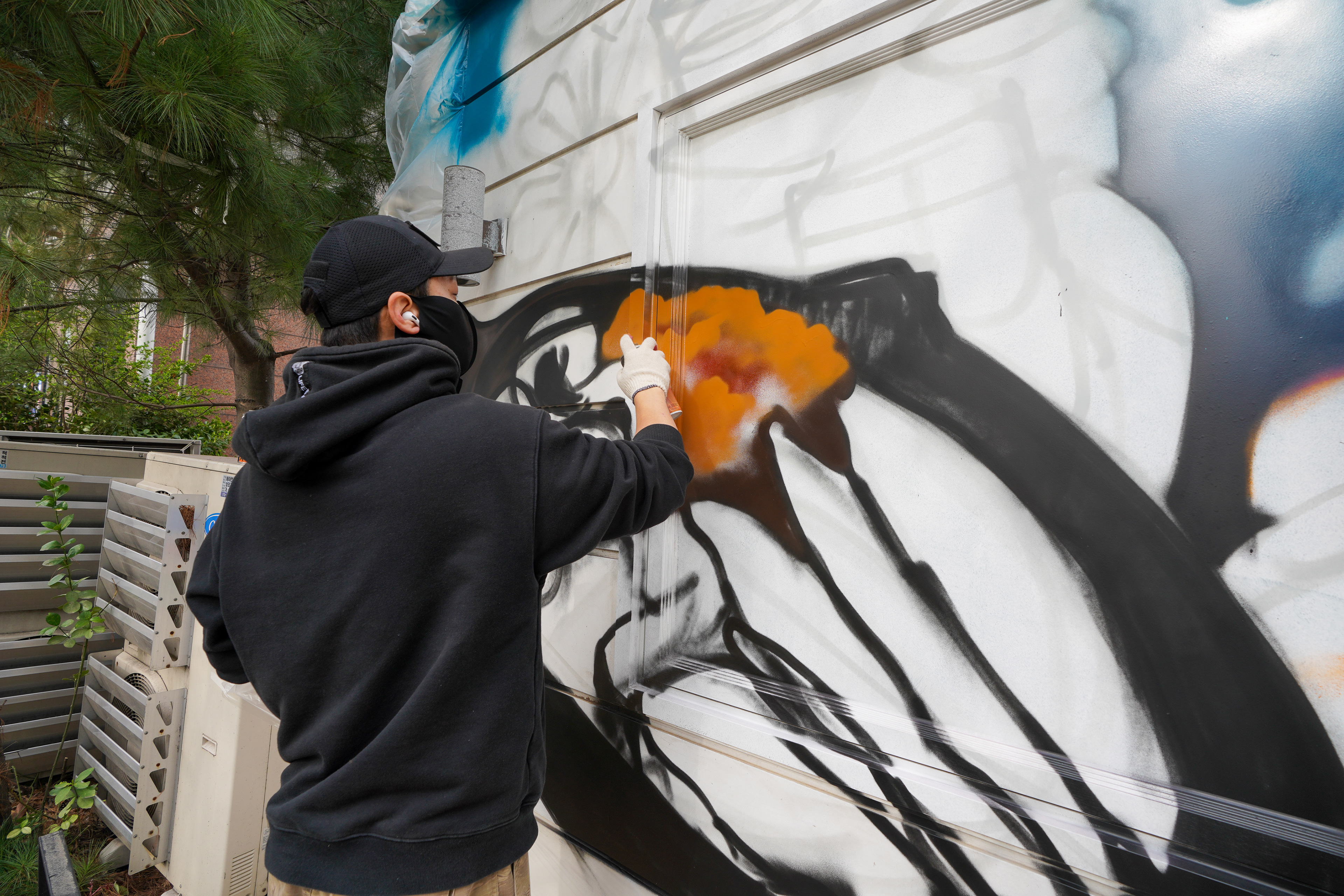
화면 중앙에는 가장 먼저 인식되는 메인 레터링 ‘TACO’를 배치하고, 상단에는 ‘BANES’, 좌우에는 타코, 파히타, 라임, 토마토, 음료 등 음식 오브젝트를 배치했다. 텍스트와 이미지가 경쟁하지 않도록 구조를 나누고, 보는 거리와 시선 흐름에 따라 단계적으로 읽히도록 구성했다.
The central focus is the large ‘TACO’ lettering, supported by ‘BANES’ above and food elements such as tacos, fajitas, lime, tomato, and drinks on both sides. The composition was organized so that text and imagery do not compete, but instead reveal themselves in stages depending on distance and viewing flow.
The central focus is the large ‘TACO’ lettering, supported by ‘BANES’ above and food elements such as tacos, fajitas, lime, tomato, and drinks on both sides. The composition was organized so that text and imagery do not compete, but instead reveal themselves in stages depending on distance and viewing flow.
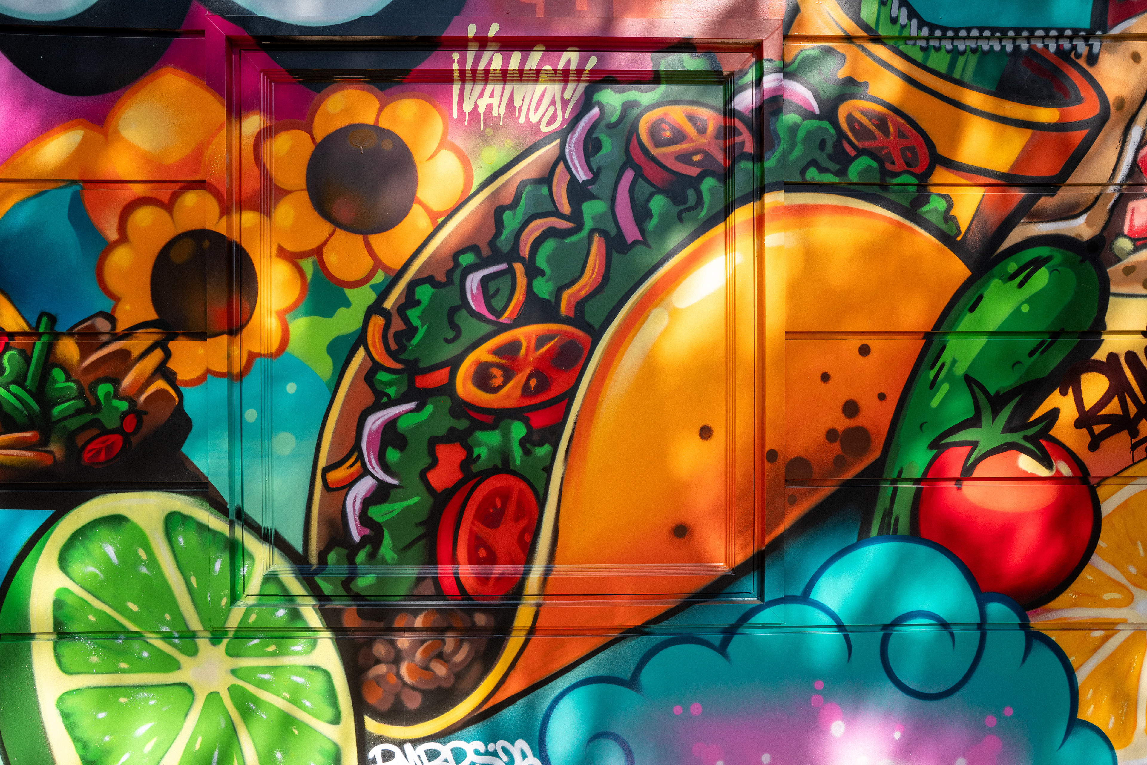
컬러는 멕시칸 키친의 분위기와 도로변 주목도를 동시에 확보하는 기준으로 설정했다. 민트 계열을 메인 레터링에 크게 사용하고, 핑크, 오렌지, 옐로, 그린을 배경과 오브젝트에 배치해 음식점의 성격이 직접적으로 읽히도록 했다.
Color was treated as both a branding device and a visibility strategy. Mint tones were used across the main lettering, while pink, orange, yellow, and green were introduced into the background and supporting objects so the Mexican kitchen identity could read directly and clearly.
Color was treated as both a branding device and a visibility strategy. Mint tones were used across the main lettering, while pink, orange, yellow, and green were introduced into the background and supporting objects so the Mexican kitchen identity could read directly and clearly.
작업 면은 가로 7미터, 높이 3미터 규모의 갈바 외장 벽면이었다. 표면에는 부분적인 녹과 페인트 탈거가 있었고, 하단 데크는 노후되어 사다리 설치가 어려운 상태였다.
The wall measured approximately 7 meters wide by 3 meters high and consisted of galvanized exterior panels. The surface showed partial rust and paint loss, while the deck below was deteriorated, making ladder placement unstable.
The wall measured approximately 7 meters wide by 3 meters high and consisted of galvanized exterior panels. The surface showed partial rust and paint loss, while the deck below was deteriorated, making ladder placement unstable.
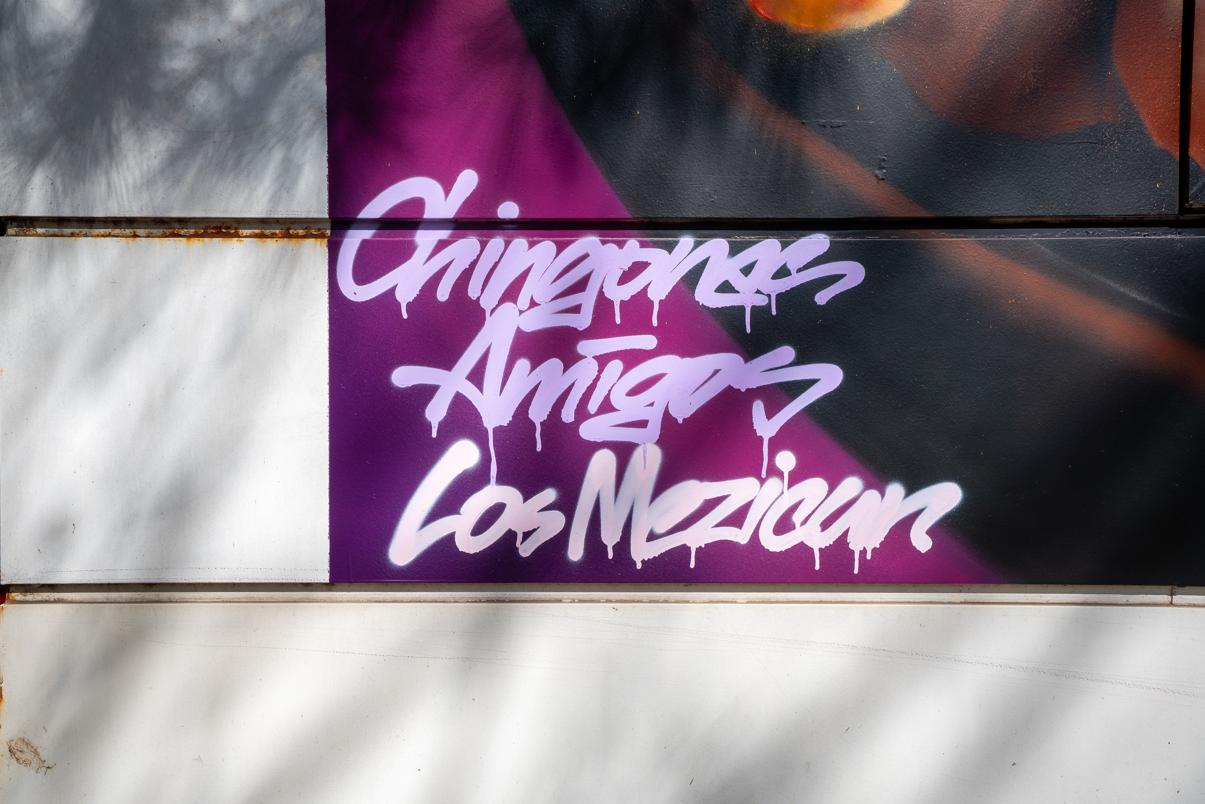
이 현장에서는 벽을 깨끗한 캔버스로 만드는 대신, 분절된 패널 구조와 표면 흔적을 그림 안으로 흡수하는 방식이 중요했다. 또한 외벽 전체를 덮기보다 외곽에 여백을 두어, 흰 건물 벽과 그래피티 사이의 대비가 더 선명하게 작동하도록 정리했다.
Instead of treating the wall as a clean blank canvas, the segmented panel structure and surface traces were absorbed into the composition. Rather than covering the entire facade, a margin was intentionally left around the mural so the contrast between the white building exterior and the painted frame would remain sharp and legible.
Instead of treating the wall as a clean blank canvas, the segmented panel structure and surface traces were absorbed into the composition. Rather than covering the entire facade, a margin was intentionally left around the mural so the contrast between the white building exterior and the painted frame would remain sharp and legible.
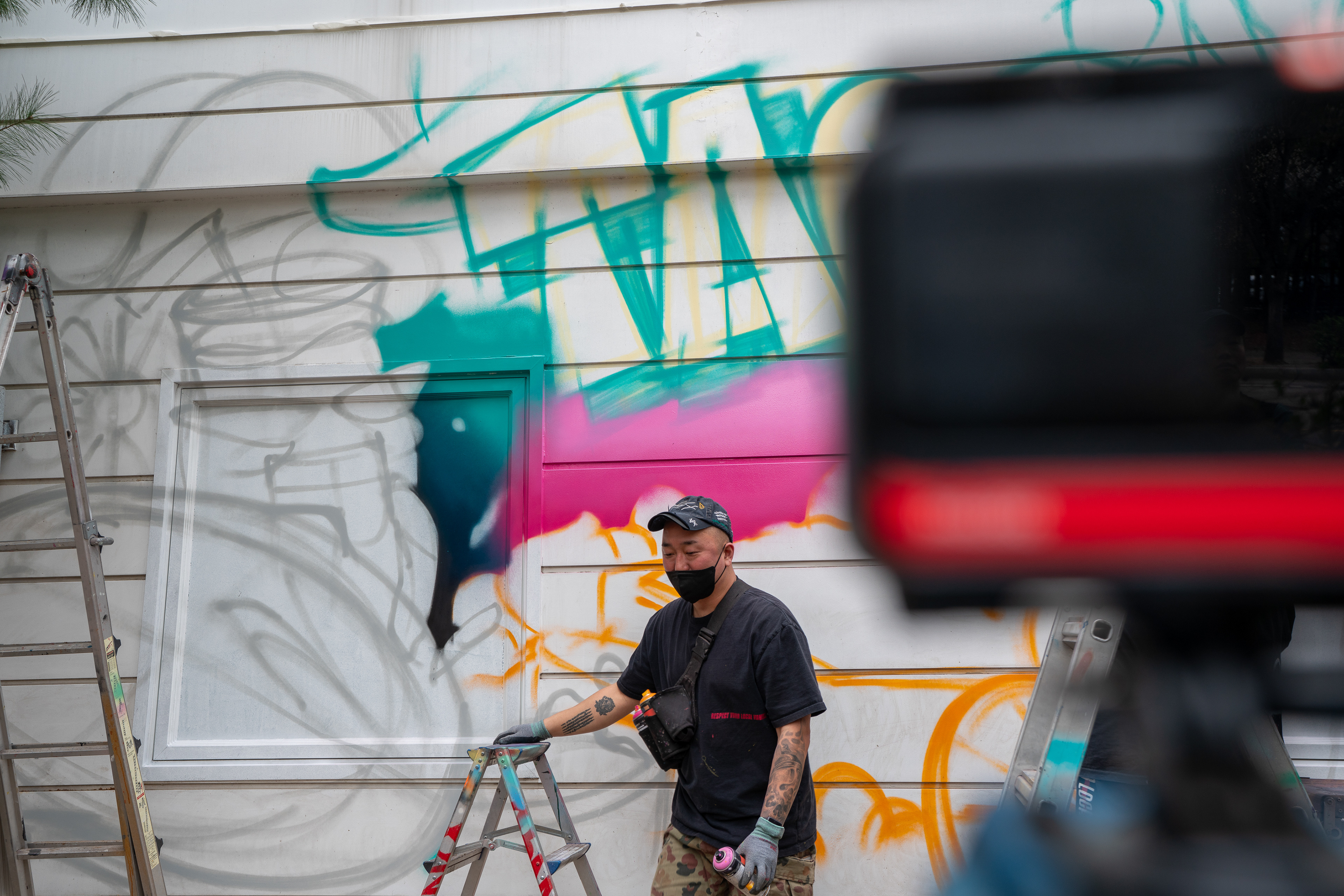
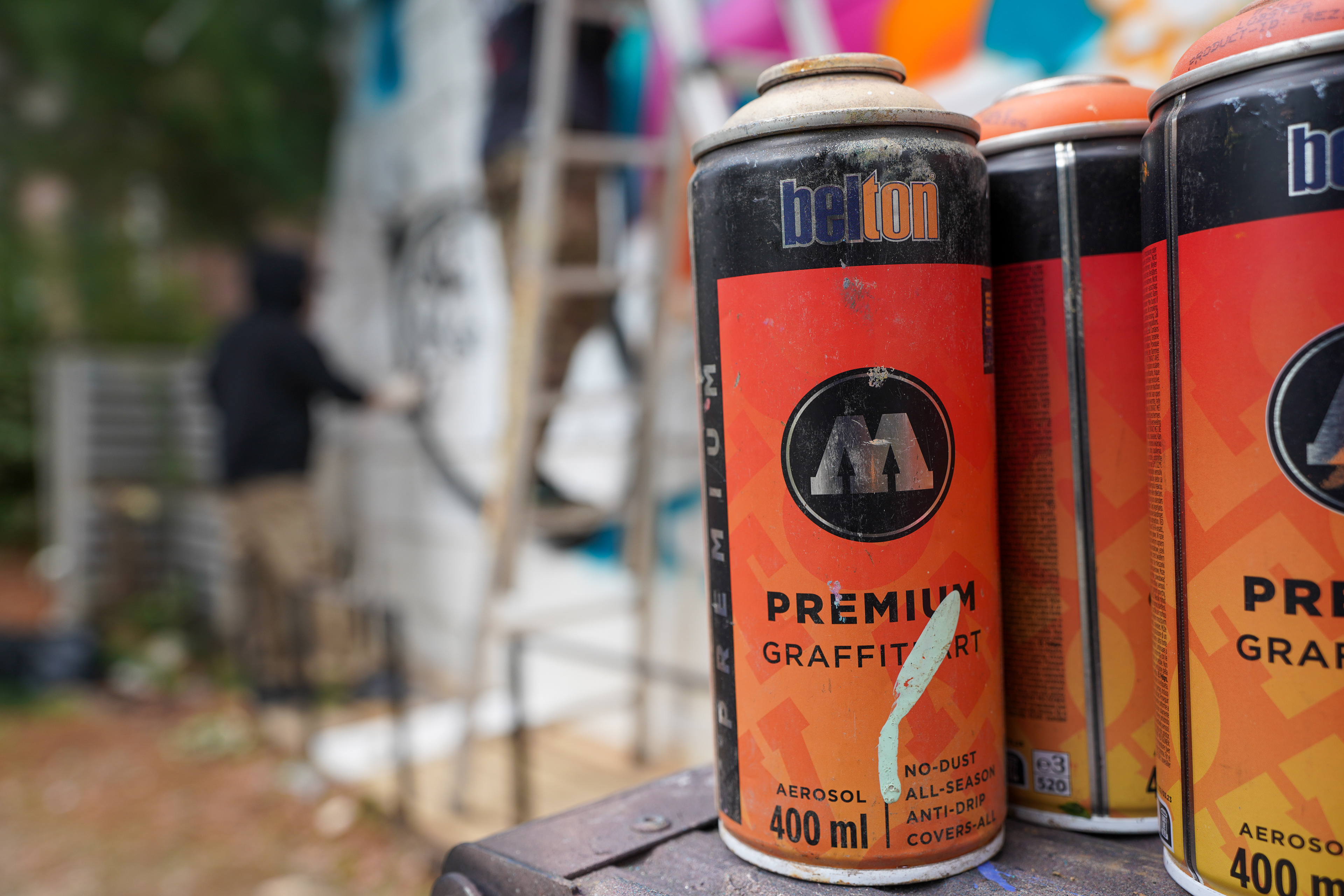
작업 전에는 먼지와 녹 등 오염 요소를 정리하고, 필요한 구간에는 프라이머와 젯소, Molotow Styrofoam Primer로 바탕을 정리했다. 이후 전체 스케치, 배경 색면, 메인 레터링, 주요 음식 오브젝트, 서브 요소 순으로 진행하며 화면의 밀도와 읽힘을 조정했다.
Before painting, dust, rust, and surface contamination were cleaned, and selected areas were prepared with primer, gesso, and Molotow Styrofoam Primer. The workflow then moved through sketching, background color blocking, main lettering, major food objects, and supporting details, allowing the density and readability of the image to be controlled in sequence.
Before painting, dust, rust, and surface contamination were cleaned, and selected areas were prepared with primer, gesso, and Molotow Styrofoam Primer. The workflow then moved through sketching, background color blocking, main lettering, major food objects, and supporting details, allowing the density and readability of the image to be controlled in sequence.
현장에서는 파손된 데크 위에 방부목을 임시 받침으로 사용해 수평을 맞추고, 7-step ladder와 3-step platform을 배치해 작업 동선을 확보했다. 이는 단순한 시공 보조가 아니라, 외부 대형 벽면 작업에서 안전성과 화면 완성도를 동시에 유지하기 위한 대응이었다.
On site, treated wood boards were used as temporary leveling supports over the damaged deck, and a 7-step ladder with a 3-step platform was arranged to secure stable working access. This was not just a technical fix, but part of maintaining both safety and execution quality on a large exterior wall.
On site, treated wood boards were used as temporary leveling supports over the damaged deck, and a 7-step ladder with a 3-step platform was arranged to secure stable working access. This was not just a technical fix, but part of maintaining both safety and execution quality on a large exterior wall.
팀 내부에서는 DHAL이 전체 구성과 메인 레터링을 맡고, Remon이 주요 음식 오브젝트를, DZ가 보조 오브젝트와 배경 연결부를 정리했으며, James가 영상 촬영과 현장 보조를 담당했다. 이러한 분업은 텍스트 중심 요소와 이미지 중심 요소를 분리해 전체 전달력을 높이는 방식으로 작동했다.
Within the team, DHAL led the overall composition and main lettering, Remon handled the major food objects, DZ supported the background and secondary visual connections, and James documented the process while assisting on site. This division of roles helped separate text-driven and image-driven elements, improving the clarity of the final surface.
Within the team, DHAL led the overall composition and main lettering, Remon handled the major food objects, DZ supported the background and secondary visual connections, and James documented the process while assisting on site. This division of roles helped separate text-driven and image-driven elements, improving the clarity of the final surface.
과정과 완성 후 공간 분위기 기록 영상 / Process and final spatial context video
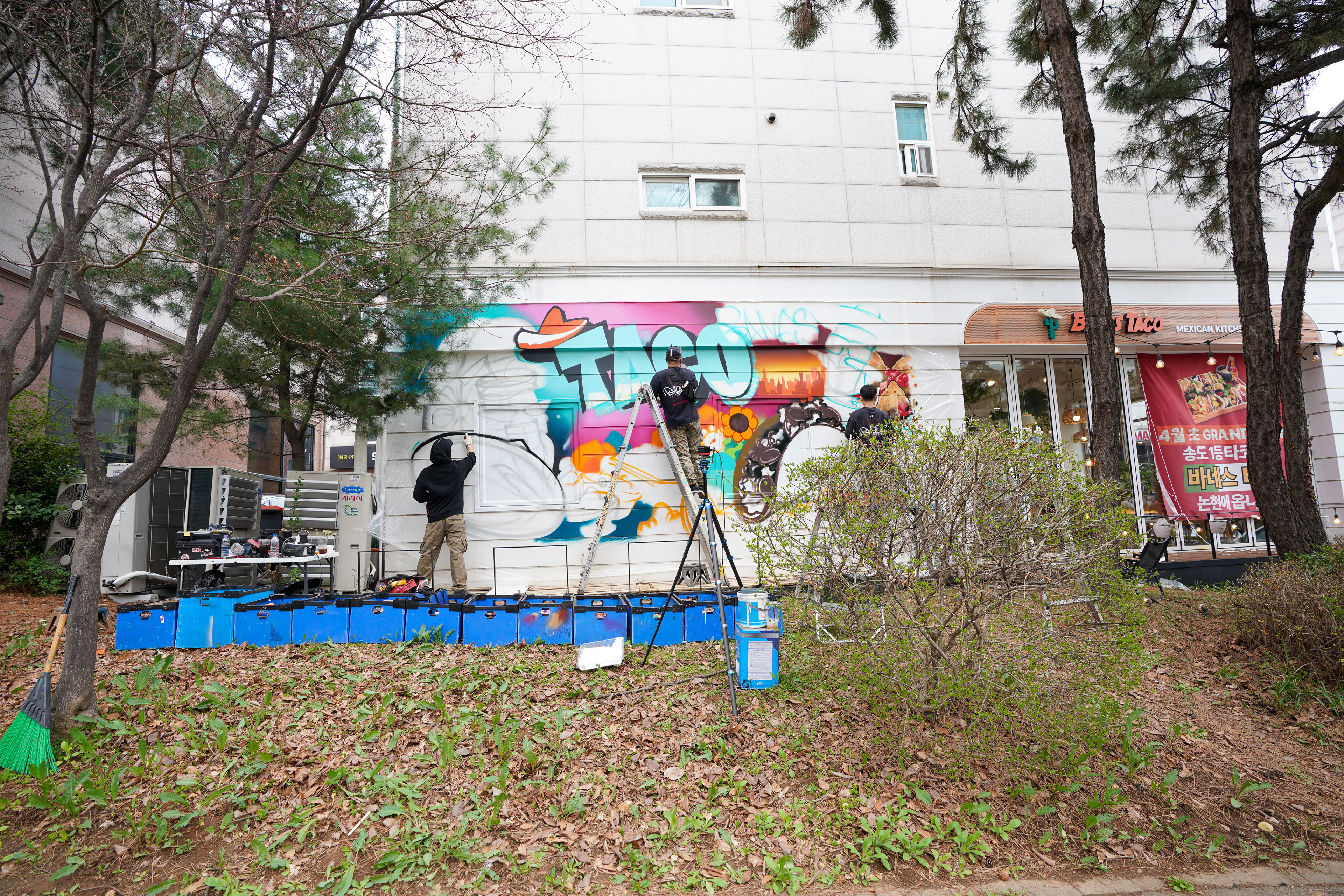
완성 후 벽면은 단순한 장식면이 아니라, 대로변에서 매장 업종을 빠르게 인식시키는 외부 브랜드 면으로 기능하게 되었다. 멀리서는 레터링이 먼저 보이고, 가까이에서는 음식 요소가 이어지면서 공간의 성격을 구체화한다.
After completion, the wall functioned not as decoration but as an exterior brand surface that quickly communicates the restaurant type from the street. The lettering reads first at a distance, while the food imagery defines the character of the space at closer range.
After completion, the wall functioned not as decoration but as an exterior brand surface that quickly communicates the restaurant type from the street. The lettering reads first at a distance, while the food imagery defines the character of the space at closer range.
이 작업은 향후 조성될 벤치, 조명, 식재와 결합되었을 때 더 적극적으로 활용될 수 있는 구조를 전제로 한다. 따라서 결과물은 외벽 개선에 그치지 않고, 사진 촬영, 방문자 체류, SNS 노출까지 연결 가능한 외부 공간 장치로 이해할 수 있다.
The project was designed with future use in mind, especially in combination with planned benches, lighting, and landscaping. In that sense, the mural goes beyond facade improvement and becomes a spatial device connected to photography, visitor dwell time, and social media visibility.
The project was designed with future use in mind, especially in combination with planned benches, lighting, and landscaping. In that sense, the mural goes beyond facade improvement and becomes a spatial device connected to photography, visitor dwell time, and social media visibility.
완성 후 외벽 전체 모습 / Final completed wall view
바네스타코 프로젝트는 음식 업종, 특히 멕시칸 키친이라는 명확한 카테고리를 시각적으로 구조화한 바머스의 외부 브랜딩 사례다. 브랜드 협업, 상업 공간 그래피티, 외부 포토존, 공간 연출형 벽화의 범주 안에서 읽을 수 있으며, 공간 조건과 시선 흐름, 활용 맥락을 함께 설계하는 바머스의 작업 방식을 보여준다.
The Banes Taco project is an exterior branding case in which BMBRS translated the specific category of a Mexican kitchen into a structured visual system. It sits within the scope of brand collaboration, commercial-space graffiti, photo-point design, and spatial mural direction, while also demonstrating BMBRS’s approach to integrating site conditions, viewing flow, and post-completion use.
The Banes Taco project is an exterior branding case in which BMBRS translated the specific category of a Mexican kitchen into a structured visual system. It sits within the scope of brand collaboration, commercial-space graffiti, photo-point design, and spatial mural direction, while also demonstrating BMBRS’s approach to integrating site conditions, viewing flow, and post-completion use.