

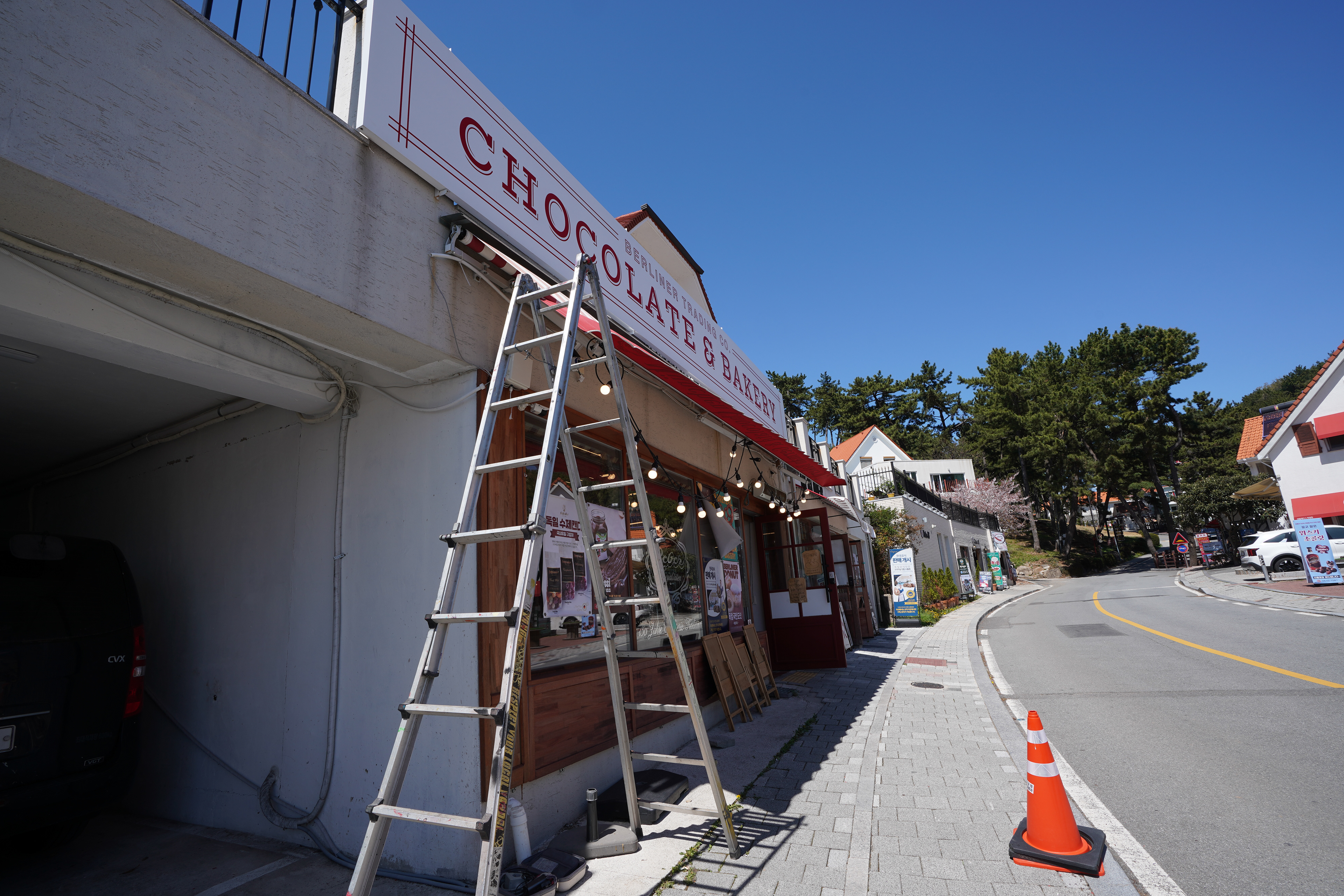
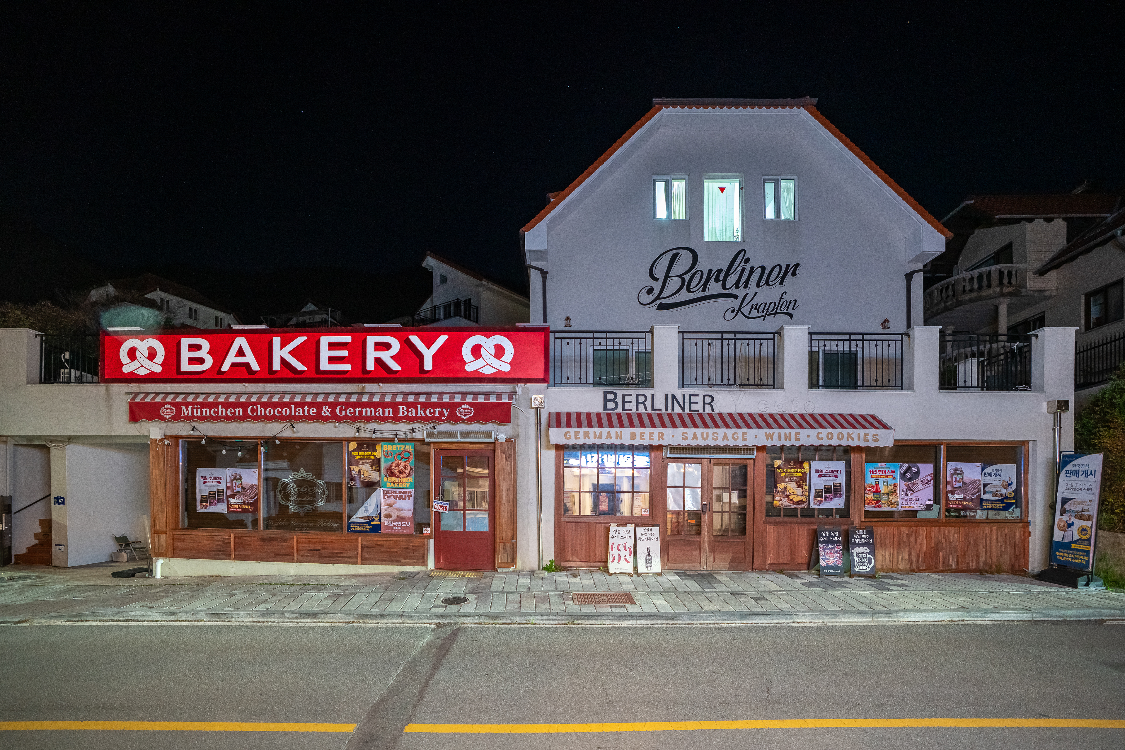
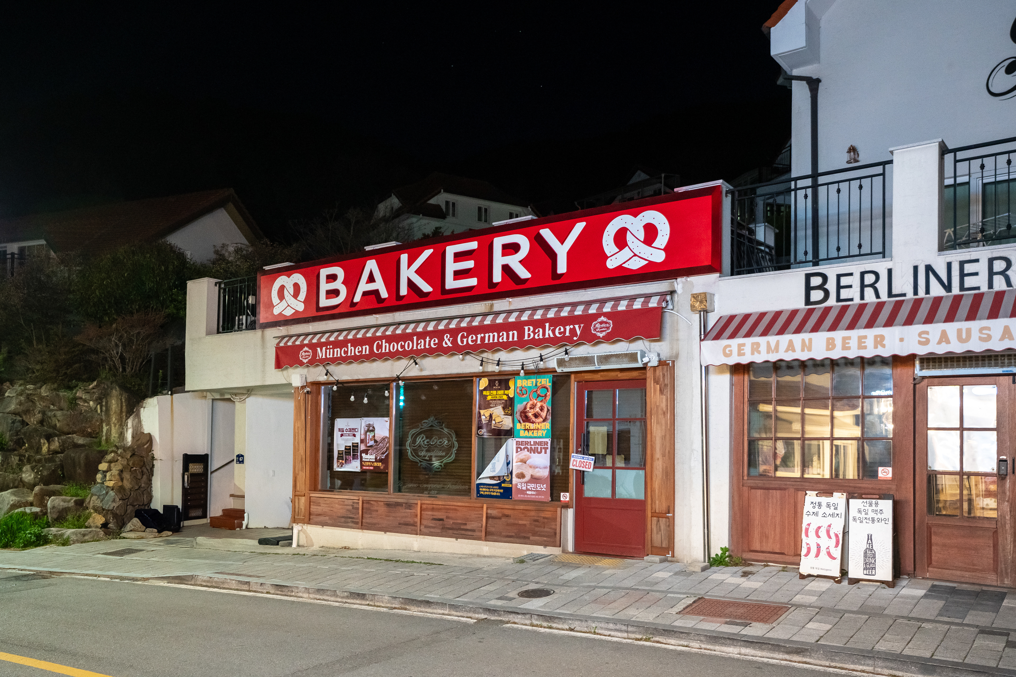
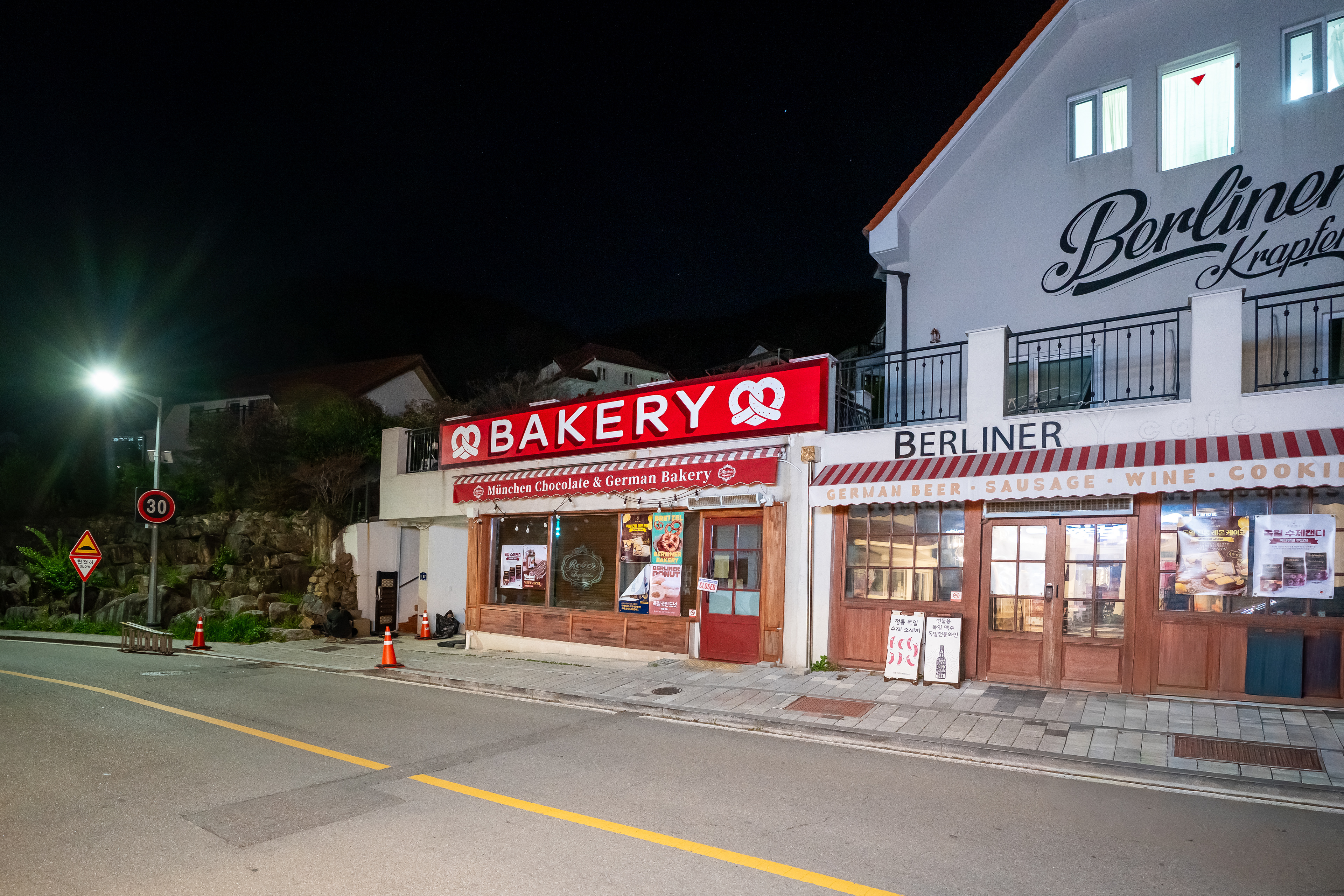
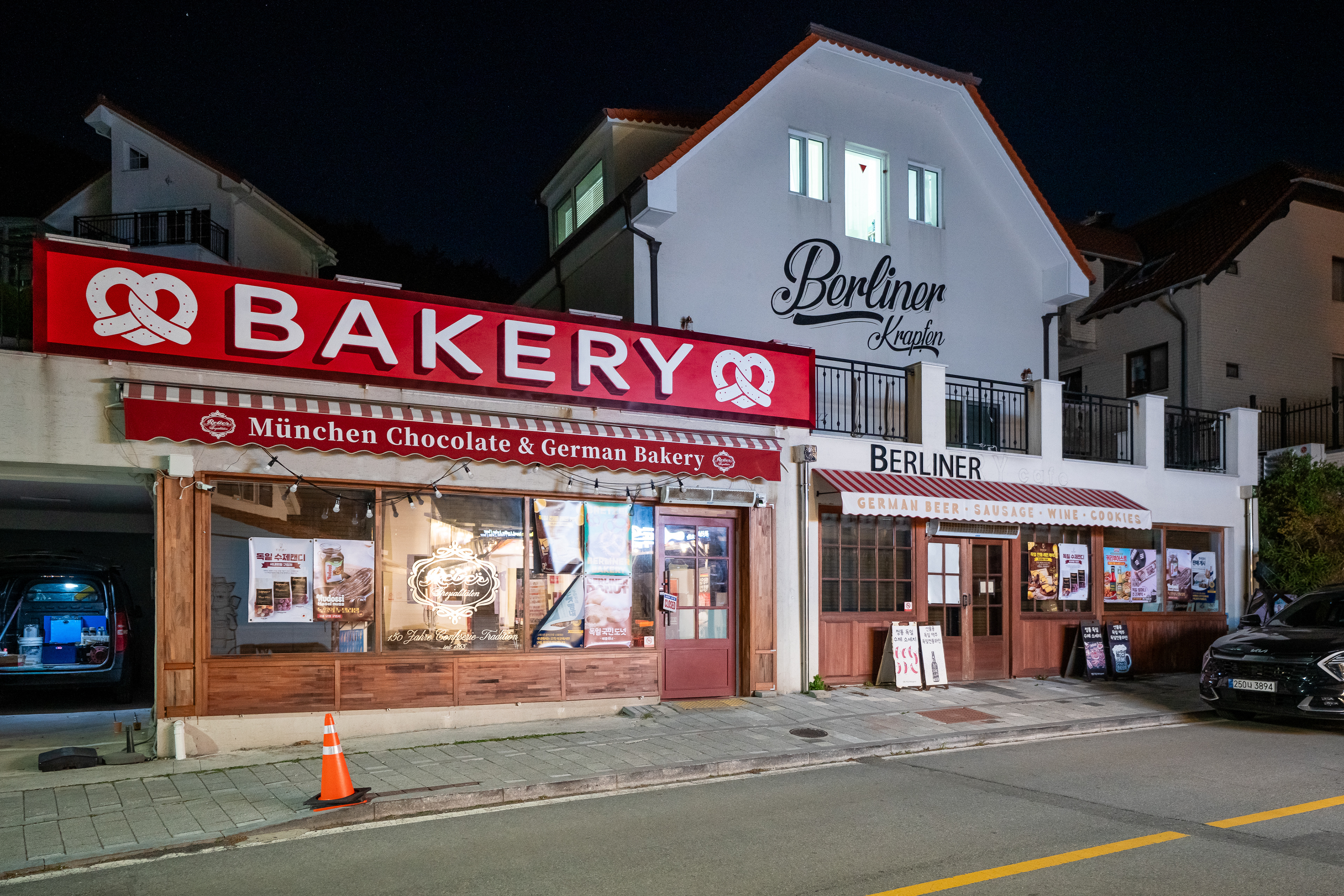
Exterior sign view of Berliner in Namhae German Village
작업 개요
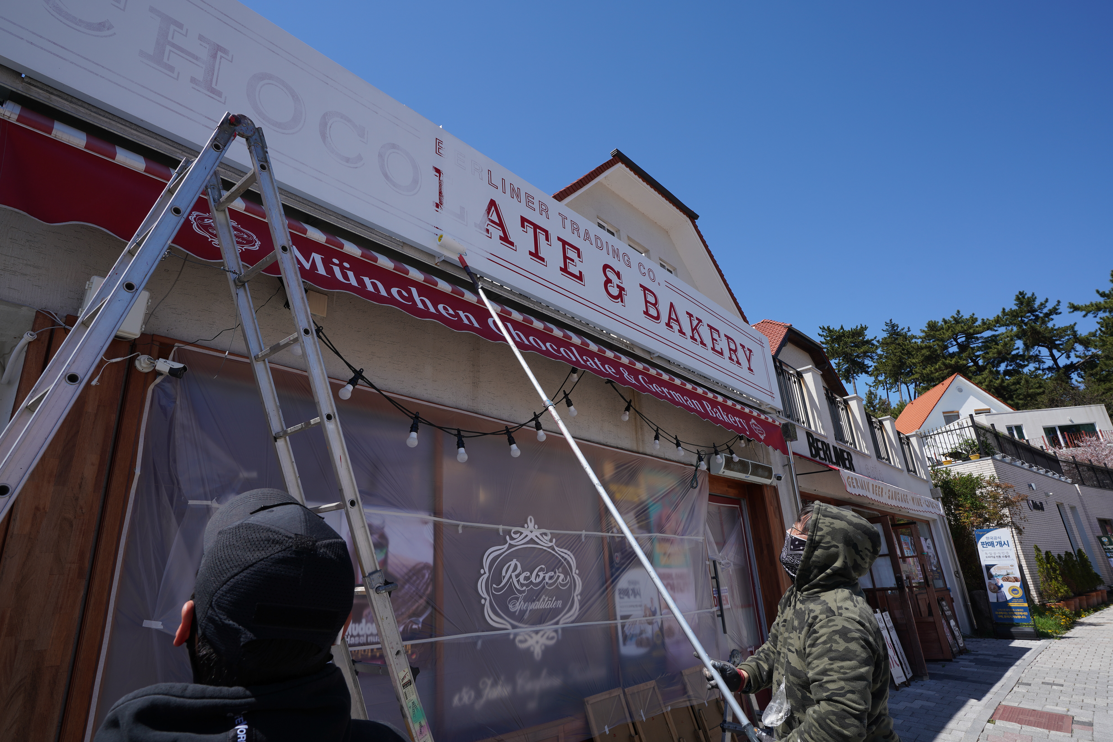
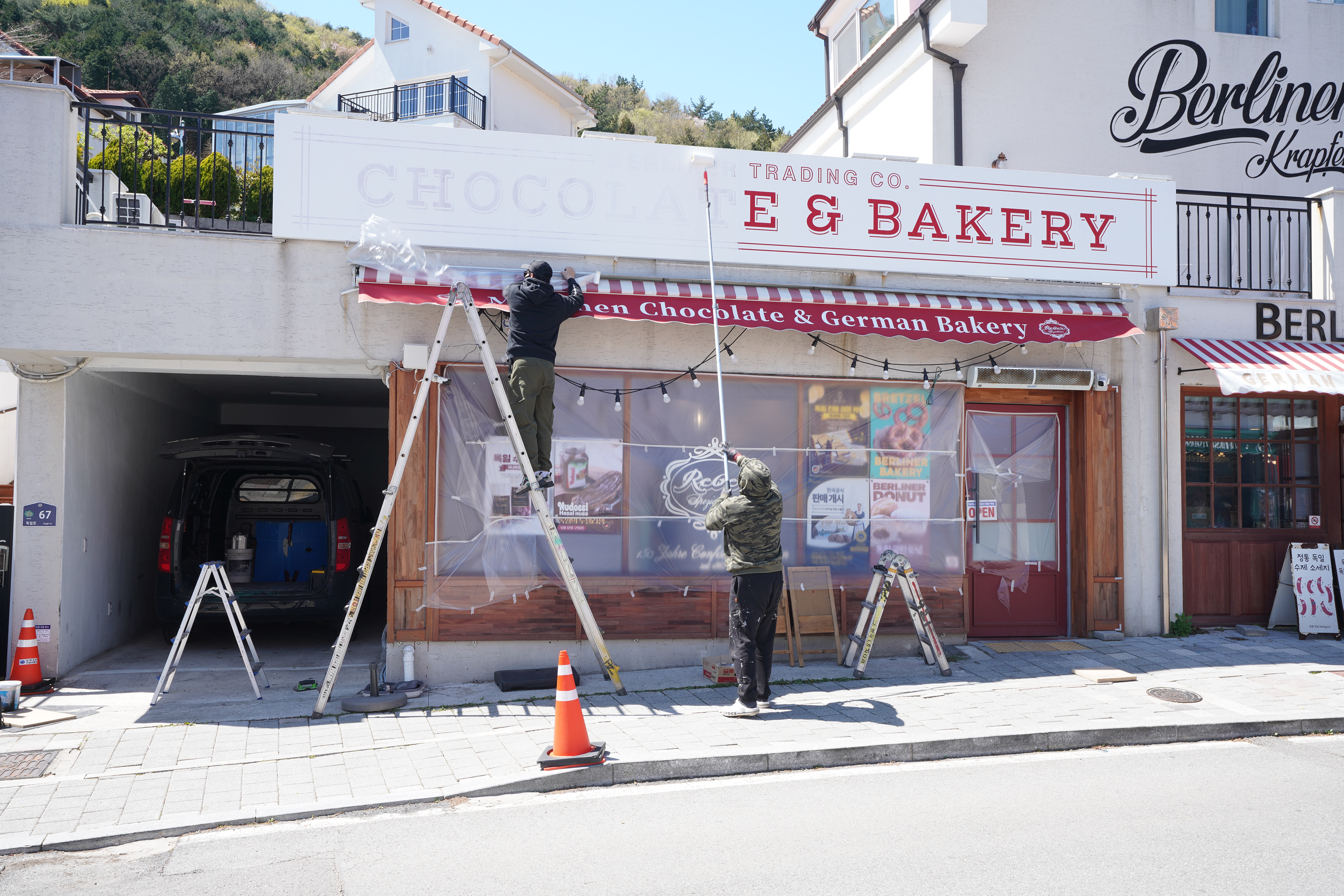
이 프로젝트는 남해 독일인마을에 위치한 베이커리 카페 베를리너의 확장된 외부 간판면을 스텐실 방식으로 리뉴얼한 작업이다. 목적은 장식적 연출보다 간판의 기능을 우선해, 멀리서도 ‘BAKERY’가 명확하게 읽히고 프레첼 심볼이 함께 인지되도록 정보 구조를 다시 정리하는 데 있었다. 기존 간판의 문구와 가독성 문제를 현장 조건에 맞게 조정한 상업 공간 사인 개선 프로젝트로 볼 수 있다.
이 프로젝트는 남해 독일인마을에 위치한 베이커리 카페 베를리너의 확장된 외부 간판면을 스텐실 방식으로 리뉴얼한 작업이다. 목적은 장식적 연출보다 간판의 기능을 우선해, 멀리서도 ‘BAKERY’가 명확하게 읽히고 프레첼 심볼이 함께 인지되도록 정보 구조를 다시 정리하는 데 있었다. 기존 간판의 문구와 가독성 문제를 현장 조건에 맞게 조정한 상업 공간 사인 개선 프로젝트로 볼 수 있다.
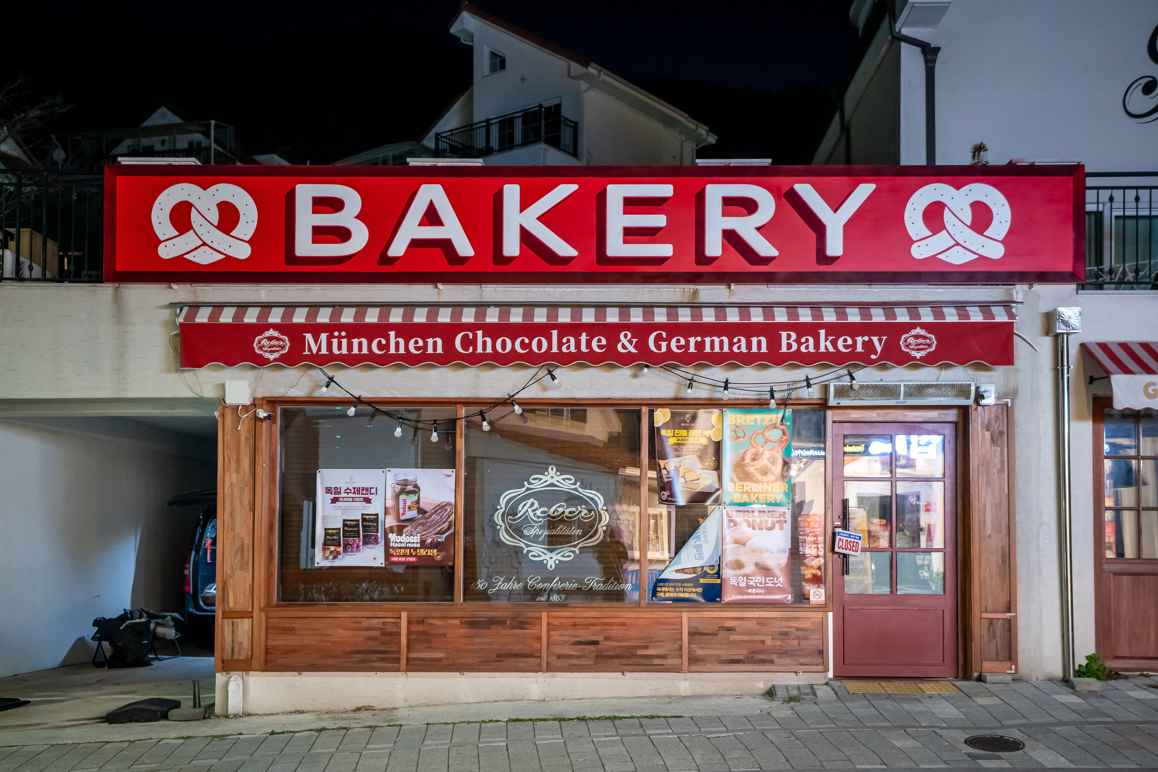
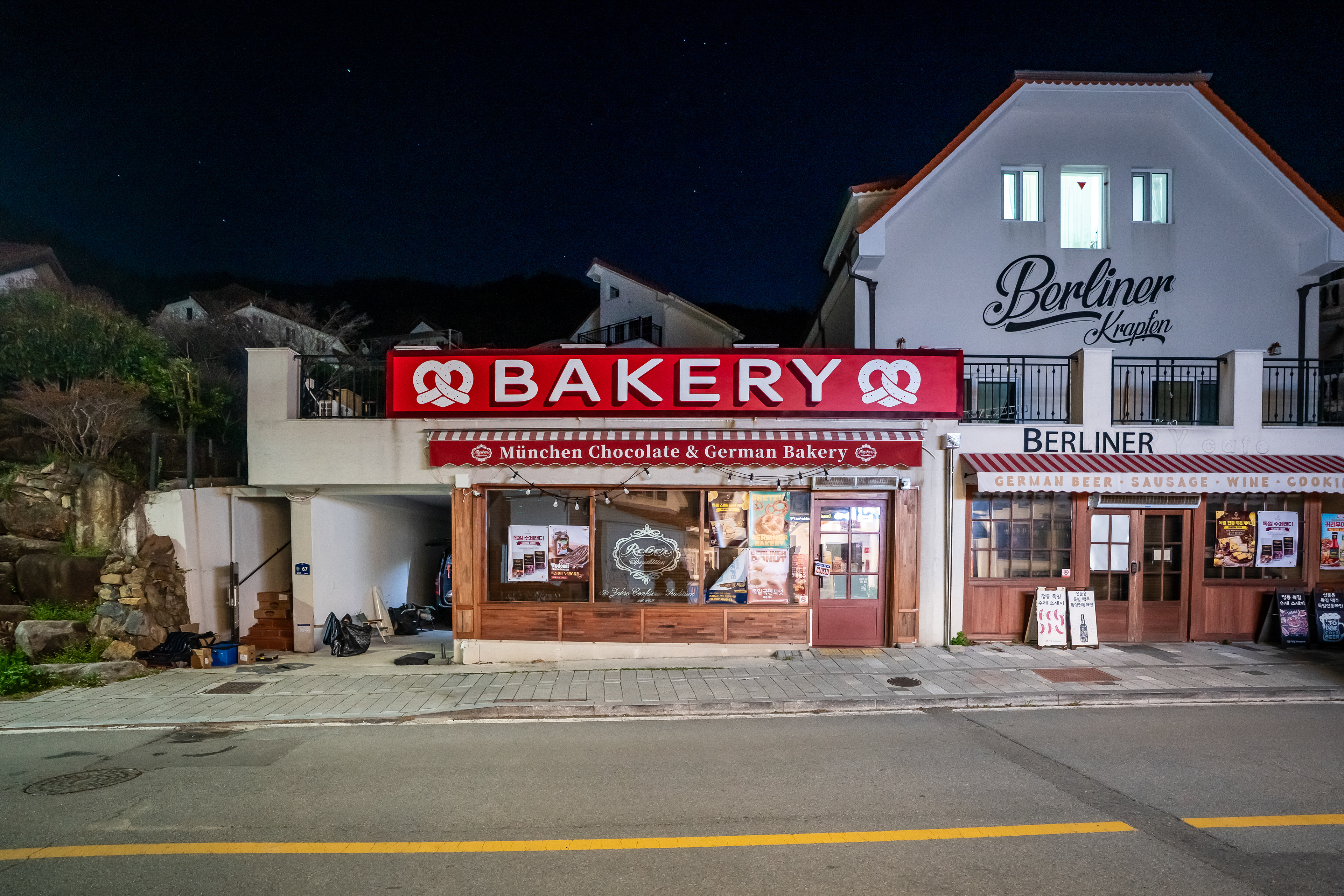
This project involved renewing the expanded exterior sign surface of Berliner, a bakery café located in Namhae German Village, through a stencil-based approach. Rather than emphasizing decoration, the primary goal was to reorganize the sign so that “BAKERY” could be read clearly from a distance while the pretzel symbol remained recognizable as a supporting visual cue. It can be understood as a commercial signage improvement project shaped by both functional clarity and site-specific conditions.
배경 & 컨셉
공간이 확장된 이후 새롭게 필요한 간판면이 생겼고, 기존 간판업체에서 제작한 문구 구성은 실제 운영 방향과 완전히 맞지 않았다. 클라이언트는 지역 특성상 연령대가 높은 방문객이나 멀리서 접근하는 사람도 업종을 빠르게 이해할 수 있기를 원했다. 이에 따라 이번 작업은 그래픽 요소 간의 경쟁을 줄이고, 레터링이 주도하고 심볼이 보완하는 구조로 재설계되었다.
공간이 확장된 이후 새롭게 필요한 간판면이 생겼고, 기존 간판업체에서 제작한 문구 구성은 실제 운영 방향과 완전히 맞지 않았다. 클라이언트는 지역 특성상 연령대가 높은 방문객이나 멀리서 접근하는 사람도 업종을 빠르게 이해할 수 있기를 원했다. 이에 따라 이번 작업은 그래픽 요소 간의 경쟁을 줄이고, 레터링이 주도하고 심볼이 보완하는 구조로 재설계되었다.
As the site was extended, a new sign surface became necessary, while the wording of the previous sign no longer matched the actual direction of the business. The client wanted the bakery to be immediately legible not only to nearby visitors but also to older customers and people approaching from a distance. The concept therefore focused on reducing competition between graphic elements and building a hierarchy in which the lettering leads and the symbol supports.
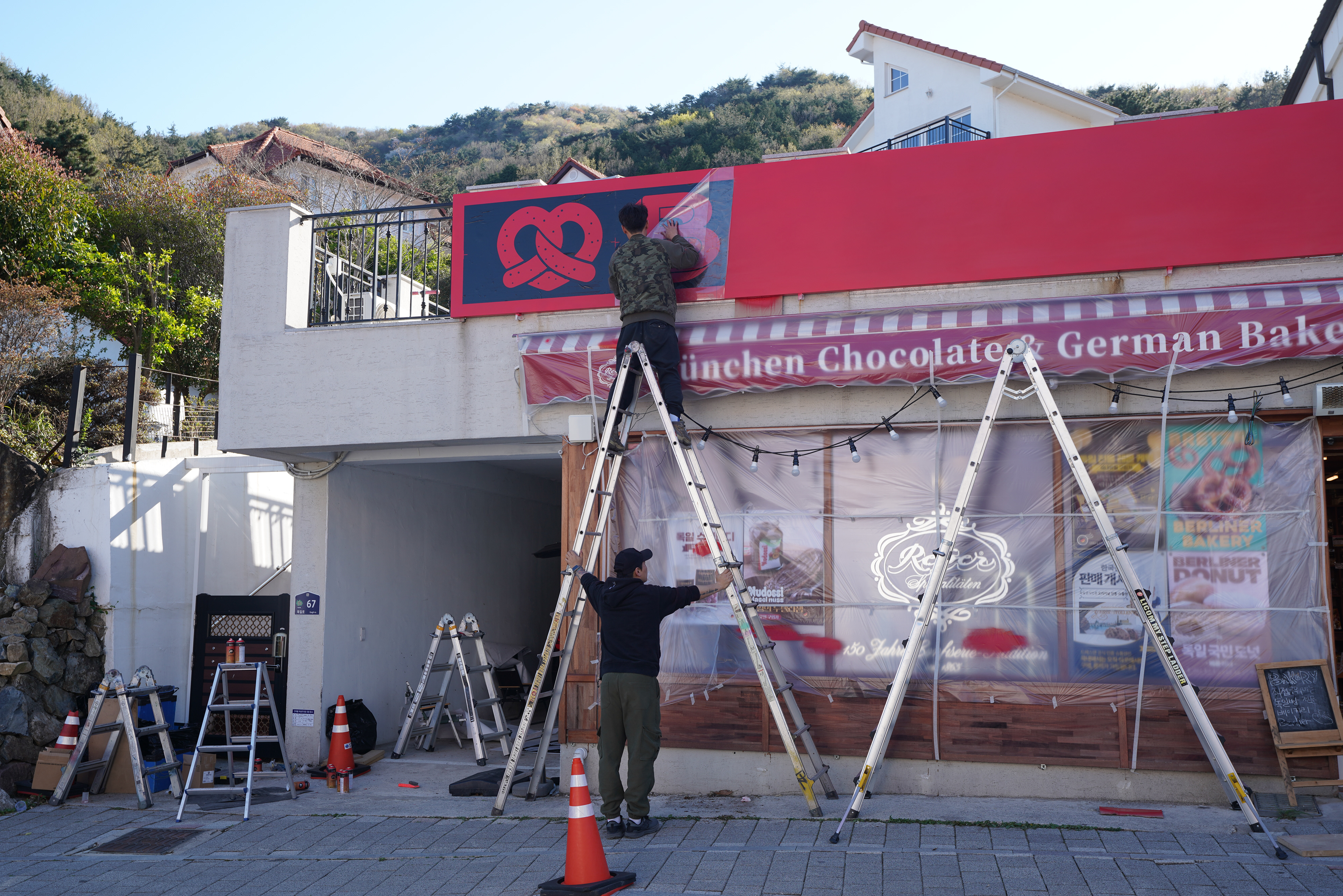
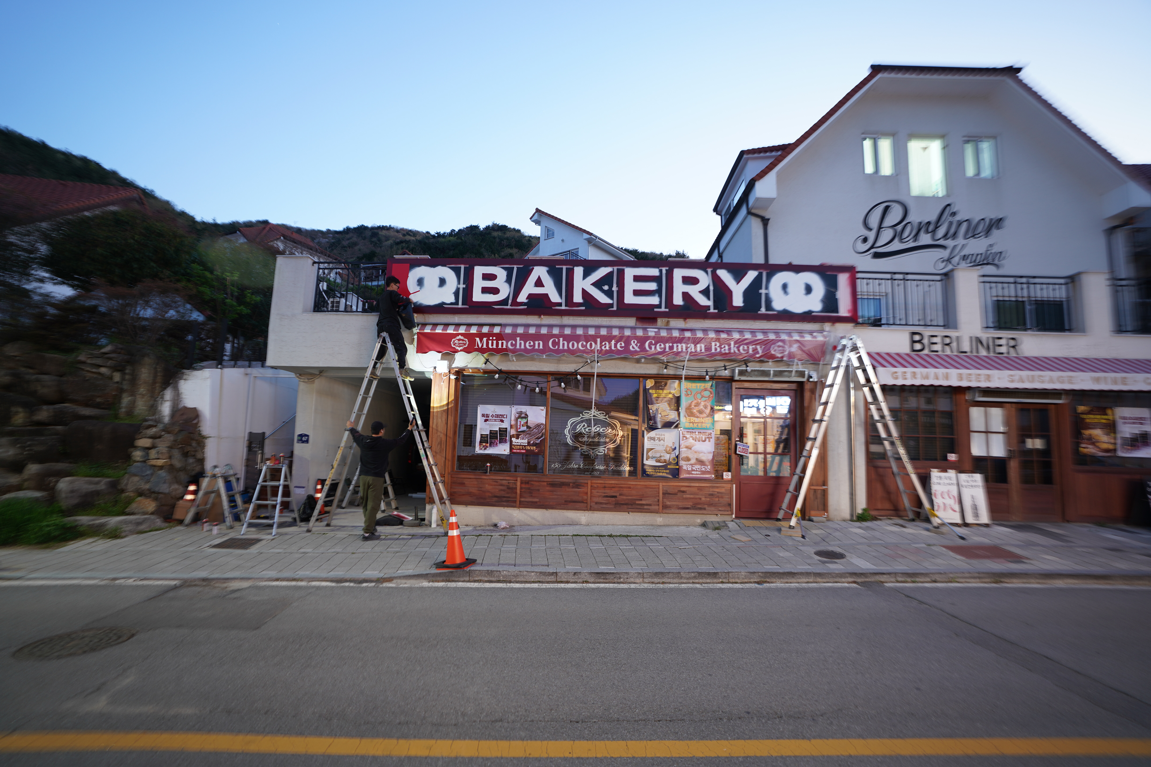
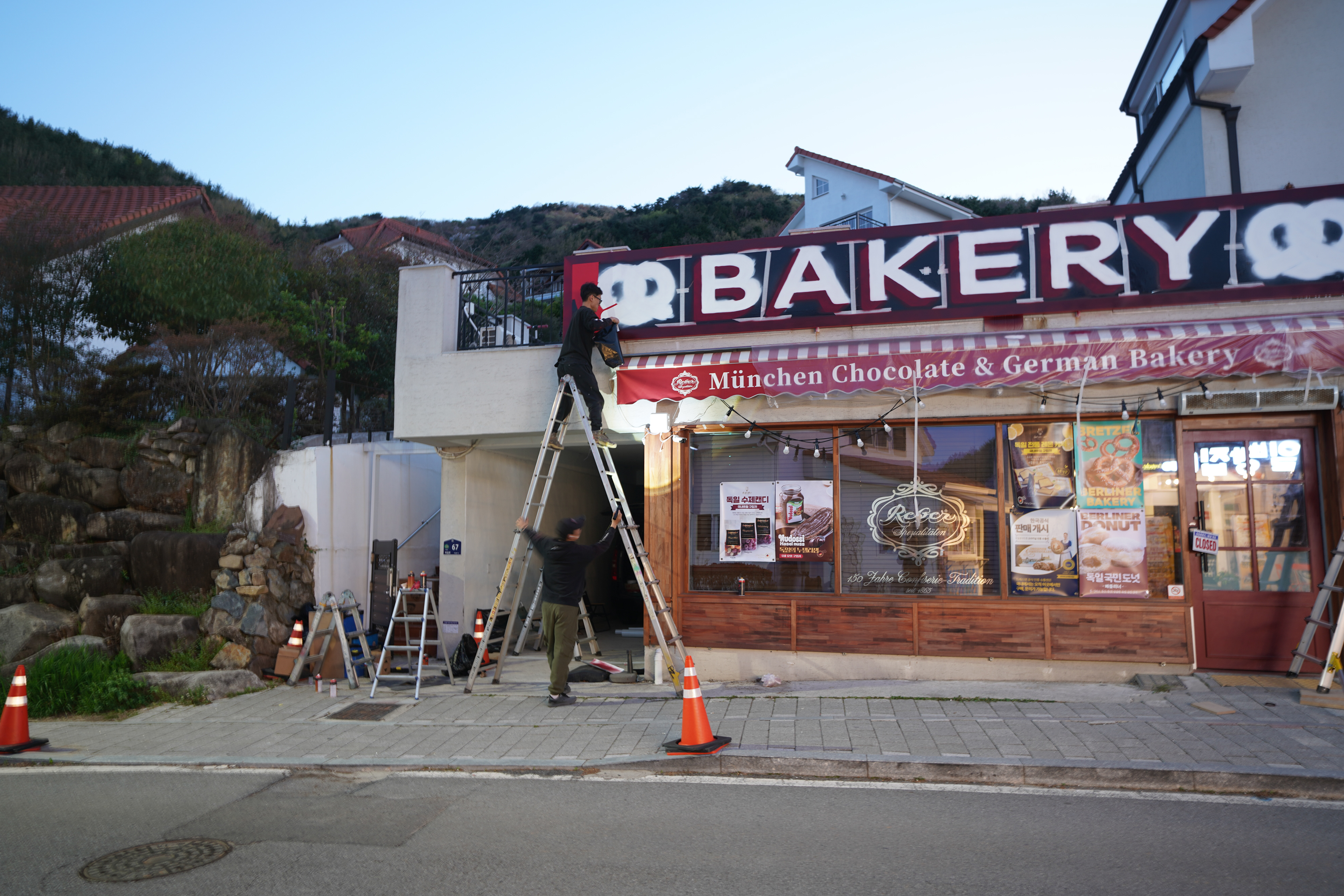
작업 과정
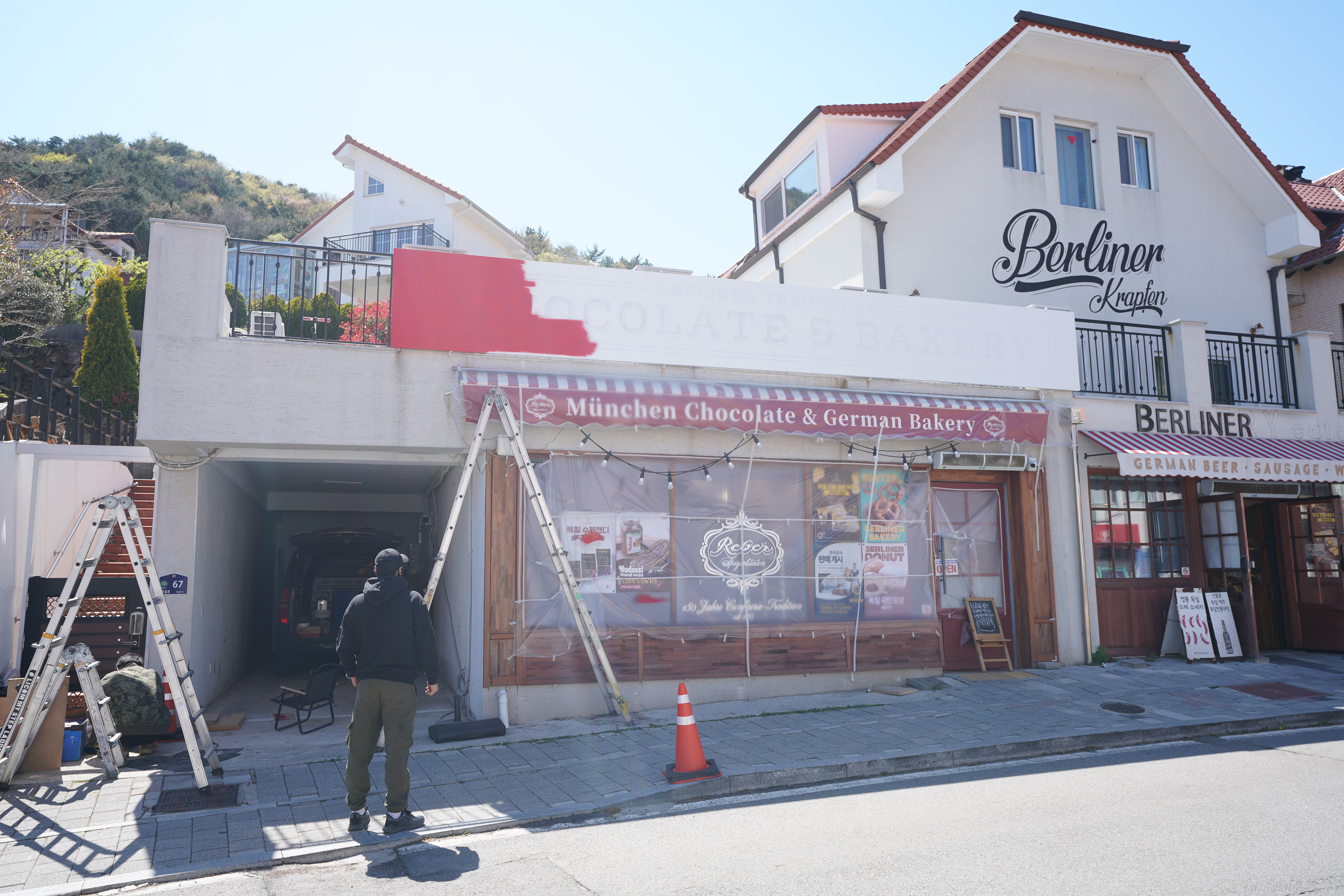
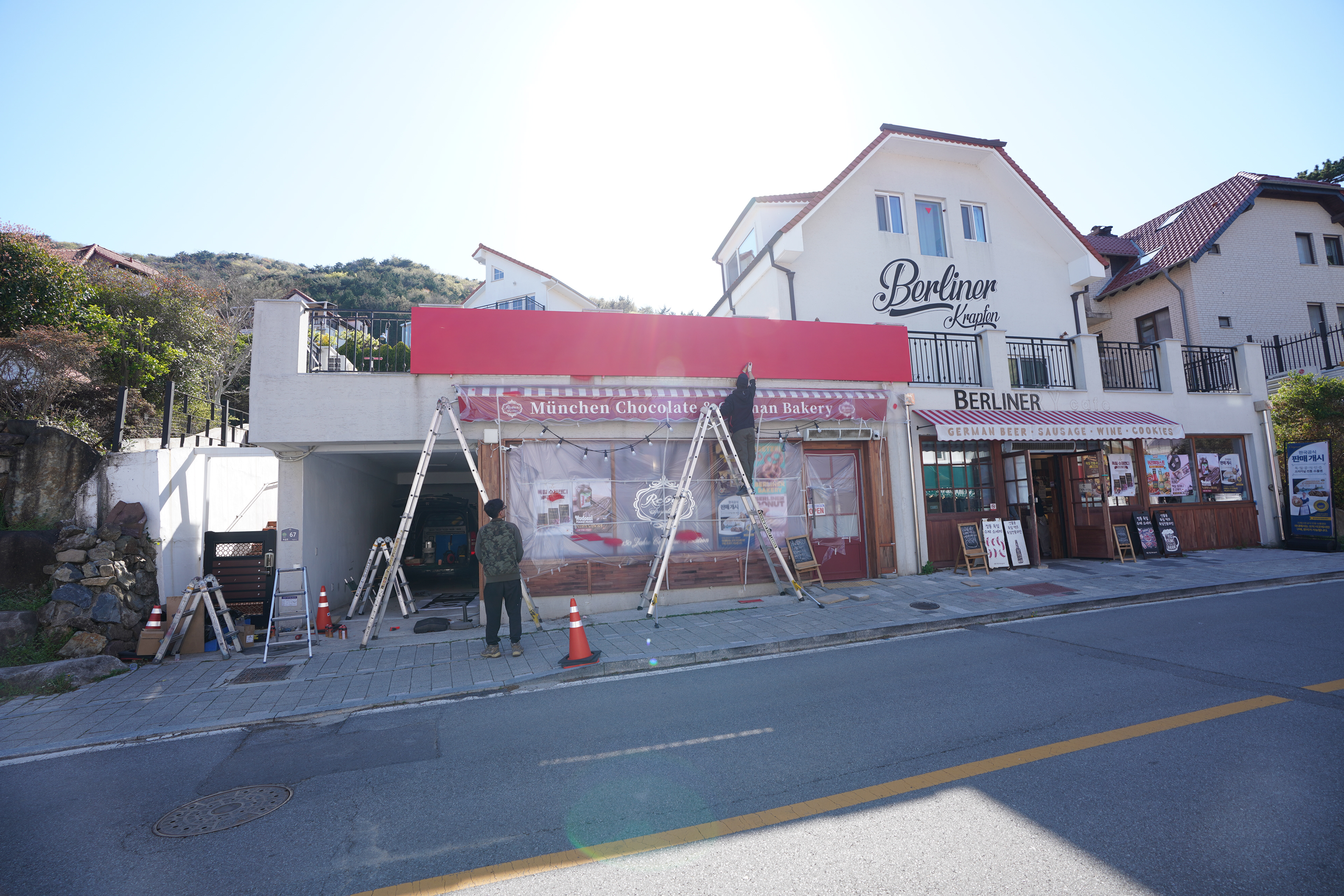
초기 방향은 클라이언트가 전달한 유럽 현지 간판 이미지를 참고해 출발했지만, 실제 현장에서는 가독성과 비례를 기준으로 폰트, 두께, 컬러를 다시 조정했다. 작업은 젯소를 통한 바탕 정리, 배경 컬러 도포, 스텐실 부착, 스프레이 채색 순으로 진행되었으며, 각 단계는 표현보다 안정적인 접착과 선명한 결과 확보에 맞춰 구성되었다. 팀은 공정을 분리하기보다 함께 공유하며 속도와 정렬감을 맞추는 방식으로 진행했다.
초기 방향은 클라이언트가 전달한 유럽 현지 간판 이미지를 참고해 출발했지만, 실제 현장에서는 가독성과 비례를 기준으로 폰트, 두께, 컬러를 다시 조정했다. 작업은 젯소를 통한 바탕 정리, 배경 컬러 도포, 스텐실 부착, 스프레이 채색 순으로 진행되었으며, 각 단계는 표현보다 안정적인 접착과 선명한 결과 확보에 맞춰 구성되었다. 팀은 공정을 분리하기보다 함께 공유하며 속도와 정렬감을 맞추는 방식으로 진행했다.
The initial direction began with reference images of European bakery signage provided by the client, but the final composition was adjusted on site with readability, proportion, and clarity as the main criteria. The process moved through priming, background painting, stencil placement, and spray application, with each stage designed less around expression and more around stable adhesion and crisp execution. Rather than separating tasks too rigidly, the team worked in a shared workflow to maintain pace and visual consistency.
기술 / 공간 포인트
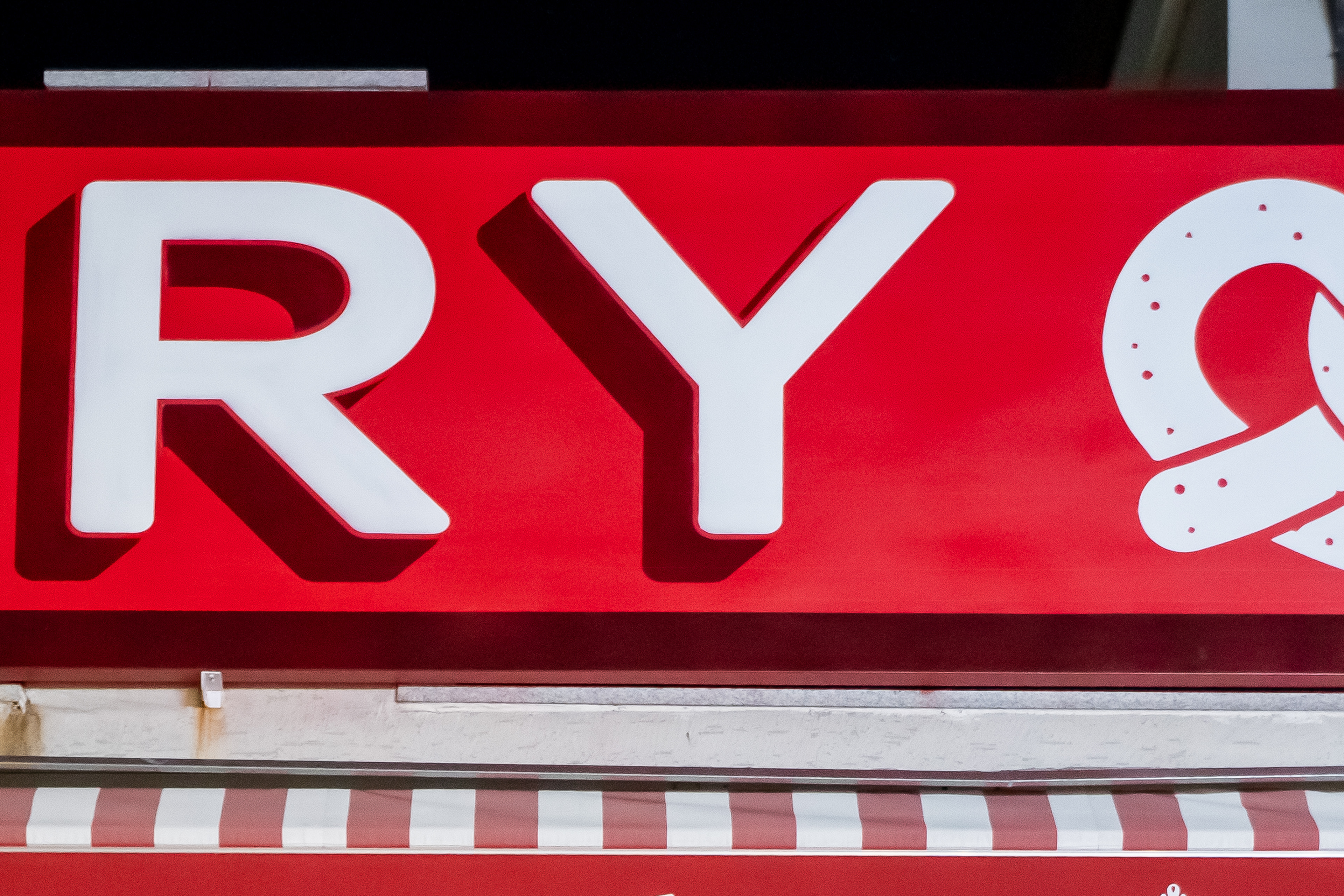
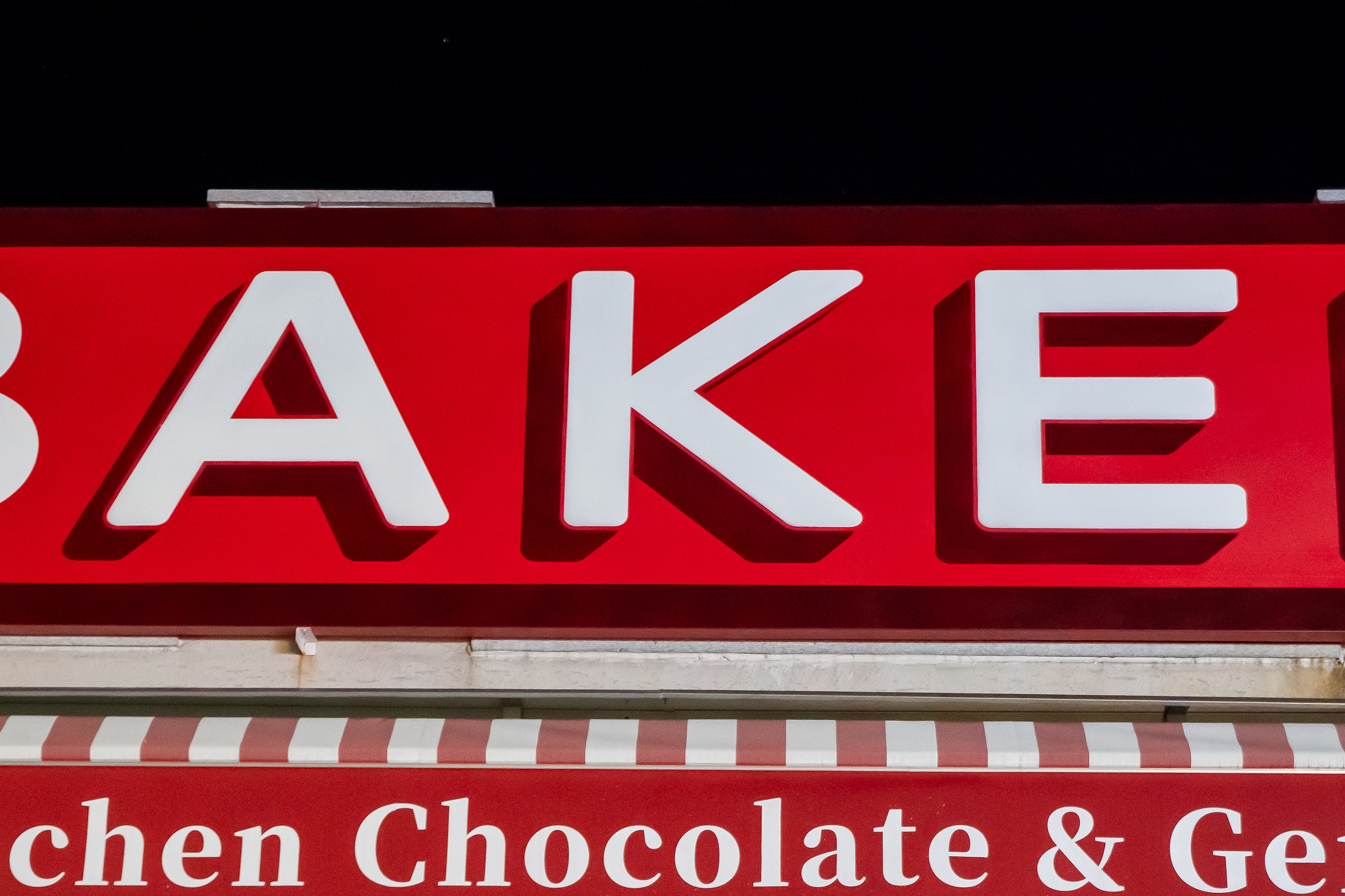
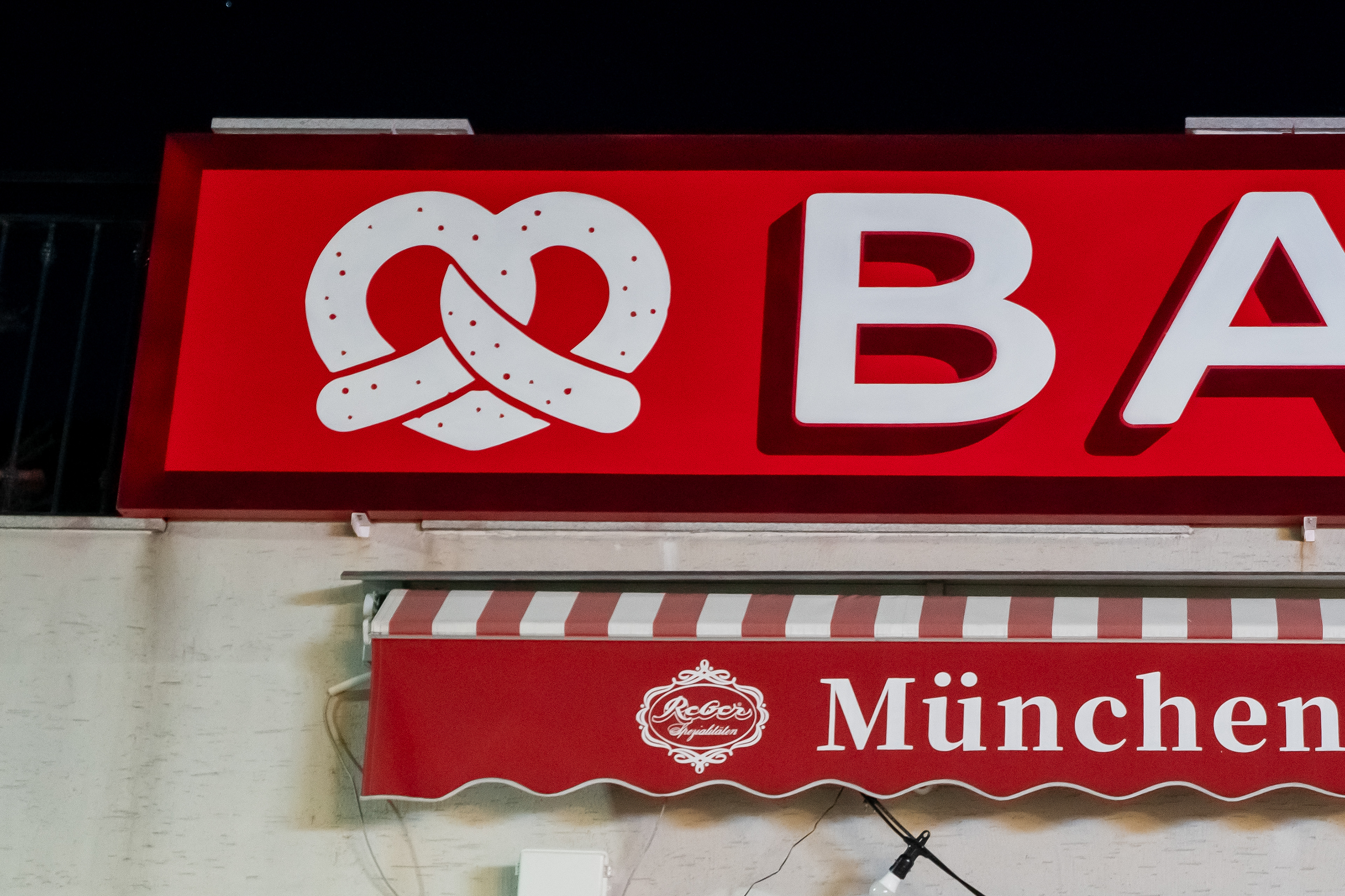
이 간판면은 가로 약 8미터, 높이 약 1미터의 긴 수평 구조로, 외부 보행자와 차량 접근 동선에서 주로 인지되는 위치에 있다. 또한 새 바탕이 아닌 갈바 구조의 기존 간판 위 실사출력 시트지 상태였기 때문에, 도료의 접착력과 스텐실 제거 과정에서의 표면 손상 여부가 중요한 기술적 변수였다. 따라서 작은 장식보다 볼드한 레터링, 안정적인 외곽선, 그리고 멀리서도 읽히는 대비 구성이 핵심 판단 기준이 되었다.
이 간판면은 가로 약 8미터, 높이 약 1미터의 긴 수평 구조로, 외부 보행자와 차량 접근 동선에서 주로 인지되는 위치에 있다. 또한 새 바탕이 아닌 갈바 구조의 기존 간판 위 실사출력 시트지 상태였기 때문에, 도료의 접착력과 스텐실 제거 과정에서의 표면 손상 여부가 중요한 기술적 변수였다. 따라서 작은 장식보다 볼드한 레터링, 안정적인 외곽선, 그리고 멀리서도 읽히는 대비 구성이 핵심 판단 기준이 되었다.
The sign surface measured approximately 8 meters wide by 1 meter high, forming a long horizontal format primarily viewed from pedestrian and vehicle approaches. Because the work was applied over an existing printed sheet on a galvanized sign structure rather than a fresh wall, paint adhesion and the risk of surface damage during stencil removal became critical technical concerns. This made bold lettering, stable outlines, and strong long-distance contrast more important than smaller decorative details.
Process video showing the making and final sign function
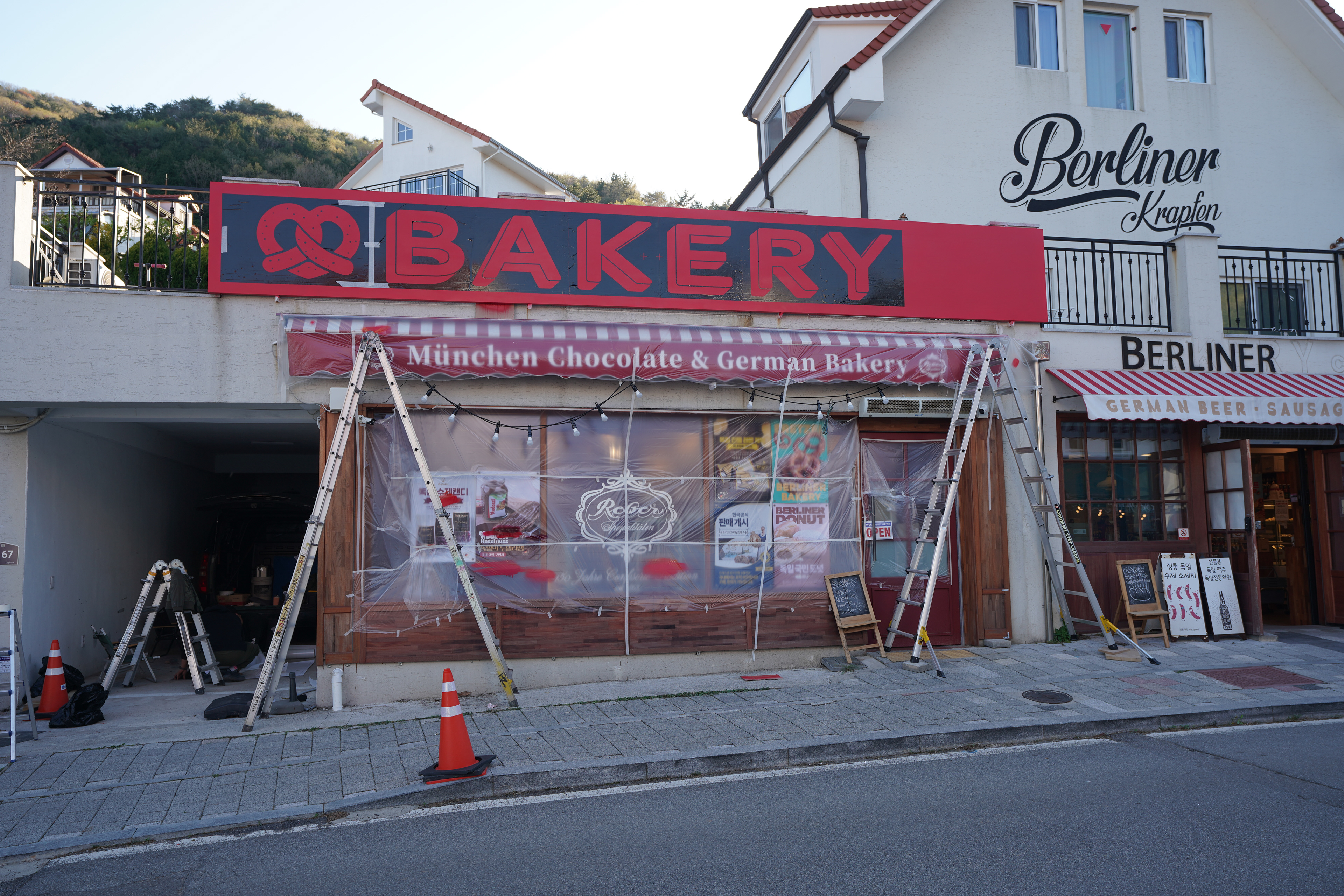
결과 & 활용 맥락
완성 후 간판은 기존보다 정보 구조가 단순해졌고, 무엇을 판매하는 공간인지가 더 빠르게 읽히는 방향으로 정리되었다. 흰색과 빨간색의 대비, 큰 문자 비중, 프레첼 심볼의 보조적 배치는 간판 기능과 공간 인지성을 동시에 강화한다. 결과적으로 이 작업은 사진과 영상 기록에서 명확한 전후 변화를 보여주며, 현장에서는 브랜드 업종을 직관적으로 전달하는 외부 사인으로 기능한다.
완성 후 간판은 기존보다 정보 구조가 단순해졌고, 무엇을 판매하는 공간인지가 더 빠르게 읽히는 방향으로 정리되었다. 흰색과 빨간색의 대비, 큰 문자 비중, 프레첼 심볼의 보조적 배치는 간판 기능과 공간 인지성을 동시에 강화한다. 결과적으로 이 작업은 사진과 영상 기록에서 명확한 전후 변화를 보여주며, 현장에서는 브랜드 업종을 직관적으로 전달하는 외부 사인으로 기능한다.
After completion, the sign was simplified into a structure that communicates the type of business much more quickly than before. The contrast between white and red, the enlarged lettering, and the supporting placement of the pretzel symbol collectively strengthen both the sign function and the spatial readability of the storefront. As a result, the project offers a clear before-and-after transformation in photo and video documentation while functioning on site as an intuitive exterior sign for the brand.
프로젝트 성격 요약
이 프로젝트는 그래피티와 스텐실의 시각 언어를 상업 공간 사인 시스템에 적용한 사례로, 단순 장식이 아닌 정보 전달과 현장 활용성을 함께 설계한 작업이다. 바머스는 이 과정에서 공간 구조, 기존 표면 상태, 동선, 가독성, 그리고 브랜드 업종 인지 방식을 동시에 고려했다. 따라서 본 작업은 그래피티 기반 상업 공간 연출, 외부 브랜딩, 구조물 기반 사인 리뉴얼 범주 안에서 이해할 수 있다.
이 프로젝트는 그래피티와 스텐실의 시각 언어를 상업 공간 사인 시스템에 적용한 사례로, 단순 장식이 아닌 정보 전달과 현장 활용성을 함께 설계한 작업이다. 바머스는 이 과정에서 공간 구조, 기존 표면 상태, 동선, 가독성, 그리고 브랜드 업종 인지 방식을 동시에 고려했다. 따라서 본 작업은 그래피티 기반 상업 공간 연출, 외부 브랜딩, 구조물 기반 사인 리뉴얼 범주 안에서 이해할 수 있다.
This project applies the visual language of graffiti and stencil practice to a commercial signage system, approaching the work not as surface decoration but as a balance between communication and site usability. In doing so, BMBRS considered the structure of the space, the condition of the existing surface, movement flow, readability, and the immediate recognition of the business type at once. It can therefore be positioned within BMBRS’s broader category of graffiti-based spatial direction, exterior branding, and structure-based sign renewal.
Final completed exterior sign view
Final completed exterior sign view
Final completed exterior sign view
Final completed exterior sign view
Final completed exterior sign view
Final completed exterior sign view