
2026 / 광양, 전라남도, 대한민국 / Billionbox Burger & Chicken 광양점
2026 / Gwangyang, Jeollanam-do, South Korea / Billionbox Burger & Chicken Gwangyang
2026 / Gwangyang, Jeollanam-do, South Korea / Billionbox Burger & Chicken Gwangyang
브랜드 그래피티 & F&B 공간 브랜딩
Brand Graffiti & Spatial Branding for an F&B Interior
Brand Graffiti & Spatial Branding for an F&B Interior
Artists: DHAL, Remon, DZ, James
DHAL, Remon, DZ, James / Gwangyang, South Korea /2026
광양점 이전 매장을 대상으로 진행한 이번 프로젝트는, 일반적인 1층 상가 구조를 브랜드 무드가 분명한 체류형 F&B 공간으로 전환하는 작업이었다. 바머스는 단순히 벽면을 채우는 방식이 아니라, 주요 벽면·파티션·카운터 프레임·대기 구간을 각각 다른 역할로 설계해 매장 전체를 하나의 시각 경험으로 구성했다.
This project transformed a standard ground-floor retail unit into a branded F&B environment with a clear sense of atmosphere and identity. Rather than treating it as a single mural commission, BMBRS structured the main walls, partitions, counter frame, and waiting zones as distinct visual moments tied together as one spatial experience.
This project transformed a standard ground-floor retail unit into a branded F&B environment with a clear sense of atmosphere and identity. Rather than treating it as a single mural commission, BMBRS structured the main walls, partitions, counter frame, and waiting zones as distinct visual moments tied together as one spatial experience.
작업 개요 / Overview
이번 작업의 목적은 햄버거 중심의 아메리칸 캐주얼 무드를 공간 전체에 자연스럽게 이식하는 것이었다. 결과적으로 이 프로젝트는 그래피티를 장식 요소로 덧붙인 사례가 아니라, 그래피티 문법을 브랜드 시각 언어로 번역해 실내 체류 경험과 사진 포인트, 브랜드 인지성을 함께 설계한 공간 그래픽 프로젝트에 가깝다.
The brief was to build an American casual mood around the burger-focused identity of the brand. In its final form, the project functions less as decorative wall painting and more as a spatial graphics system that uses graffiti language to shape customer experience, photo moments, and brand recognition at once.
The brief was to build an American casual mood around the burger-focused identity of the brand. In its final form, the project functions less as decorative wall painting and more as a spatial graphics system that uses graffiti language to shape customer experience, photo moments, and brand recognition at once.
배경 & 컨셉 / Background & Concept
클라이언트는 신규 이전 매장에 차별화된 인상을 만들되, 과도하게 하드코어한 스트리트 감성보다는 가족 단위 방문객과 비교적 어린 연령층도 수용할 수 있는 방향을 원했다. 이에 바머스는 팝아트, 사인그래픽, 캐릭터, 레터링, 포트레이트를 층위별로 조합해, 현대적인 아메리칸 레트로를 기반으로 한 팝-그래피티 브랜드 공간이라는 방향으로 정리했다.
The client needed a distinct visual identity for the relocated store, but one that remained approachable for families and younger visitors rather than leaning too far into a raw street aesthetic. BMBRS responded by layering pop graphics, signage, character work, lettering, and portraiture into a contemporary American-retro pop graffiti environment tailored to a public-facing commercial space.
The client needed a distinct visual identity for the relocated store, but one that remained approachable for families and younger visitors rather than leaning too far into a raw street aesthetic. BMBRS responded by layering pop graphics, signage, character work, lettering, and portraiture into a contemporary American-retro pop graffiti environment tailored to a public-facing commercial space.
그래피티 특유의 에너지와 상업공간의 사용성을 동시에 유지하기 위해, 브랜드명과 업종 인지 요소는 명확하게 남기고 표현 수위는 대중적으로 조절했다. Route 66, 레트로 차량, boombox, 캐릭터 버거, 포트레이트 같은 시각 요소는 각각 독립적으로 보이기보다 브랜드 세계관의 일부로 배치되도록 조율했다.
To preserve both graffiti energy and commercial usability, the visual system kept the brand name and category cues highly legible while moderating the overall tone for a broader audience. Elements such as Route 66 signage, retro cars, boombox imagery, burger characters, and portrait work were positioned not as isolated illustrations but as parts of a cohesive brand world.
To preserve both graffiti energy and commercial usability, the visual system kept the brand name and category cues highly legible while moderating the overall tone for a broader audience. Elements such as Route 66 signage, retro cars, boombox imagery, burger characters, and portrait work were positioned not as isolated illustrations but as parts of a cohesive brand world.
작업 과정 / Process
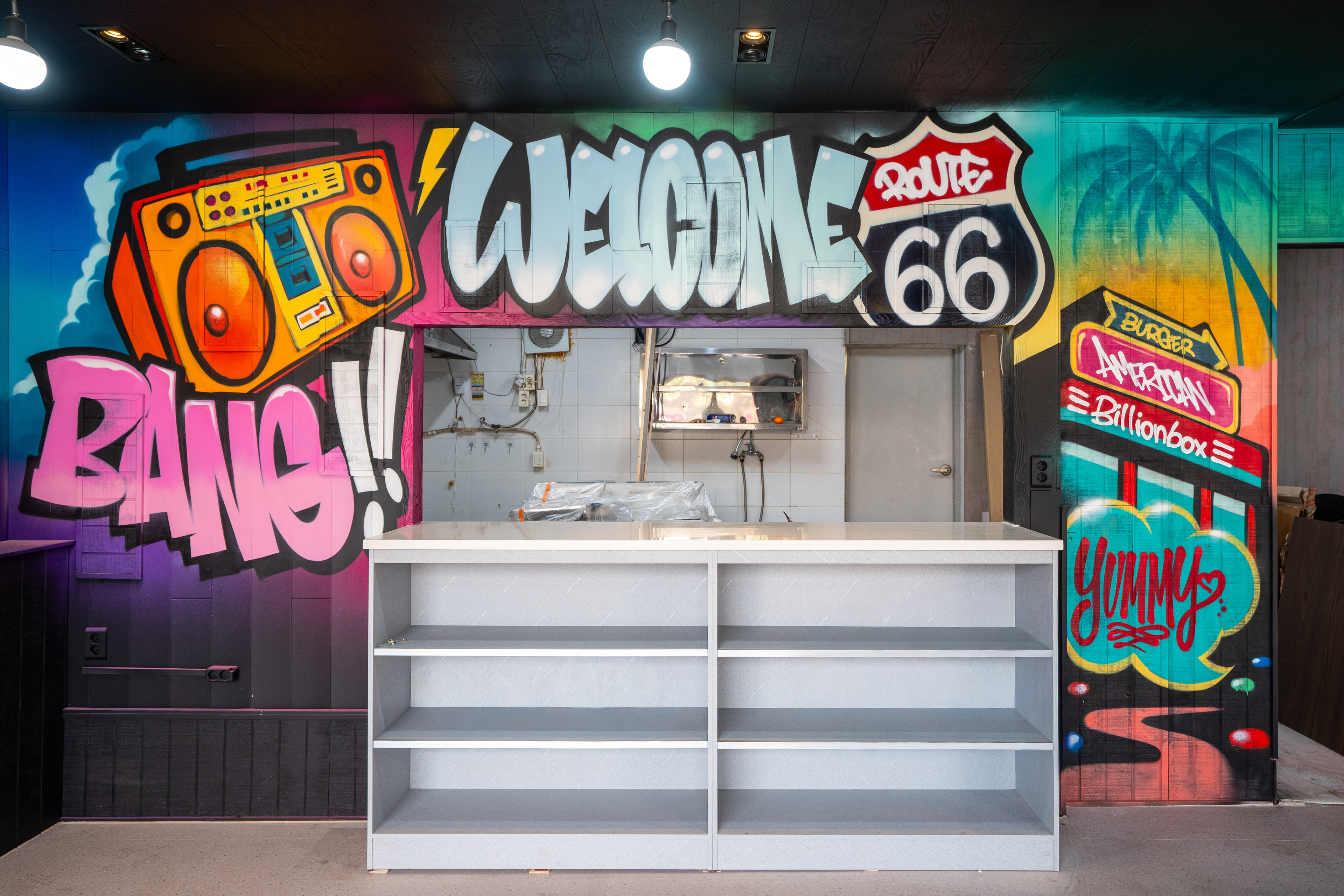
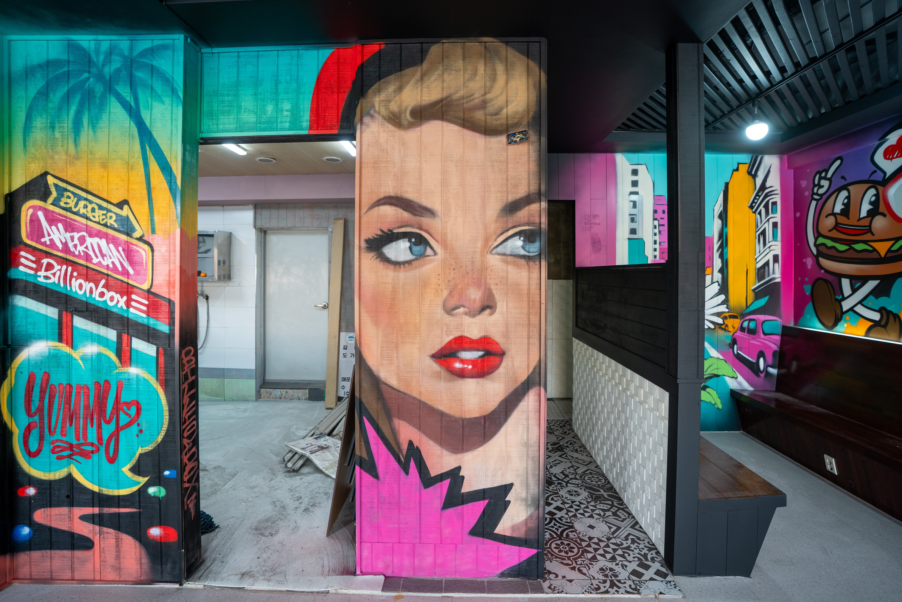
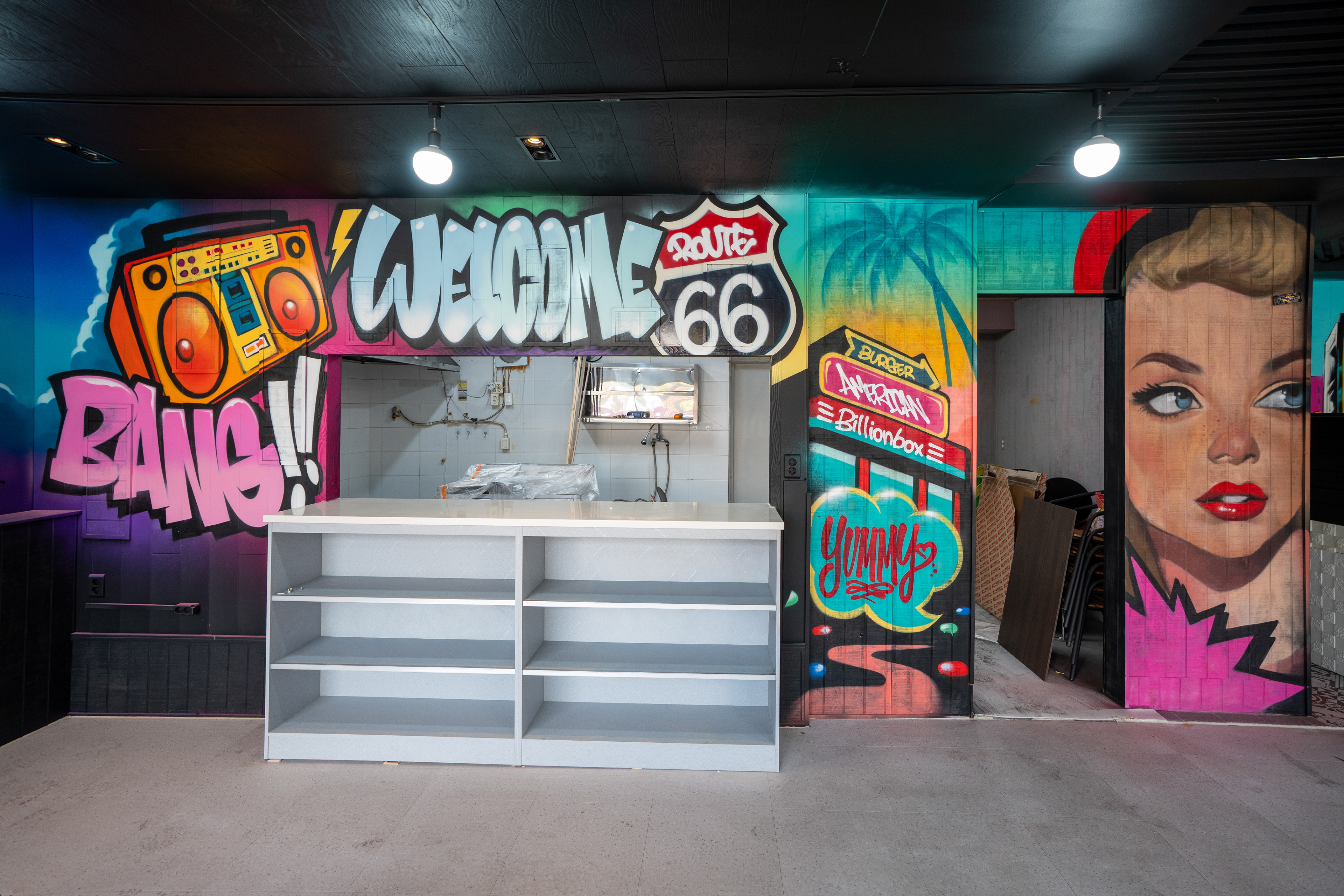
현장은 과거 외식업 매장이었던 구조로, 오픈부와 파티션, 좁은 코너, 긴 좌석벽 등 분절된 면이 많은 공간이었다. 바머스는 큰 벽 하나에 모든 정보를 몰아넣는 대신, 메인 롱월은 브랜드 인지와 포토월, 카운터 연결부는 인트로 프레임, 세로 파티션은 시선 정지점, 협소 구간 끝면은 공간 깊이를 만드는 장면으로 각각 역할을 분리해 접근했다.
The site carried the typical fragmentation of a repurposed restaurant interior, with service openings, partitions, narrow corners, and an extended seating wall. Instead of forcing all information into one dominant mural, BMBRS assigned a clear function to each surface: the long wall for brand recognition and photography, the counter opening as an entry frame, the vertical partition as a visual pause point, and the narrow end wall as a device for spatial depth.
The site carried the typical fragmentation of a repurposed restaurant interior, with service openings, partitions, narrow corners, and an extended seating wall. Instead of forcing all information into one dominant mural, BMBRS assigned a clear function to each surface: the long wall for brand recognition and photography, the counter opening as an entry frame, the vertical partition as a visual pause point, and the narrow end wall as a device for spatial depth.
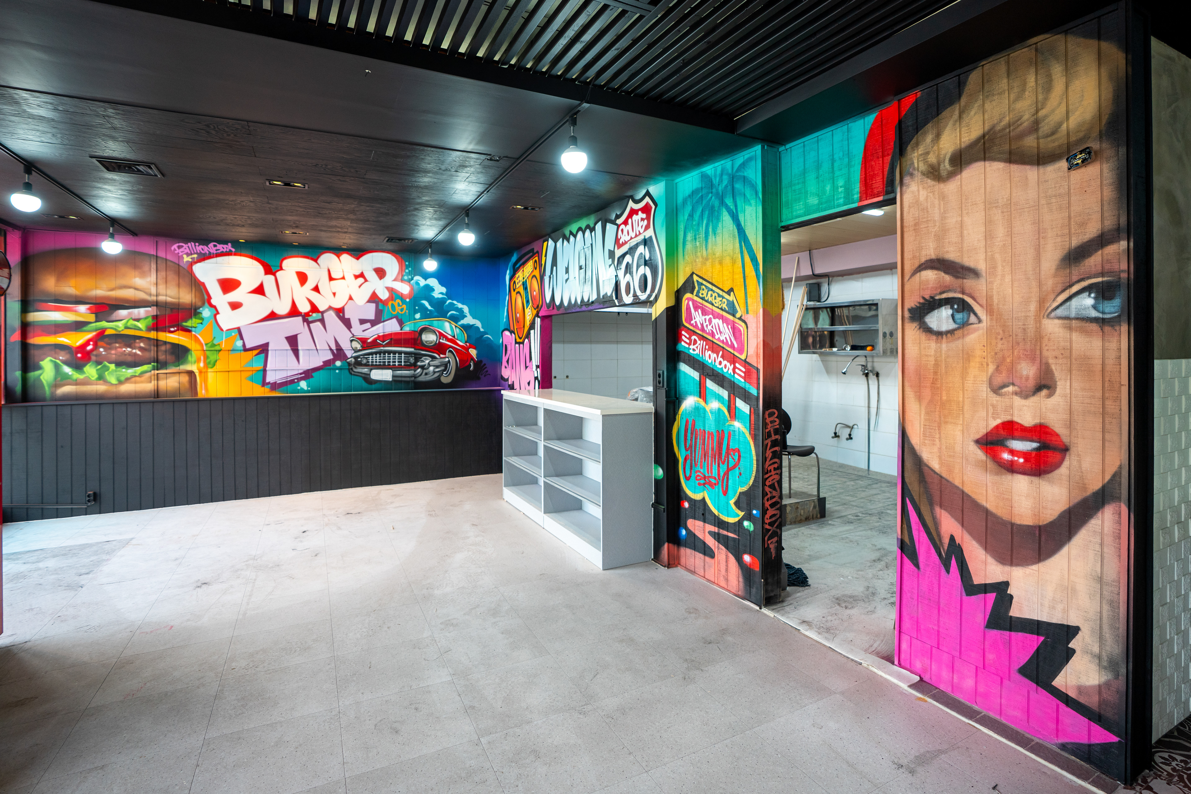

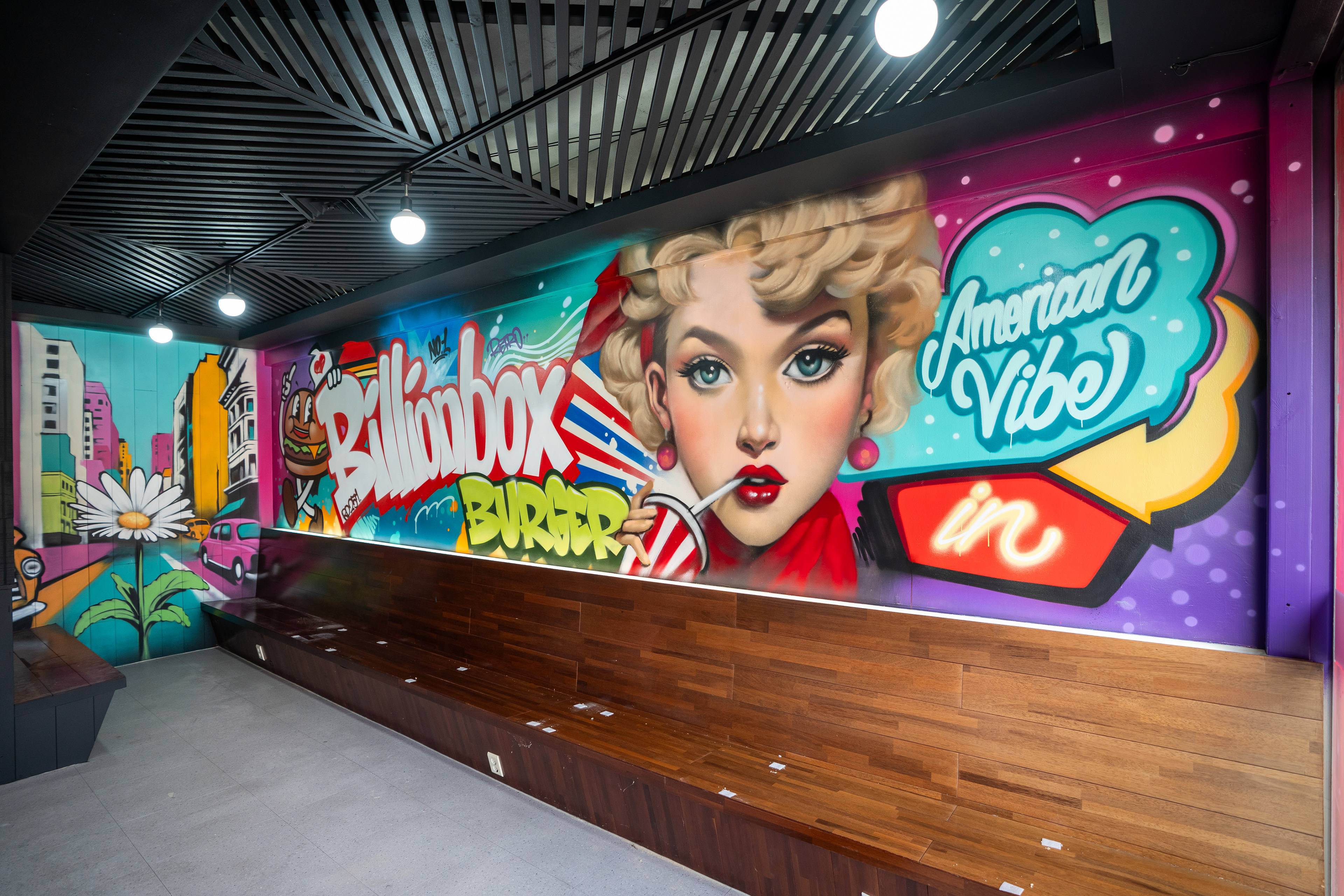
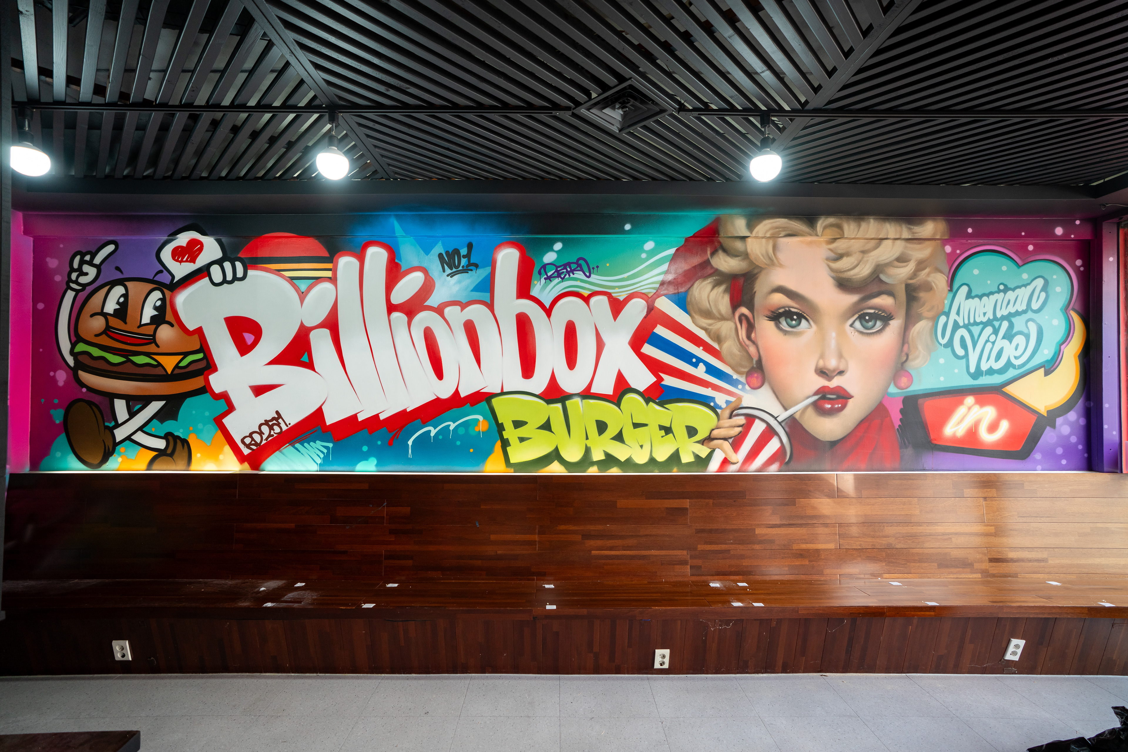
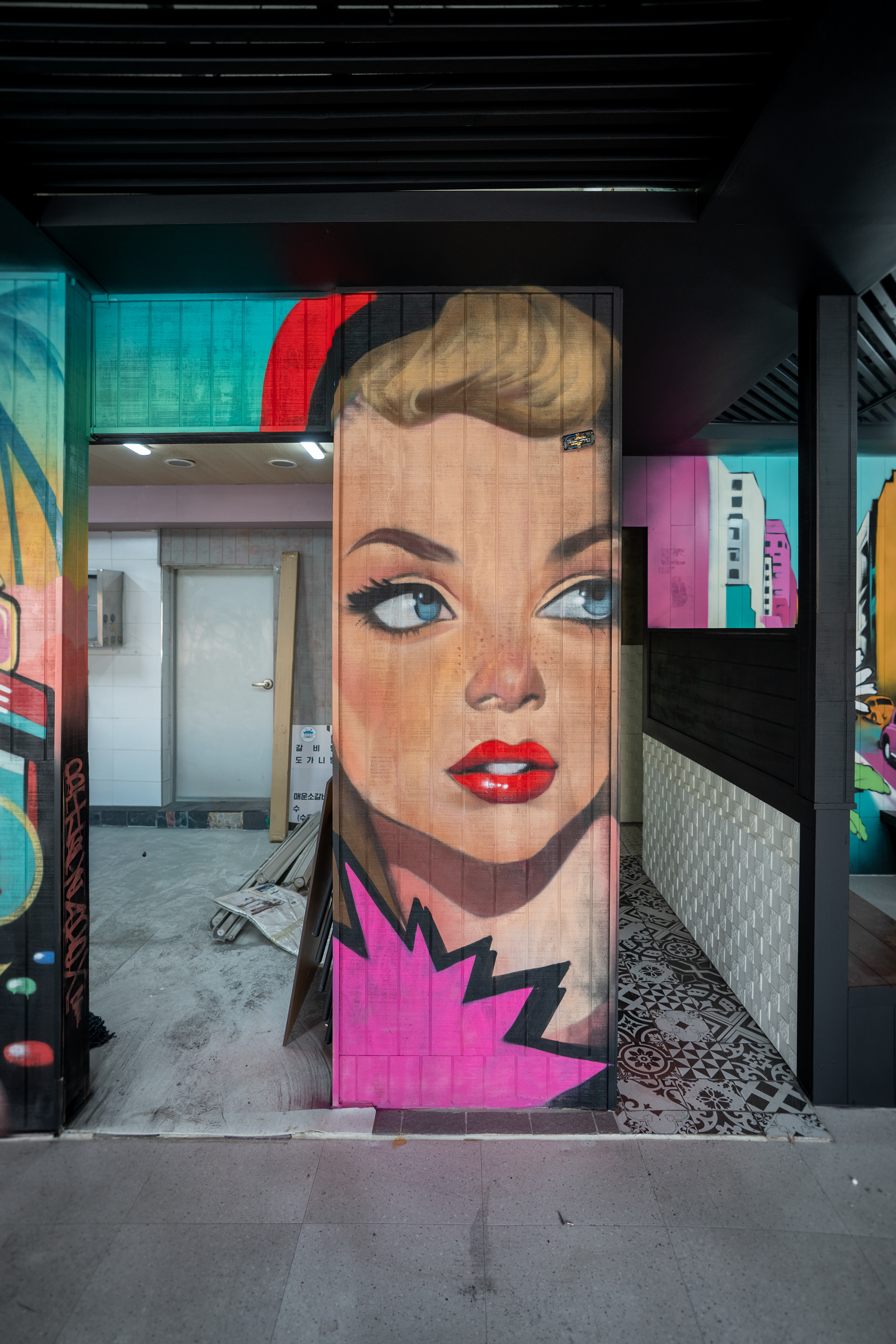
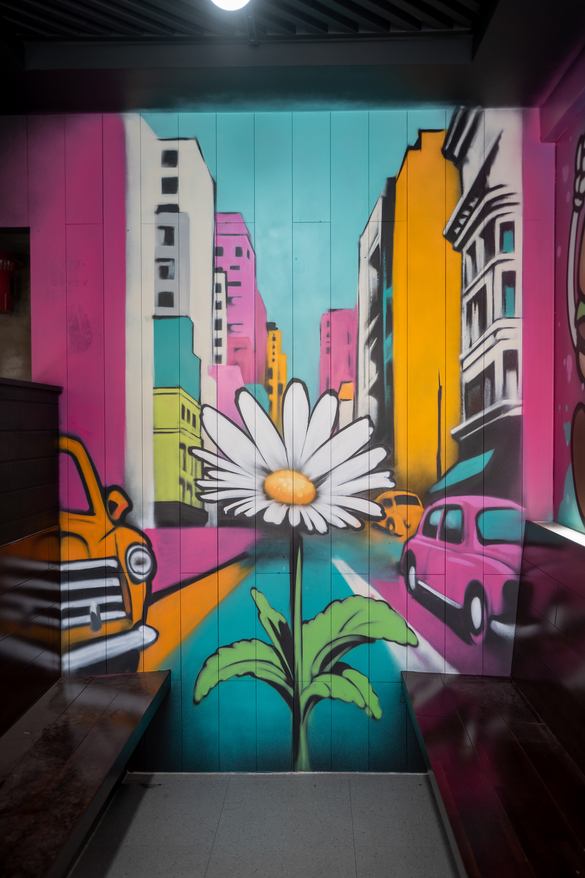
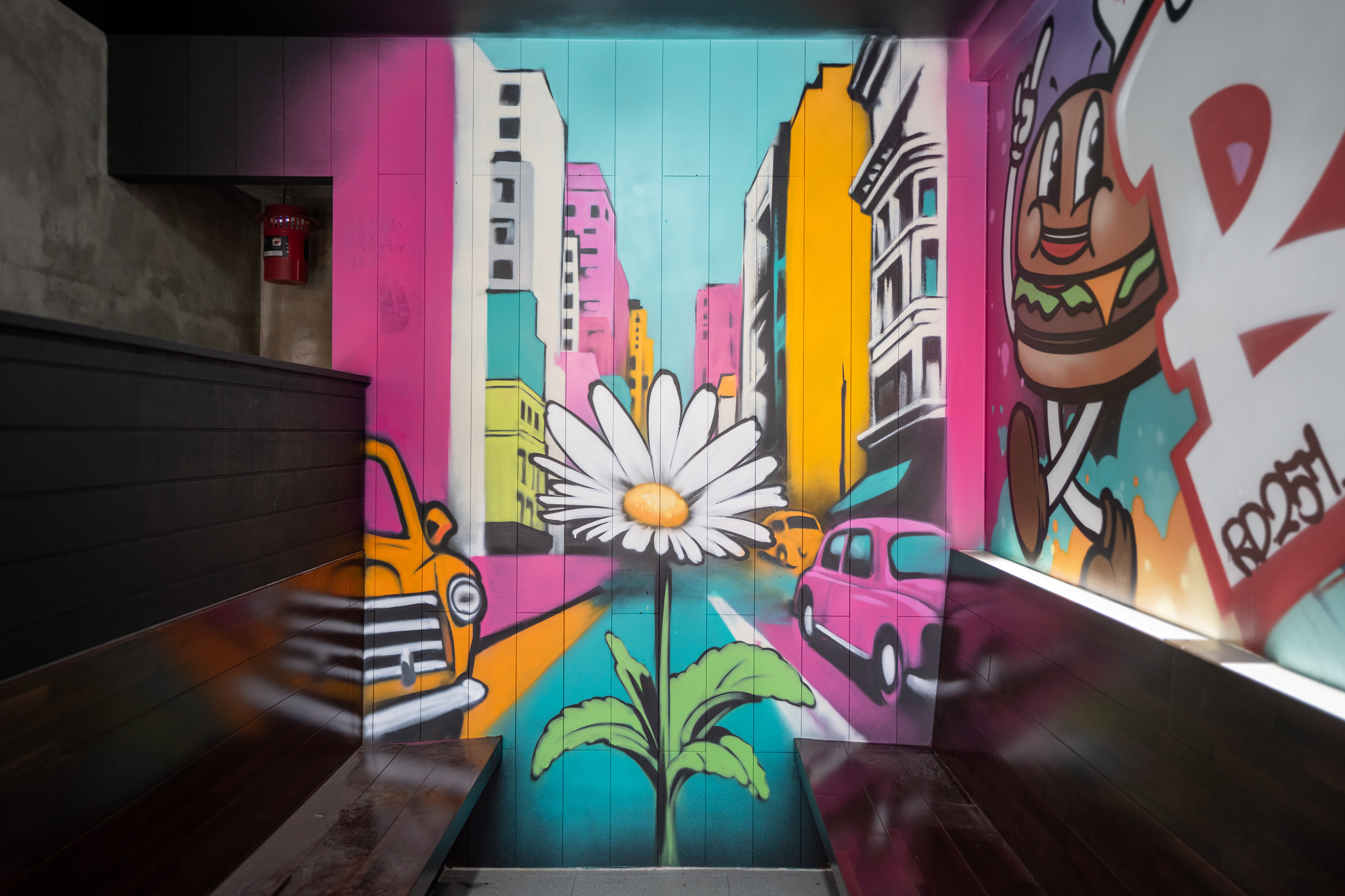
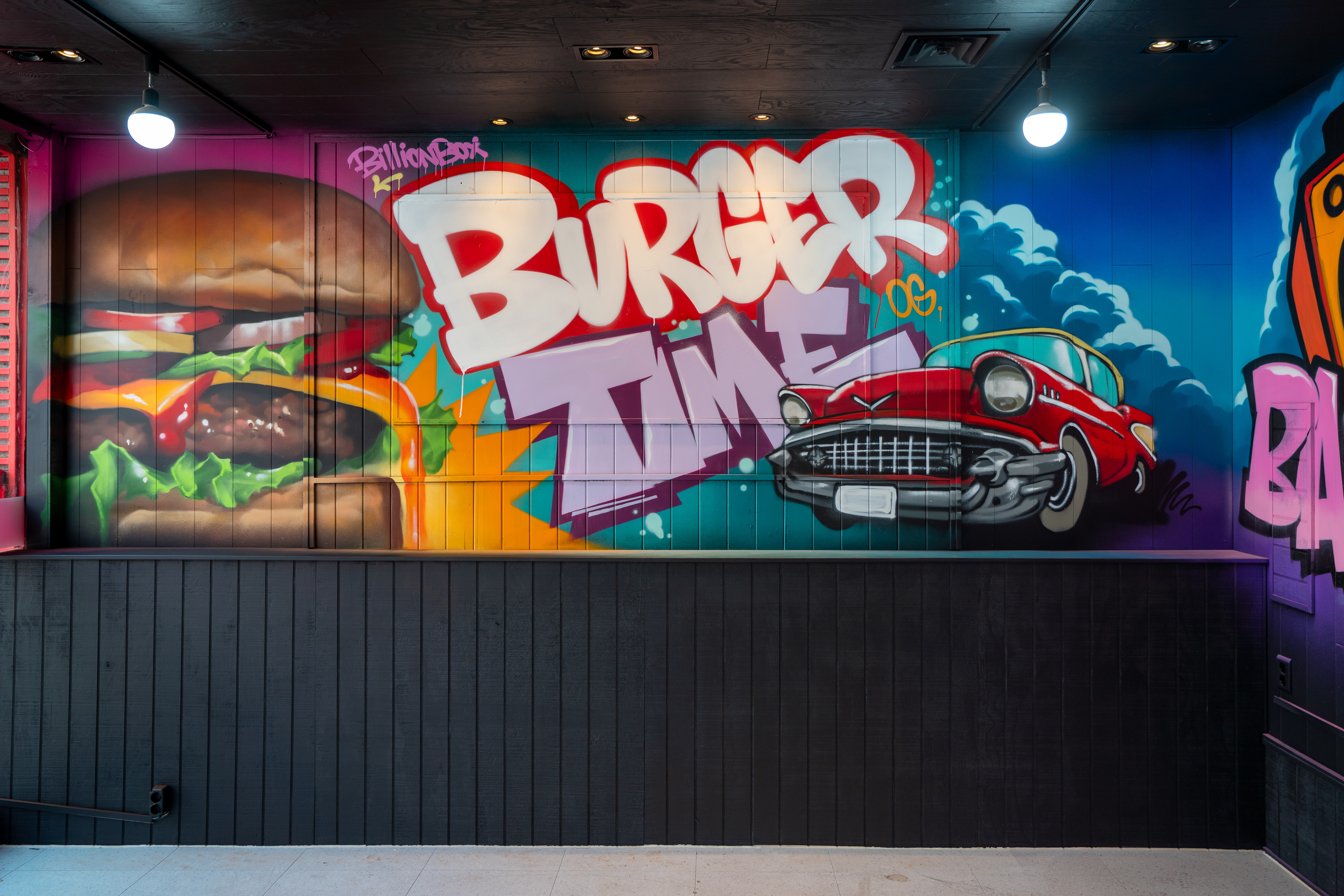
메인 벽면에는 브랜드 레터링, 캐릭터, 포트레이트, 무드 타이포를 집중 배치해 대표 장면을 만들고, 오픈부 주변은 사인보드형 그래픽과 레터링으로 매장의 중심 프레임을 구성했다. 좁은 좌석 구간 끝면에는 도시 배경과 데이지, 차량 요소를 활용해 시선 수렴점과 배경 깊이를 만들었고, 이동 동선에서는 장면이 순차적으로 전개되도록 구성했다.
On the main wall, brand lettering, character work, portraiture, and mood-driven typography were concentrated to create the store’s hero image. Around the counter opening, signage-based graphics and lettering turned a functional cutout into a central frame, while the narrow seating end wall used city imagery, floral motifs, and vehicle elements to create both a focal point and visual depth along the customer path.
On the main wall, brand lettering, character work, portraiture, and mood-driven typography were concentrated to create the store’s hero image. Around the counter opening, signage-based graphics and lettering turned a functional cutout into a central frame, while the narrow seating end wall used city imagery, floral motifs, and vehicle elements to create both a focal point and visual depth along the customer path.
기술 / 공간 포인트 / Technical & Spatial Points
이번 프로젝트의 핵심은 강한 색과 그래픽을 사용하면서도 공간이 산만해 보이지 않도록 밀도를 조절한 점이다. 고채도 벽면은 블랙 천장, 우드 벤치, 화이트 카운터와 타일 같은 기존 인테리어 요소와 균형을 이루도록 설계되었고, 판넬 이음과 구조적 분절은 레이아웃과 장면 분리로 흡수했다.
A key technical achievement of the project was controlling visual density while working with highly saturated color and energetic graphic language. The wall treatments were balanced against existing interior elements such as the black ceiling, wood seating, and white counter and tile surfaces, while panel seams and structural interruptions were absorbed through composition and surface-specific scene planning.
A key technical achievement of the project was controlling visual density while working with highly saturated color and energetic graphic language. The wall treatments were balanced against existing interior elements such as the black ceiling, wood seating, and white counter and tile surfaces, while panel seams and structural interruptions were absorbed through composition and surface-specific scene planning.
브랜드명만 과도하게 강조하면 홍보물처럼 보이고, 반대로 이미지 비중만 높이면 업종성이 약해질 수 있기 때문에 텍스트와 이미지의 비율을 구간별로 다르게 조절했다. 그 결과, 공간은 벽화의 집합이 아니라 브랜드 메시지와 체류 경험이 연결된 시퀀스로 읽히도록 정리되었다.
Because an overemphasis on typography can flatten a space into advertising, while image-heavy walls can dilute category recognition, the ratio of text to imagery was calibrated by zone. This allowed the project to read not as a series of separate murals, but as a connected sequence where brand messaging and spatial experience reinforce one another.
Because an overemphasis on typography can flatten a space into advertising, while image-heavy walls can dilute category recognition, the ratio of text to imagery was calibrated by zone. This allowed the project to read not as a series of separate murals, but as a connected sequence where brand messaging and spatial experience reinforce one another.
결과 & 활용 맥락 / Outcome & Use Context
완성 이후 이 공간은 단순한 식음 매장이 아니라, 브랜드 분위기가 즉시 인지되는 촬영 가능한 상업공간으로 기능하게 되었다. 메인 롱월, 포트레이트 면, 카운터 프레임은 각각 다른 각도에서 사진과 영상의 배경으로 작동하며, 대기·주문·착석 동선 전반에서 브랜드 인상이 끊기지 않도록 유지한다.
In its completed state, the space functions not simply as a restaurant interior, but as a commercially active environment with immediate brand readability and strong visual documentation value. The hero wall, portrait surface, and counter frame each operate as distinct photo and video backdrops, maintaining a continuous brand impression across waiting, ordering, and seating zones.
In its completed state, the space functions not simply as a restaurant interior, but as a commercially active environment with immediate brand readability and strong visual documentation value. The hero wall, portrait surface, and counter frame each operate as distinct photo and video backdrops, maintaining a continuous brand impression across waiting, ordering, and seating zones.
이 프로젝트는 버거, 치킨, 캐주얼 다이닝처럼 대중성이 중요한 업종에서 그래피티가 어떻게 조정되고 작동할 수 있는지를 보여준다. 브랜드 메시지 전달, 현장 체류감 강화, SNS 공유 장면 확보, 공간 분위기 전환이라는 측면에서 실질적인 활용성이 높은 결과를 만든 사례다.
The project demonstrates how graffiti can be translated effectively for accessible, high-traffic F&B formats such as burgers, fried chicken, and casual dining. It offers a practical model for combining brand communication, dwell-time atmosphere, shareable content moments, and a strong overall shift in spatial identity.
The project demonstrates how graffiti can be translated effectively for accessible, high-traffic F&B formats such as burgers, fried chicken, and casual dining. It offers a practical model for combining brand communication, dwell-time atmosphere, shareable content moments, and a strong overall shift in spatial identity.

프로젝트 성격 요약 / Project Summary
광양 Billionbox Burger & Chicken 프로젝트는 브랜드 협업, 상업공간 연출, 대형 실내 벽화, 그래피티 기반 공간 브랜딩이 결합된 사례다. 바머스는 이 작업에서 그래피티를 단순 스타일이 아니라, 공간 구조와 이용자 동선, 브랜드 메시지, 촬영 활용성을 함께 설계하는 실무적 도구로 적용했다.
The Billionbox Burger & Chicken Gwangyang project sits at the intersection of brand collaboration, commercial spatial direction, large-scale interior mural work, and graffiti-led environmental branding. Here, BMBRS used graffiti not as surface decoration alone, but as a practical design language for organizing structure, movement, messaging, and visual use within a working commercial space.
The Billionbox Burger & Chicken Gwangyang project sits at the intersection of brand collaboration, commercial spatial direction, large-scale interior mural work, and graffiti-led environmental branding. Here, BMBRS used graffiti not as surface decoration alone, but as a practical design language for organizing structure, movement, messaging, and visual use within a working commercial space.