
Remon, Dhal, DZ / Pyeong taek, Korea / 2026
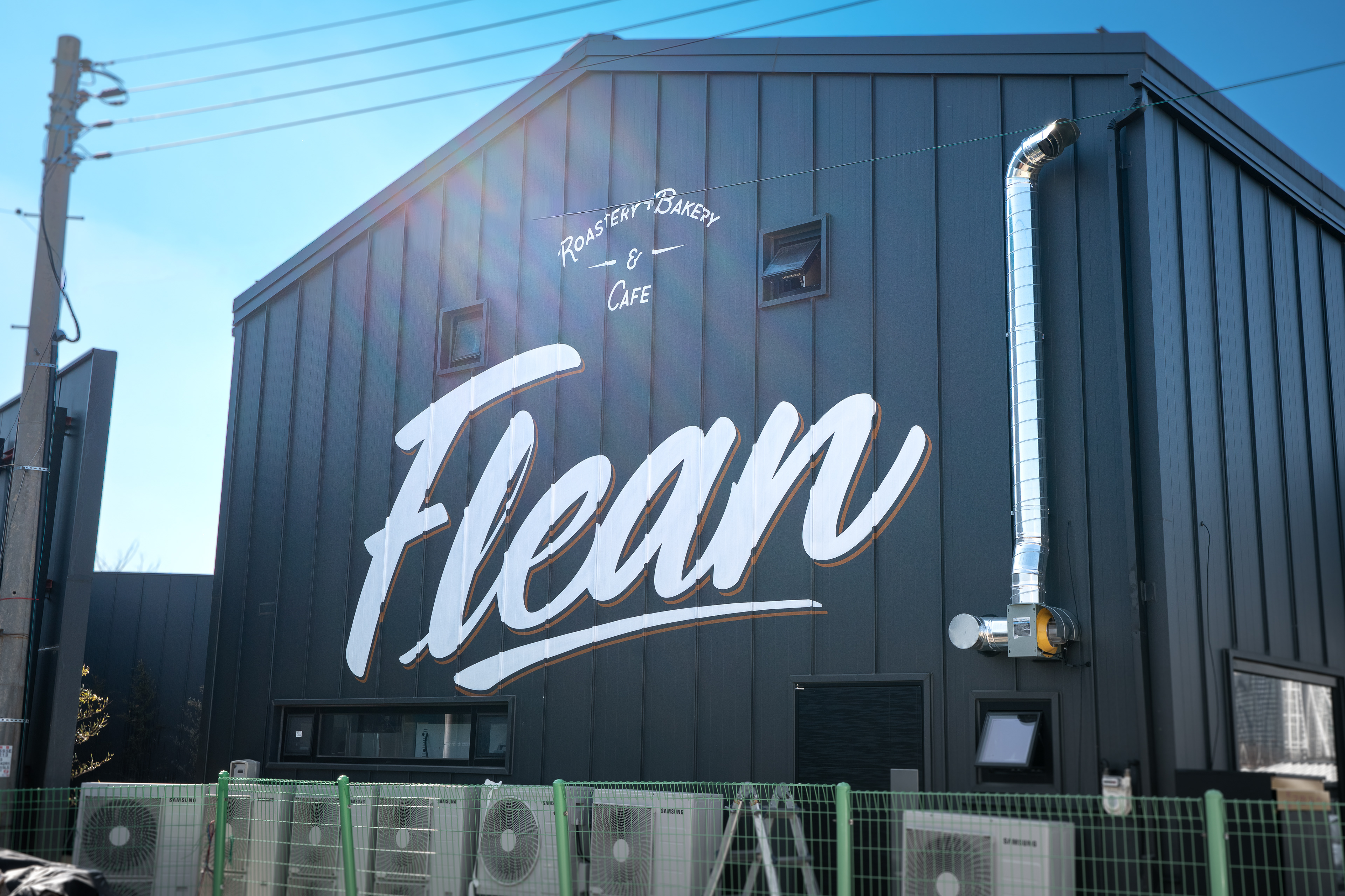
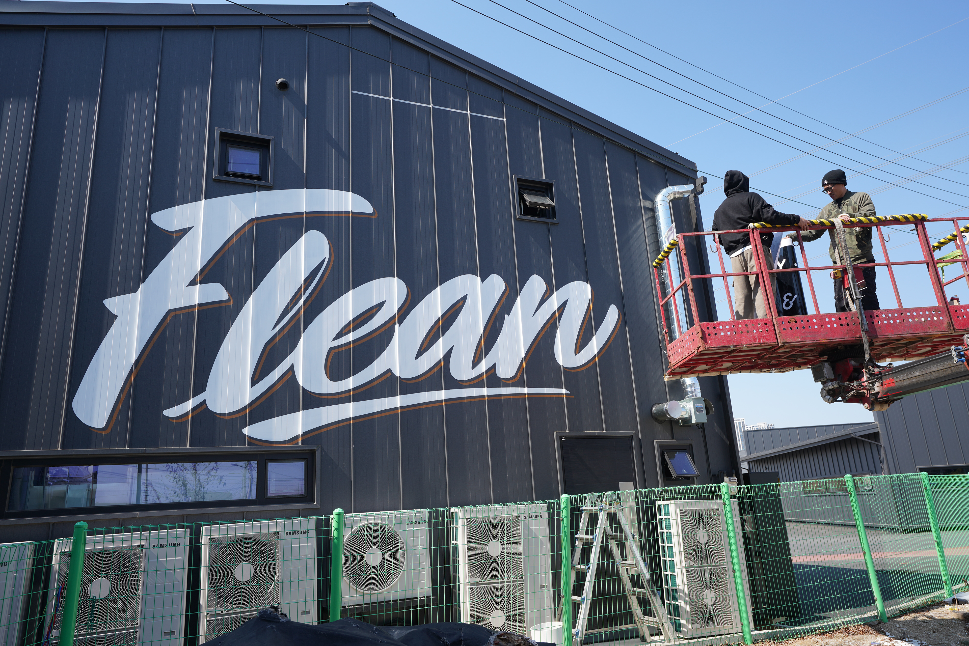
평택시 죽백동에 위치한 베이커리 로스팅 카페 Flean 외벽에 진행한 대형 스텐실 레터링 시공 프로젝트이다. 이번 작업은 별도의 간판을 설치하는 대신, 건물 외벽 자체를 멀리서도 읽히는 사인 면으로 활용하기 위해 기획되었다. 전체 벽면은 약 10m x 6m 규모이며, 실제 레터링은 약 6m x 3m 범위 안에서 계획·시공되었다.
This project is a large-scale stencil lettering installation created for the exterior wall of Flean, a bakery and roastery café located in Jukbaek-dong, Pyeongtaek. Rather than installing a separate signboard, the project was planned to use the building façade itself as a readable sign surface visible from a distance. The full wall measures approximately 10m x 6m, and the actual lettering was designed and executed within an area of about 6m x 3m.
This project is a large-scale stencil lettering installation created for the exterior wall of Flean, a bakery and roastery café located in Jukbaek-dong, Pyeongtaek. Rather than installing a separate signboard, the project was planned to use the building façade itself as a readable sign surface visible from a distance. The full wall measures approximately 10m x 6m, and the actual lettering was designed and executed within an area of about 6m x 3m.
이번 프로젝트의 출발점은 장식적 벽화가 아니라, 외벽이 간판 역할을 대신할 수 있도록 만드는 것이었다. 클라이언트는 새 건물의 징크판넬 외벽 위에 프린팅된 것처럼 보이거나, 벽화처럼 크게 읽히는 레터링을 원했다. 즉, 이 작업은 단순한 시각적 포인트가 아니라 공간에 필요한 정보를 멀리서도 명확하게 전달하는 기능적 레터링이어야 했다.
The starting point of this project was not decorative mural-making, but creating a wall that could function as signage. The client wanted lettering that would read like something printed directly onto the new zinc panel exterior, or a mural-scale graphic that could operate as a sign. In other words, this work needed to function not merely as a visual accent, but as clear and readable information within the space.
The starting point of this project was not decorative mural-making, but creating a wall that could function as signage. The client wanted lettering that would read like something printed directly onto the new zinc panel exterior, or a mural-scale graphic that could operate as a sign. In other words, this work needed to function not merely as a visual accent, but as clear and readable information within the space.
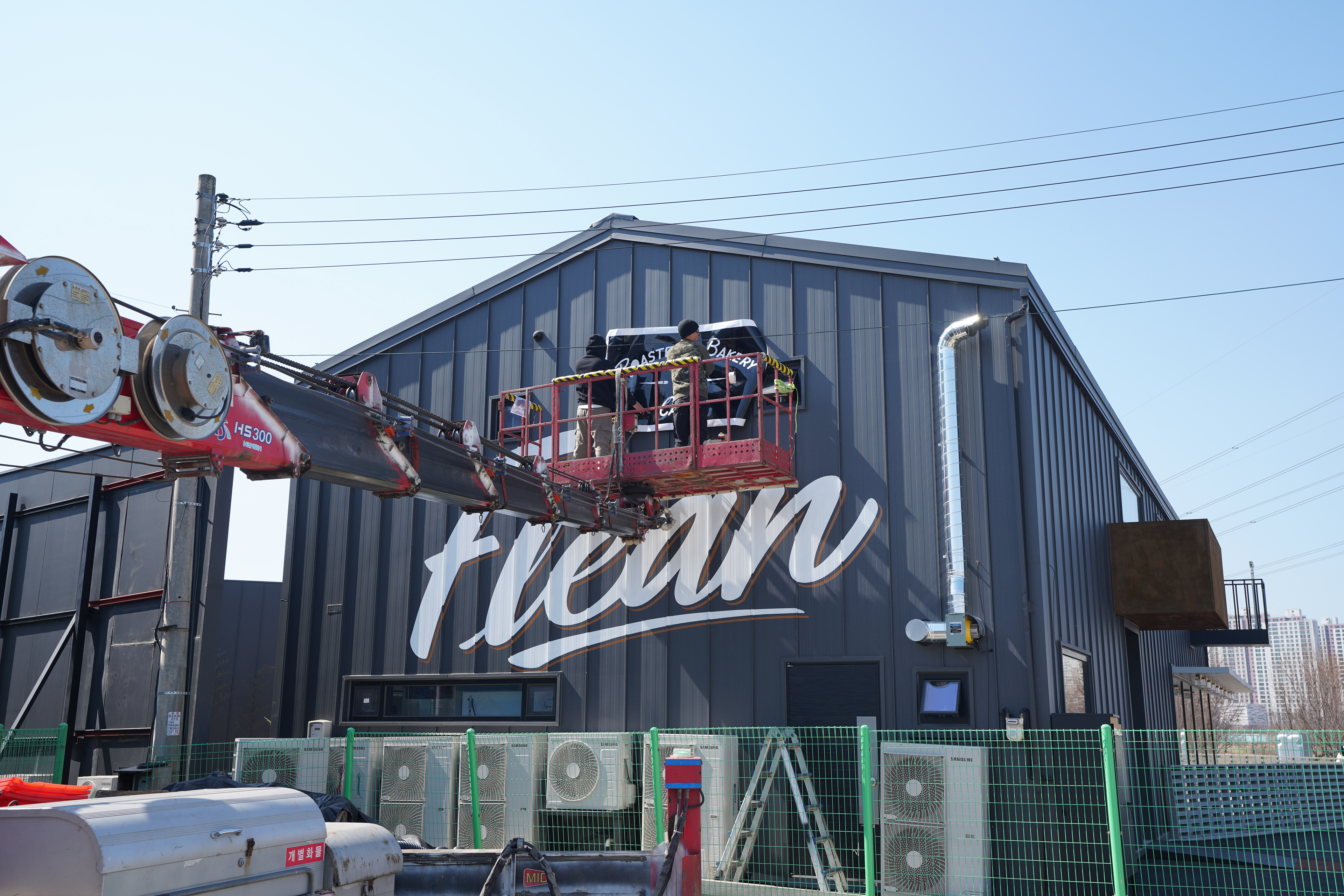
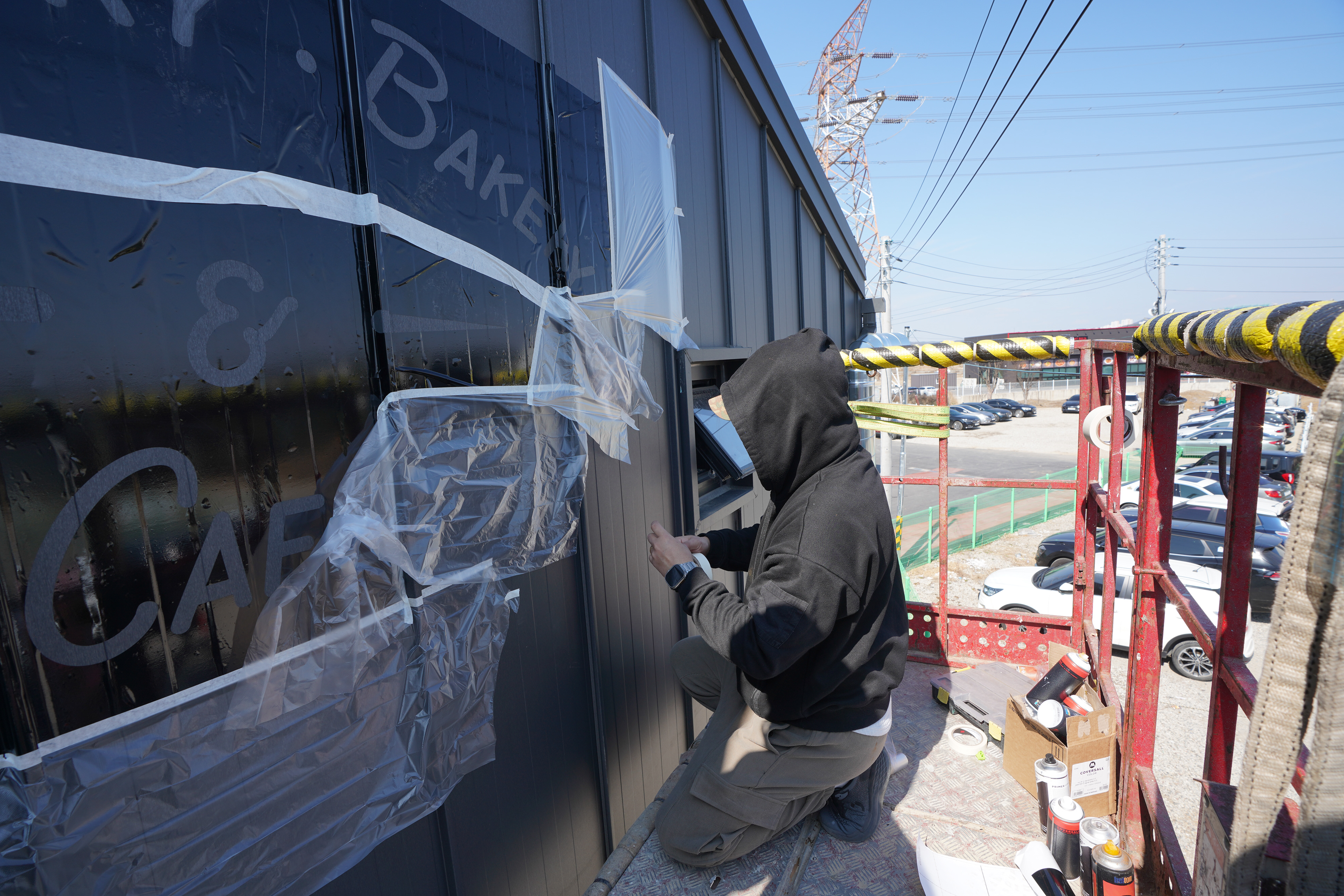
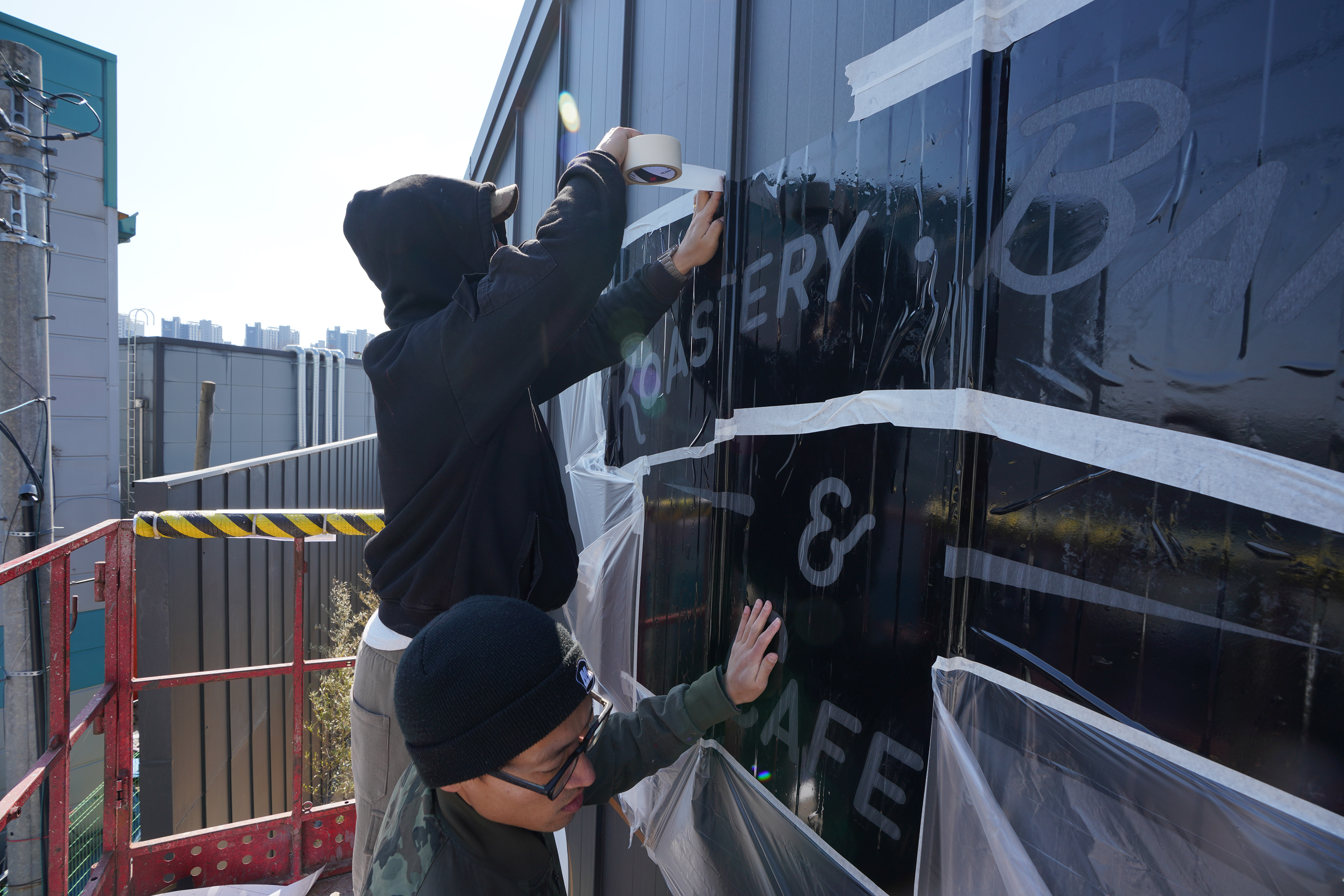
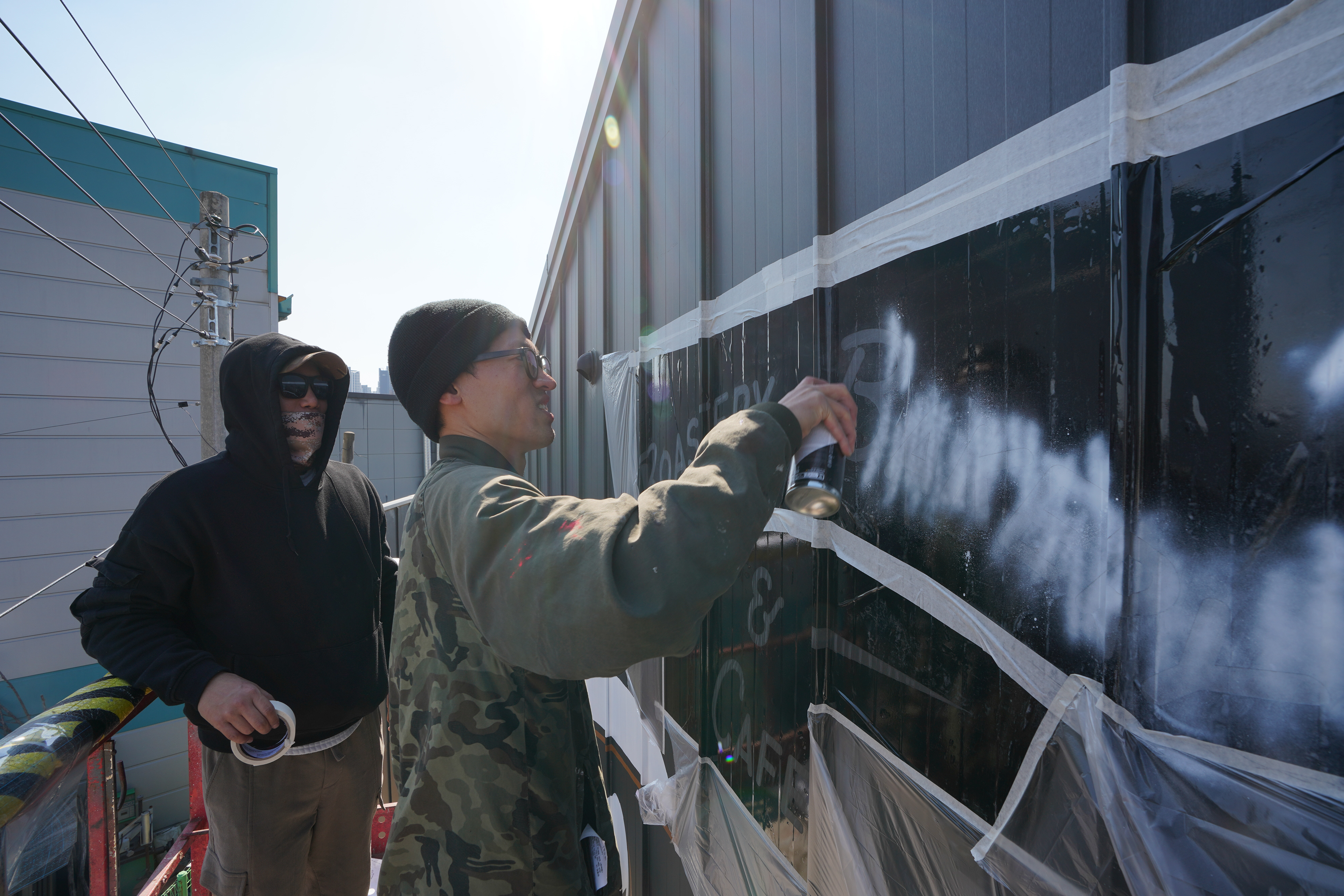
초기에는 프리핸드 방식의 스프레이 레터링도 검토되었다. 그러나 새 징크판넬 표면 위에 직접 도장할 경우 장기적으로 도막 박리 가능성이 있다는 점, 그리고 간판 역할을 해야 하는 외벽에서는 손맛보다 선명도와 균일도, 유지보수의 안정성이 더 중요하다는 점을 고려해 방향을 조정했다. 최종적으로는 디지털 편집을 통해 레터링을 설계하고, 시트지 컷팅 스텐실로 형태를 고정한 뒤 스프레이로 마감하는 공정으로 전환했다.
A freehand spray lettering approach was considered in the early stage. However, the direction shifted after evaluating the risk of long-term paint failure on a new zinc panel surface and recognizing that, for a façade functioning as signage, clarity, consistency, and maintenance stability were more important than expressive spontaneity. The final method involved digitally designing the lettering, fixing the form through a cut-vinyl stencil system, and finishing it with spray paint.
A freehand spray lettering approach was considered in the early stage. However, the direction shifted after evaluating the risk of long-term paint failure on a new zinc panel surface and recognizing that, for a façade functioning as signage, clarity, consistency, and maintenance stability were more important than expressive spontaneity. The final method involved digitally designing the lettering, fixing the form through a cut-vinyl stencil system, and finishing it with spray paint.
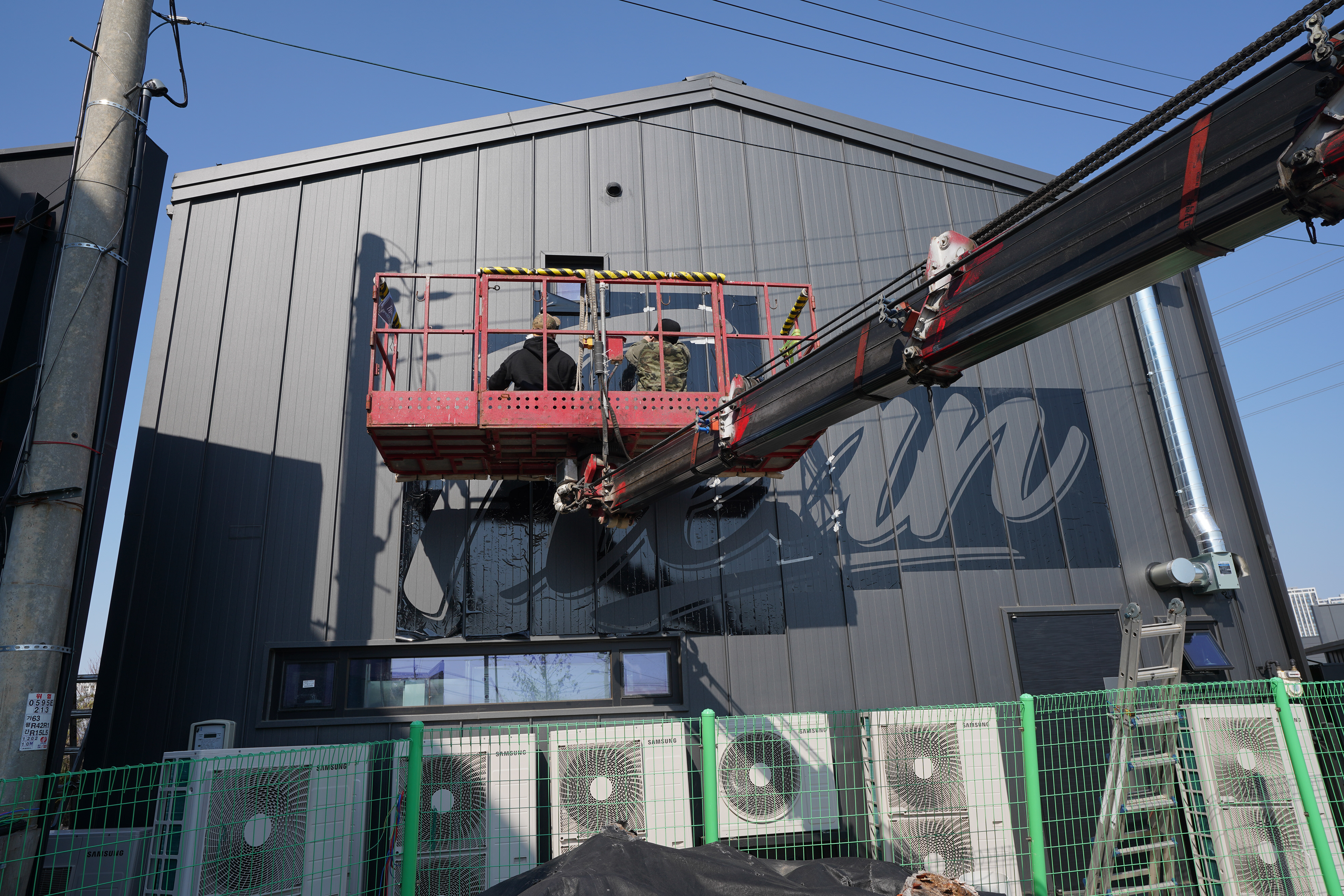
작업은 시트지 컷팅, 스텐실 세팅, 스프레이 마감의 순서로 진행되었으며, 그 이전 단계에서 표면 처리 공정이 핵심적으로 포함되었다. 새 징크판넬의 얇은 코팅막은 그대로 도장할 경우 추후 탈거 가능성이 있어, 사포 작업으로 표면 부착력을 확보한 뒤 Molotow Urban Fine-Art 라인의 스티로폼 프라이머를 도포해 도막의 안정성을 보강했다. 이 과정은 단순히 결과를 만드는 단계가 아니라, 결과가 오래 유지되기 위한 필수 조건이었다.
The process followed a sequence of cut-vinyl preparation, stencil setup, and spray finishing, with surface treatment positioned as a critical prior step. Because the thin coating layer on the new zinc panel could lead to future peeling if painted directly, the surface was sanded to improve adhesion, then reinforced with Molotow Urban Fine-Art Styrofoam Primer to stabilize the paint film. This was not simply a production step, but a necessary condition for long-term durability.
The process followed a sequence of cut-vinyl preparation, stencil setup, and spray finishing, with surface treatment positioned as a critical prior step. Because the thin coating layer on the new zinc panel could lead to future peeling if painted directly, the surface was sanded to improve adhesion, then reinforced with Molotow Urban Fine-Art Styrofoam Primer to stabilize the paint film. This was not simply a production step, but a necessary condition for long-term durability.
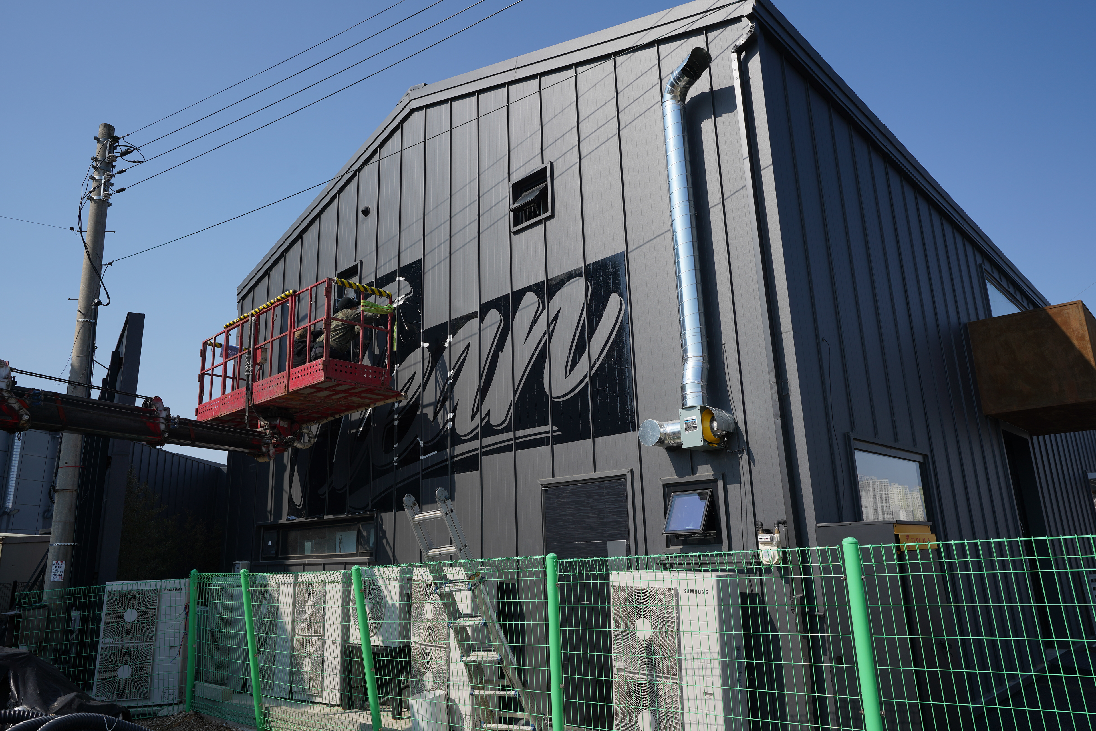
현장은 좌우의 연통과 판넬의 겹침 구조로 인해 이상적인 평면이 아니었고, 표면에는 요철이 존재했다. 특히 판넬 겹침부의 굴곡은 스텐실을 밀착시키는 과정에서 세밀한 조절을 요구했다. 따라서 이번 작업은 단순히 스프레이를 분사하는 수준이 아니라, 표면 상태에 맞춰 공정을 분리하고 각 단계를 설계해 결과의 정확도와 유지력을 함께 확보한 사례로 볼 수 있다.
The site was not an ideal flat surface due to flue elements on both sides and the overlapping structure of the zinc panels, which created ridges and irregularities. In particular, the panel seams required careful control when pressing the stencil into place. For that reason, this project was not simply about spraying onto a wall, but about separating and designing each process stage according to the surface condition in order to secure both precision and durability.
The site was not an ideal flat surface due to flue elements on both sides and the overlapping structure of the zinc panels, which created ridges and irregularities. In particular, the panel seams required careful control when pressing the stencil into place. For that reason, this project was not simply about spraying onto a wall, but about separating and designing each process stage according to the surface condition in order to secure both precision and durability.
이번 프로젝트의 핵심 기술 포인트는 ‘표현 방식’보다 ‘공정 전환의 판단’에 있다. 프리핸드 그래피티 감각을 유지하는 대신, 현장 조건과 유지보수 리스크를 고려해 디지털 설계 기반 스텐실 공정으로 전환함으로써 외벽 레터링이 실제 간판처럼 기능하도록 만들었다. 이는 BMBRS가 현장의 구조, 재료, 시인성, 내구성을 함께 검토하고, 그에 맞는 방법을 선택하는 방식으로 작업을 수행한다는 점을 보여준다.
The key technical point of this project lies less in style than in the decision to shift the method itself. Rather than insisting on a freehand graffiti approach, the process moved toward a digitally planned stencil system in response to site conditions and maintenance risk, allowing the wall lettering to function as actual signage. This reflects how BMBRS approaches projects by assessing structure, material, visibility, and durability together, then selecting the most appropriate method.
The key technical point of this project lies less in style than in the decision to shift the method itself. Rather than insisting on a freehand graffiti approach, the process moved toward a digitally planned stencil system in response to site conditions and maintenance risk, allowing the wall lettering to function as actual signage. This reflects how BMBRS approaches projects by assessing structure, material, visibility, and durability together, then selecting the most appropriate method.
완성된 결과물은 외벽 레터링에 요구되는 가독성과 균일도를 안정적으로 확보했다. 사전 디지털 설계와 정밀한 시트지 재단은 현장 작업의 흐름을 효율적으로 만들었고, 표면 샌딩과 프라이머 공정은 새 자재 위 도장의 내구성 리스크를 줄이는 데 기여했다. 클라이언트 반응 역시 만족으로 확인되었으며, 본 작업은 짧은 일정 안에서도 준비 단계와 현장 공정을 분리 설계할 때 품질과 효율을 동시에 확보할 수 있음을 보여주는 사례로 남았다.
The final result achieved the readability and consistency required of exterior lettering used as signage. The digital planning and precise stencil preparation stabilized the on-site workflow, while sanding and primer application reduced durability risks on the new material surface. The client response was positive, and the project stands as a case demonstrating how separating preparation from on-site execution can improve both quality and efficiency within a short production schedule.
The final result achieved the readability and consistency required of exterior lettering used as signage. The digital planning and precise stencil preparation stabilized the on-site workflow, while sanding and primer application reduced durability risks on the new material surface. The client response was positive, and the project stands as a case demonstrating how separating preparation from on-site execution can improve both quality and efficiency within a short production schedule.
Youtube [BMBRS graffiti]
Flean 프로젝트는 그래피티의 표현성을 전면에 내세운 작업이라기보다, 공간이 요구하는 기능을 우선한 외벽 레터링 시공 사례에 가깝다. 간판을 대체할 만큼 크고 명확하며 오래 유지되는 결과를 목표로 했고, 새 징크판넬이라는 조건 속에서 공정을 유연하게 전환한 판단이 결과의 안정성을 만들었다. 이 작업은 BMBRS가 단순히 벽을 채우는 팀이 아니라, 공간의 목적과 재료 조건, 유지관리까지 함께 고려해 결과를 설계하는 팀이라는 점을 보여주는 기록이다.
Rather than foregrounding graffiti as pure expression, the Flean project is better understood as an exterior lettering installation shaped by the functional needs of the space. The goal was to create a result large enough, clear enough, and durable enough to replace conventional signage, and the decision to adapt the process to the condition of the new zinc panel surface was key to that stability. This project documents how BMBRS works not simply by filling walls, but by designing outcomes through an understanding of site purpose, material conditions, and long-term maintenance.
Rather than foregrounding graffiti as pure expression, the Flean project is better understood as an exterior lettering installation shaped by the functional needs of the space. The goal was to create a result large enough, clear enough, and durable enough to replace conventional signage, and the decision to adapt the process to the condition of the new zinc panel surface was key to that stability. This project documents how BMBRS works not simply by filling walls, but by designing outcomes through an understanding of site purpose, material conditions, and long-term maintenance.