

BMBRS / Sinchon, Seoul, Korea / 2024
신촌 현대백화점 지하통로와 지하 매장 동선 일부를 대상으로 진행한 설치형 그래피티 프로젝트다. 지하철 이용객, 백화점 방문객, 관광객이 동시에 지나는 실내 공공 동선 안에서, 브랜드 아이덴티티와 지역 이미지를 함께 전달할 수 있는 시각적 장면을 만드는 것이 핵심 목표였다.
This was an installation-based graffiti project developed for the underground passageway and selected floor zones inside Sinchon Hyundai Department Store. The main objective was to create a visual landmark within a high-traffic indoor public corridor, where subway users, department store visitors, and tourists intersect, while communicating both brand identity and a sense of place.
This was an installation-based graffiti project developed for the underground passageway and selected floor zones inside Sinchon Hyundai Department Store. The main objective was to create a visual landmark within a high-traffic indoor public corridor, where subway users, department store visitors, and tourists intersect, while communicating both brand identity and a sense of place.
이 프로젝트는 단순한 장식이나 벽화 시공이 아니라, 상업공간 브랜딩, 공공 동선 개선, 시즌형 공간 개편, 전시적 연출이 동시에 요구된 복합 작업이었다. 바머스는 ‘지나는 공간’을 ‘기억되는 공간’으로 전환하기 위해, 그래피티의 시각 언어를 공간 구조와 운영 조건에 맞게 재구성했다.
Rather than functioning as a decorative mural alone, the project operated across several layers at once: retail branding, public circulation enhancement, seasonal spatial renewal, and exhibition-like presentation. BMBRS approached it as a transformation of a pass-through space into a memorable environment, translating graffiti language into a system that could work within the site’s operational and architectural constraints.
Rather than functioning as a decorative mural alone, the project operated across several layers at once: retail branding, public circulation enhancement, seasonal spatial renewal, and exhibition-like presentation. BMBRS approached it as a transformation of a pass-through space into a memorable environment, translating graffiti language into a system that could work within the site’s operational and architectural constraints.
배경 기획의 출발점은 신촌 상권과 백화점 공간에 보다 젊고 즉각적인 인상을 부여하는 것이었다. 초기에는 한글을 활용한 방향도 검토했지만, 장기적인 활용성과 그래피티 특유의 스트릿 감도를 함께 확보하기 위해 최종적으로는 읽기 쉬운 볼드한 영문 레터 구조를 중심에 두고, 그 안에 한국적 요소와 쇼핑, 젊음, 지역성을 분배하는 방식으로 컨셉을 정리했다.
The concept originated from a need to give the Sinchon district and the department store environment a younger, more immediate visual identity. An early direction based on Korean lettering was considered, but the final concept shifted toward bold, legible English lettering in order to retain both long-term usability and the visual energy of graffiti, while embedding Korean references, shopping culture, youthfulness, and local character within the letterforms.
The concept originated from a need to give the Sinchon district and the department store environment a younger, more immediate visual identity. An early direction based on Korean lettering was considered, but the final concept shifted toward bold, legible English lettering in order to retain both long-term usability and the visual energy of graffiti, while embedding Korean references, shopping culture, youthfulness, and local character within the letterforms.
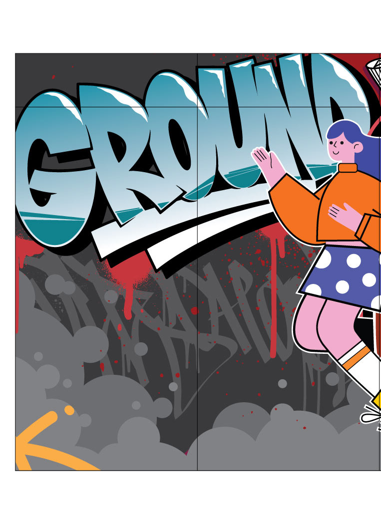
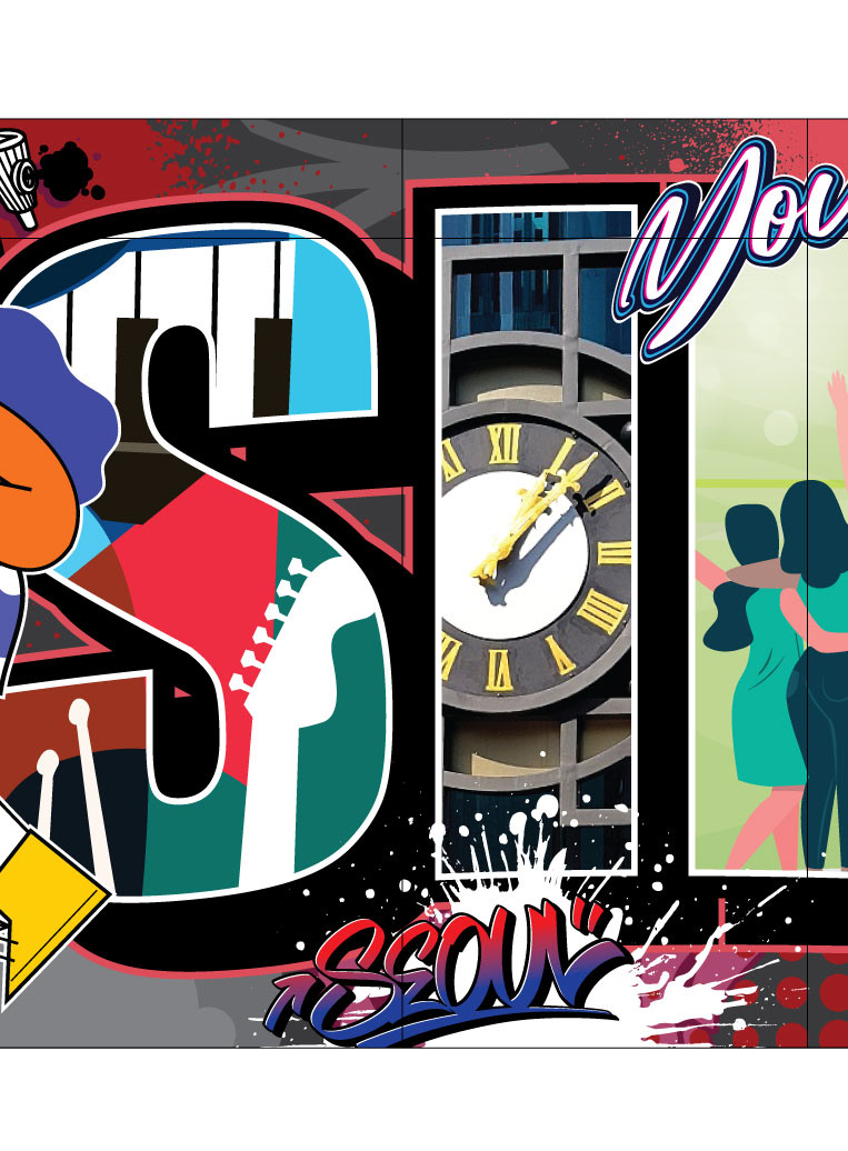

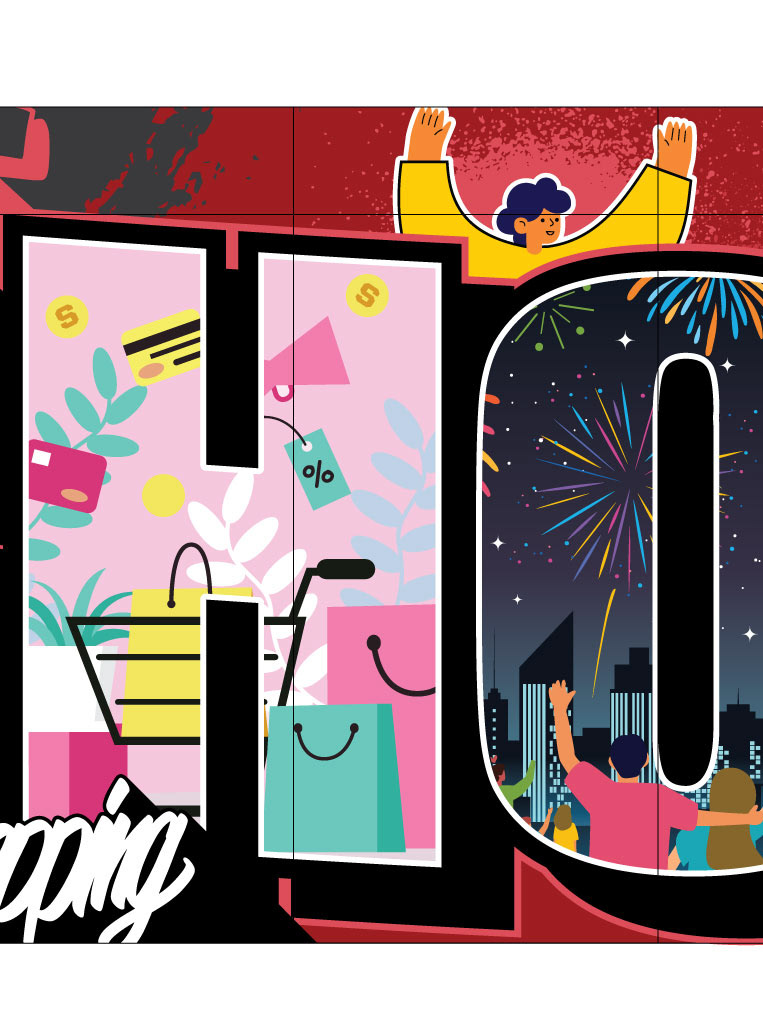

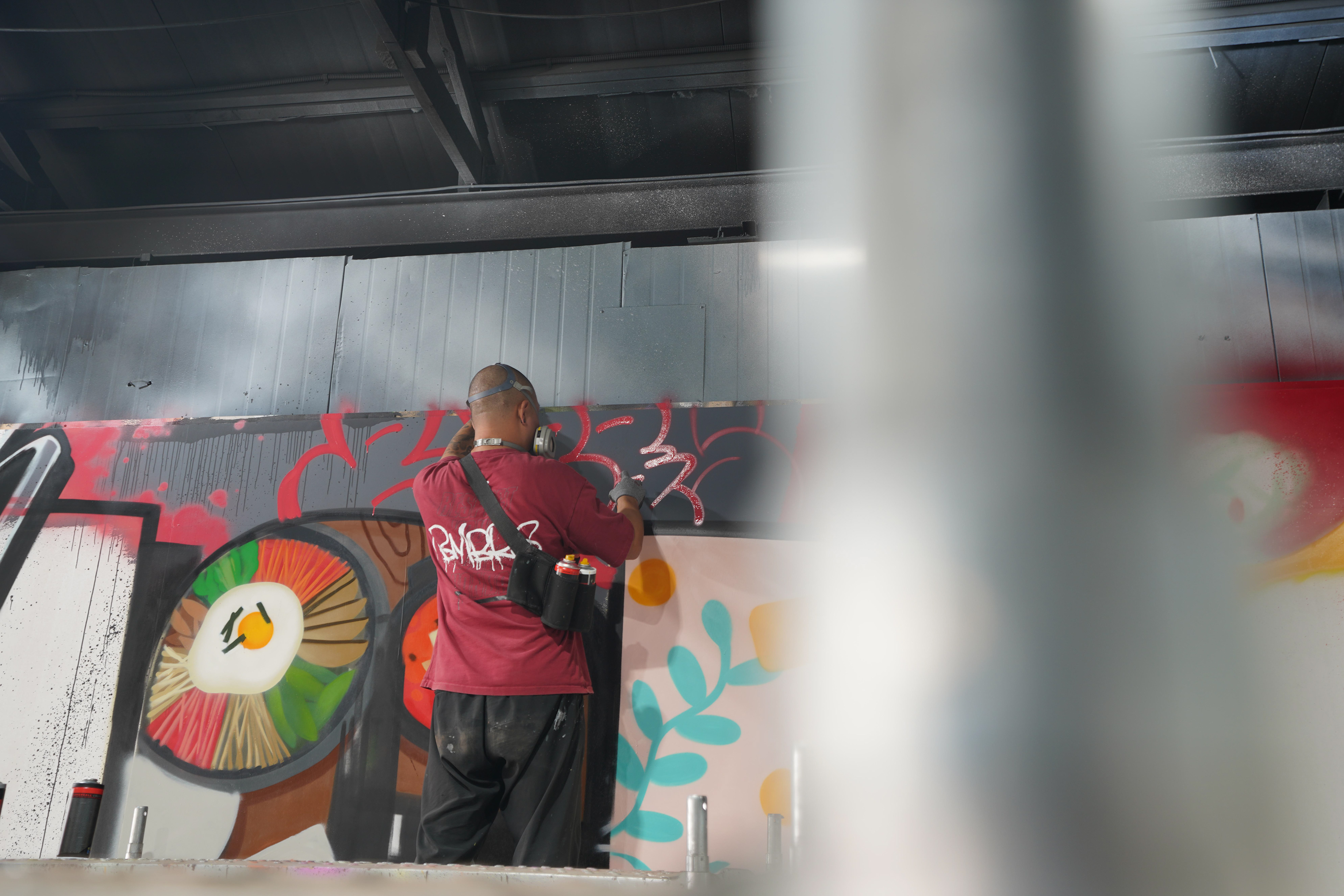
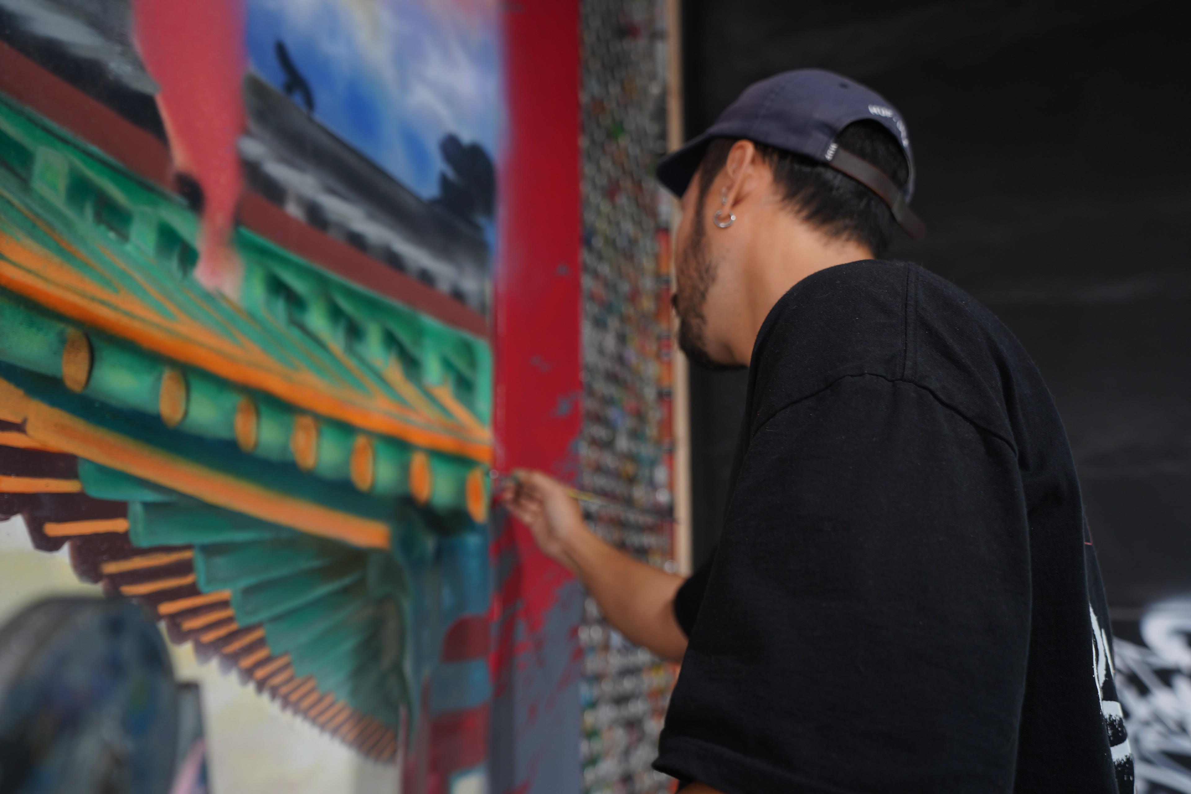
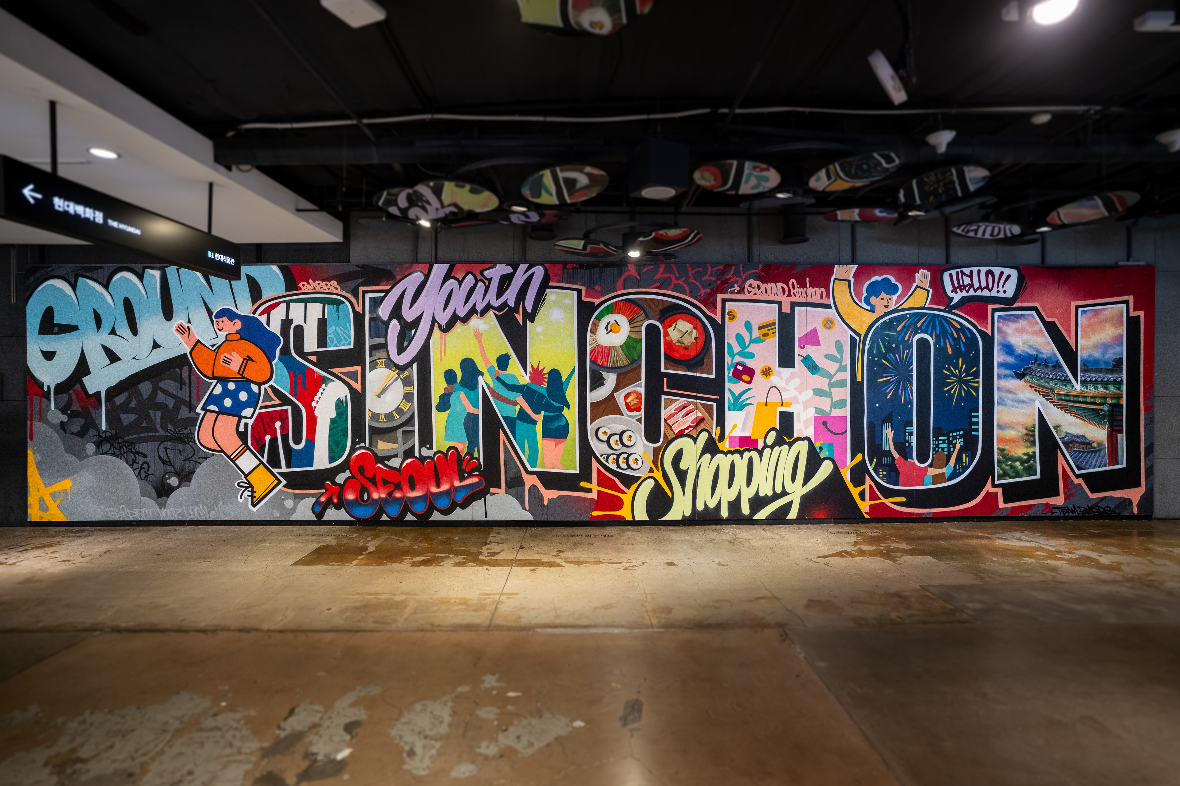
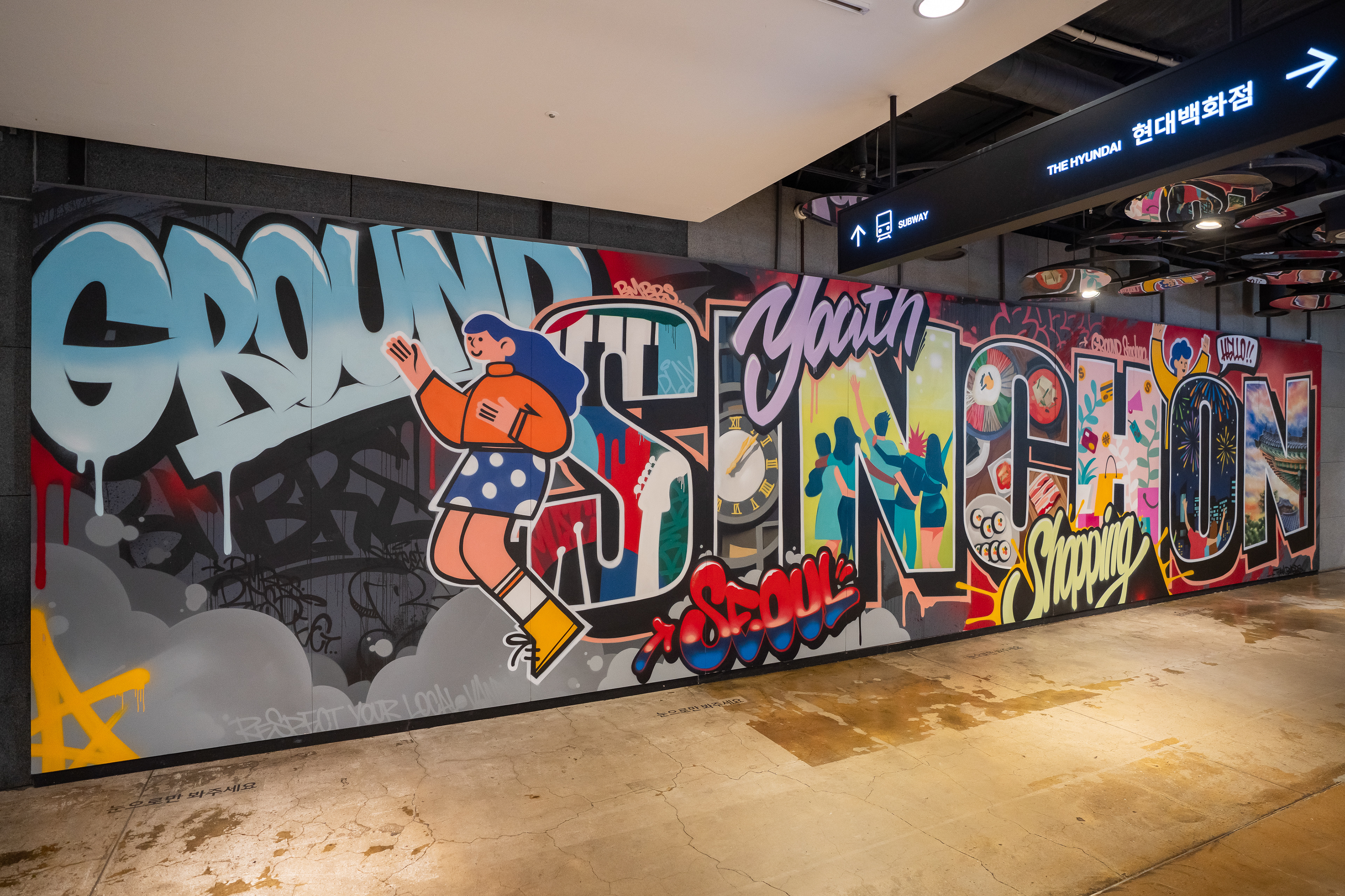
화면 구성은 멀리서도 메인 테마가 먼저 읽히고, 가까이에서는 세부 요소가 드러나는 이중 구조로 설계되었다. 전체에서는 “Ground Sinchon”이라는 강한 레터가 시선을 잡고, 디테일에서는 서울, 한국, 한식, 시계탑, 거리의 감각 같은 요소가 레이어처럼 작동하도록 시선 흐름을 정리했다.
The composition was designed as a two-level reading experience: a strong central theme visible from a distance, with layered details revealed at close range. From afar, the “Ground Sinchon” lettering anchors the view; up close, references to Seoul, Korean culture, local food, the clock tower, and street atmosphere begin to emerge as secondary visual layers.
The composition was designed as a two-level reading experience: a strong central theme visible from a distance, with layered details revealed at close range. From afar, the “Ground Sinchon” lettering anchors the view; up close, references to Seoul, Korean culture, local food, the clock tower, and street atmosphere begin to emerge as secondary visual layers.
공간 조건은 작업 방식 자체를 결정했다. 대상 벽면은 현무암 타일이었고, 원상복구 가능성과 실내 운영 안정성이 중요했기 때문에 현장 직접 작화 대신, 안성 스튜디오에서 합판 패널을 제작·작화한 뒤 현장에서 재조립하는 방식을 선택했다.
The site conditions directly shaped the production method. Because the walls were finished with basalt tile and the project required reversibility and operational safety inside an active retail environment, BMBRS chose not to paint directly on site. Instead, the work was produced on custom plywood panels in the studio and later reassembled on location.
The site conditions directly shaped the production method. Because the walls were finished with basalt tile and the project required reversibility and operational safety inside an active retail environment, BMBRS chose not to paint directly on site. Instead, the work was produced on custom plywood panels in the studio and later reassembled on location.
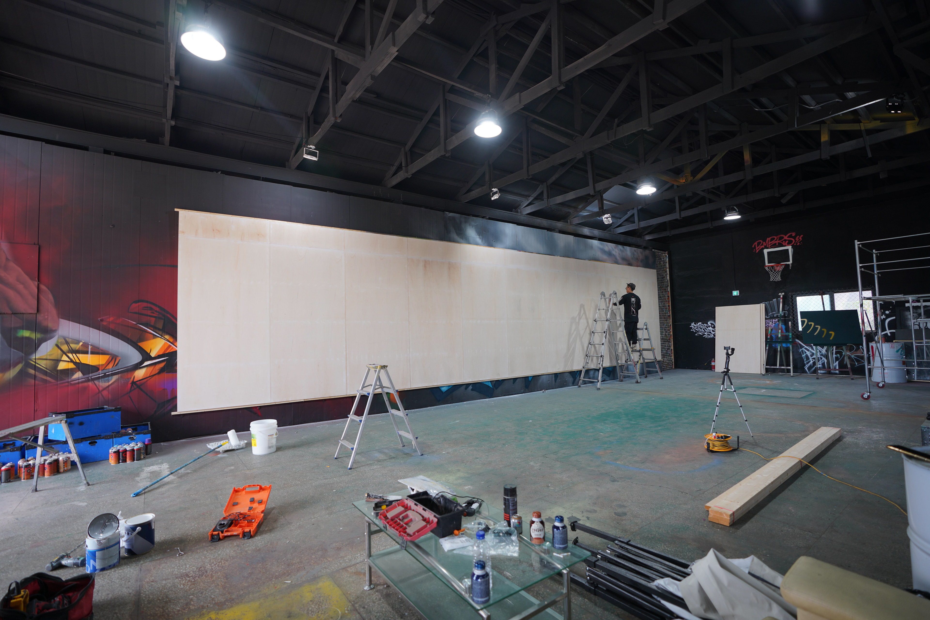
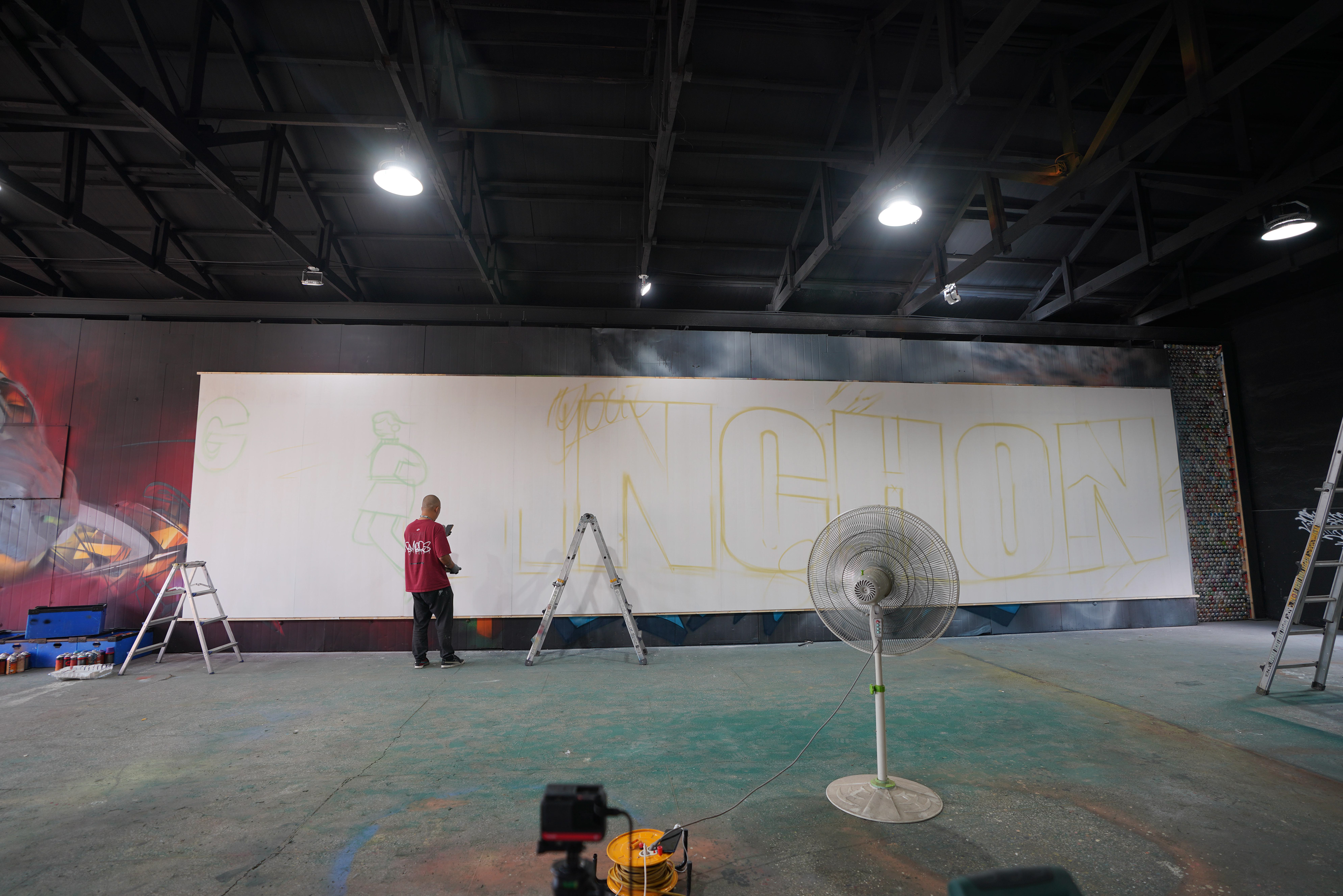
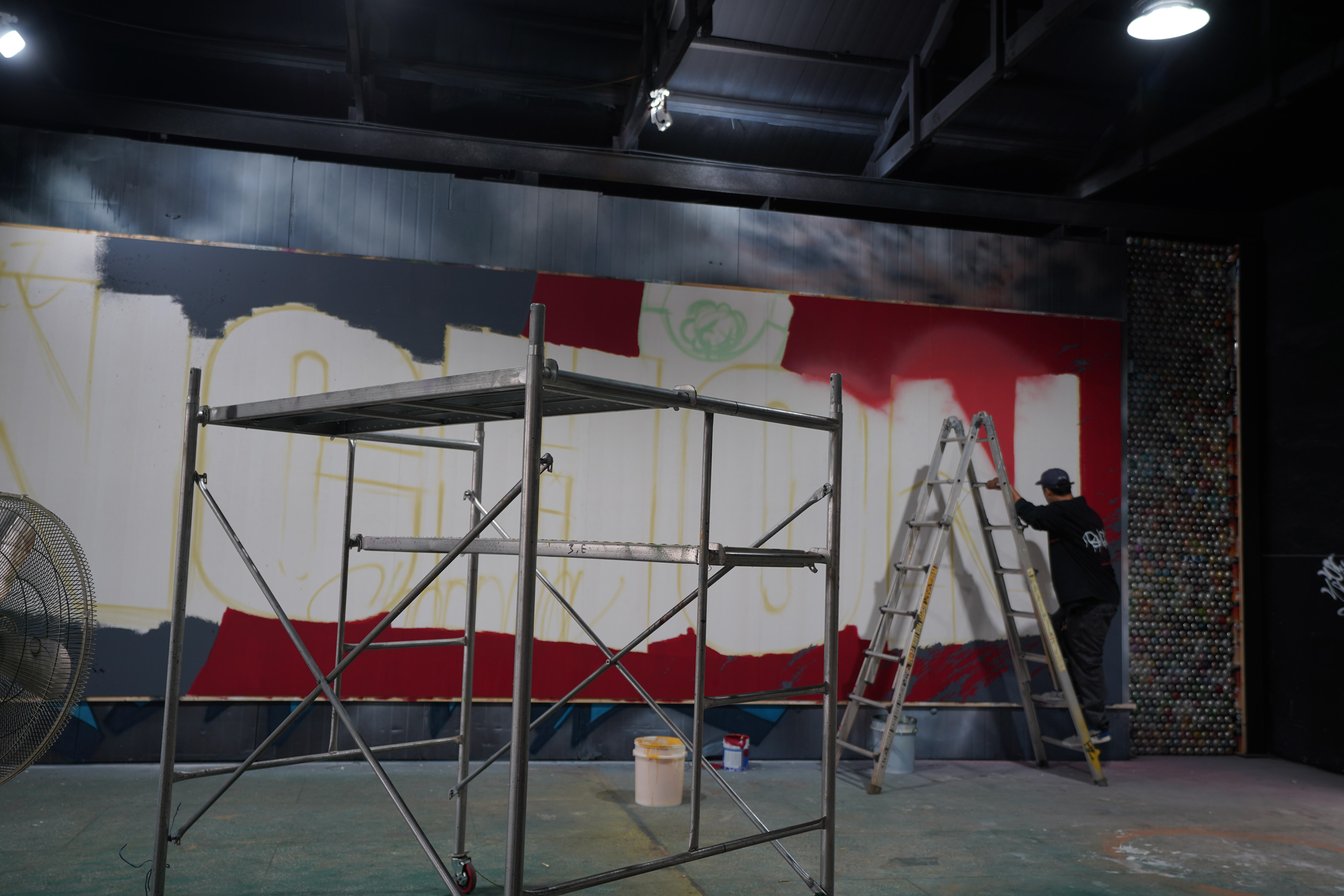
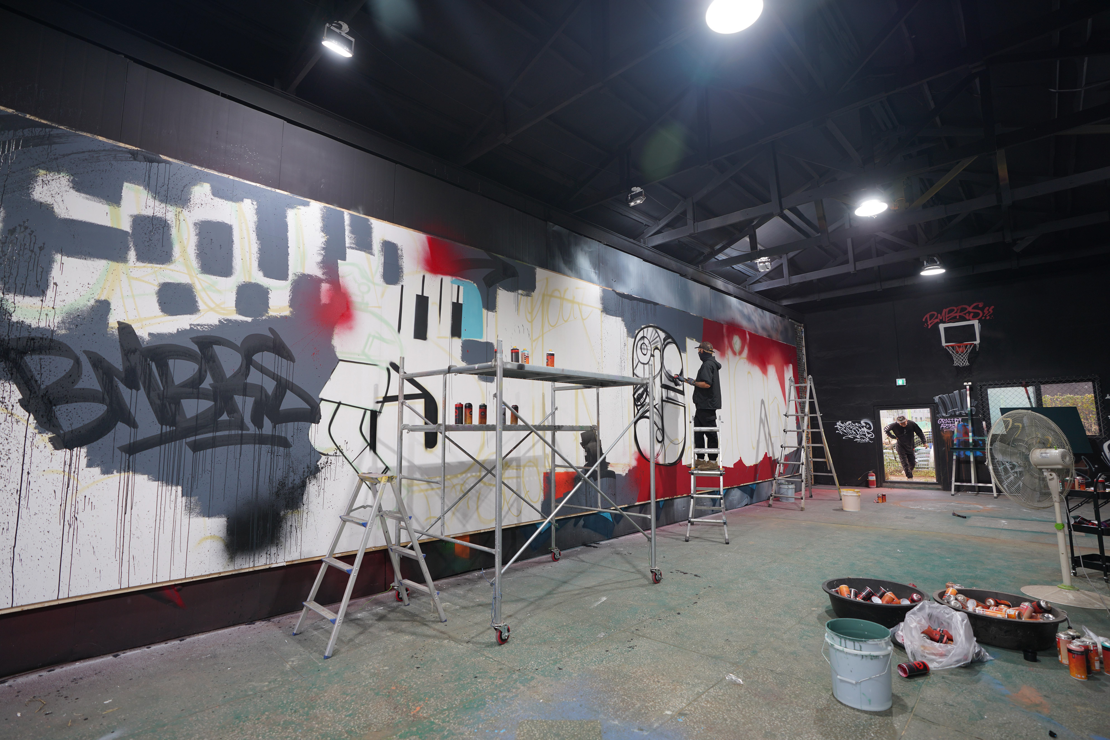
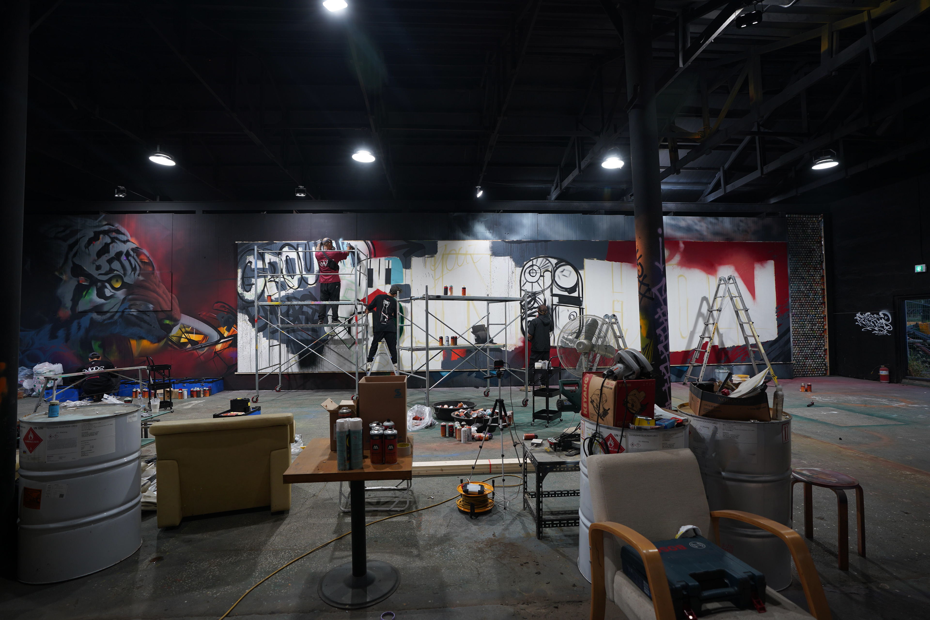
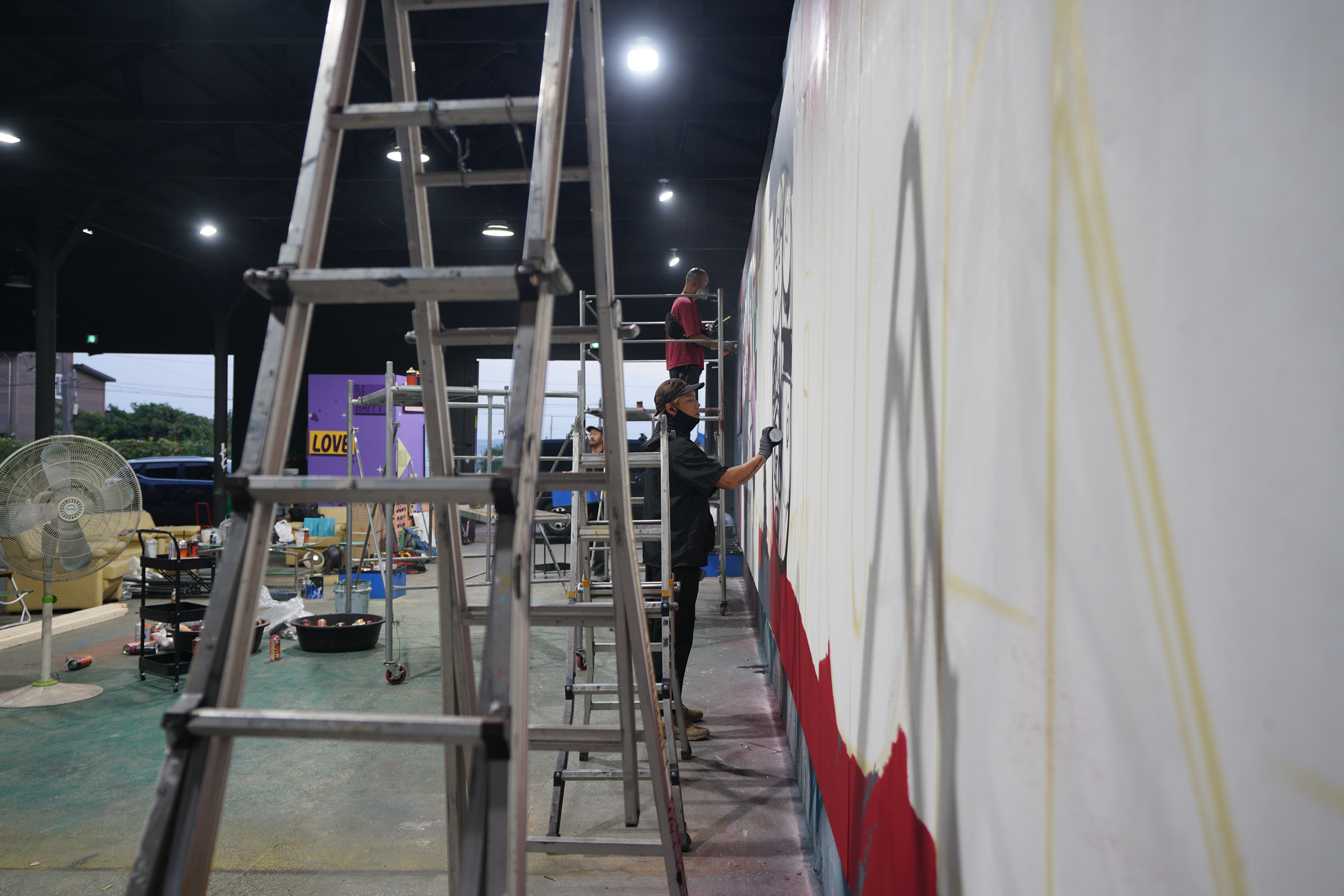
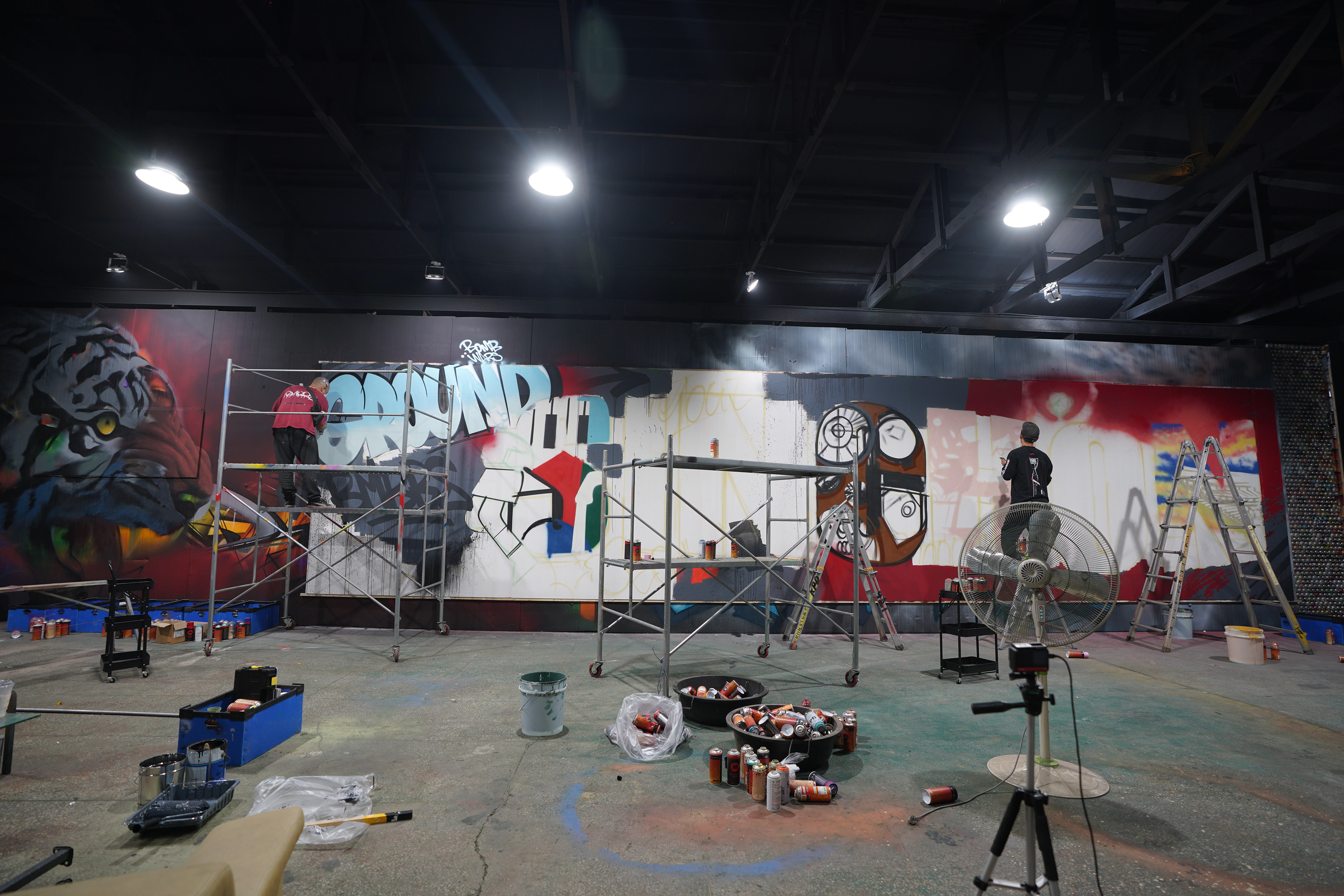
작업 과정은 패널 제작, 바인더 및 바탕 작업, 메인 스케치, 대면적 컬러링, 세부 묘사, 코팅, 현장 설치 순으로 진행되었다. 패널은 하나의 벽처럼 보여야 했지만 실제로는 분해와 재조립을 전제로 했기 때문에, 이음새가 시각적으로 깨지지 않도록 작화 단계부터 구조를 함께 계산해야 했다.
The process moved through panel fabrication, priming and surface preparation, main sketching, large-scale color development, detailed rendering, coating, and final installation. Although the work needed to read as a single mural, it was built as a modular structure, so the image had to be designed from the beginning to remain visually continuous across seams and reassembly points.
The process moved through panel fabrication, priming and surface preparation, main sketching, large-scale color development, detailed rendering, coating, and final installation. Although the work needed to read as a single mural, it was built as a modular structure, so the image had to be designed from the beginning to remain visually continuous across seams and reassembly points.
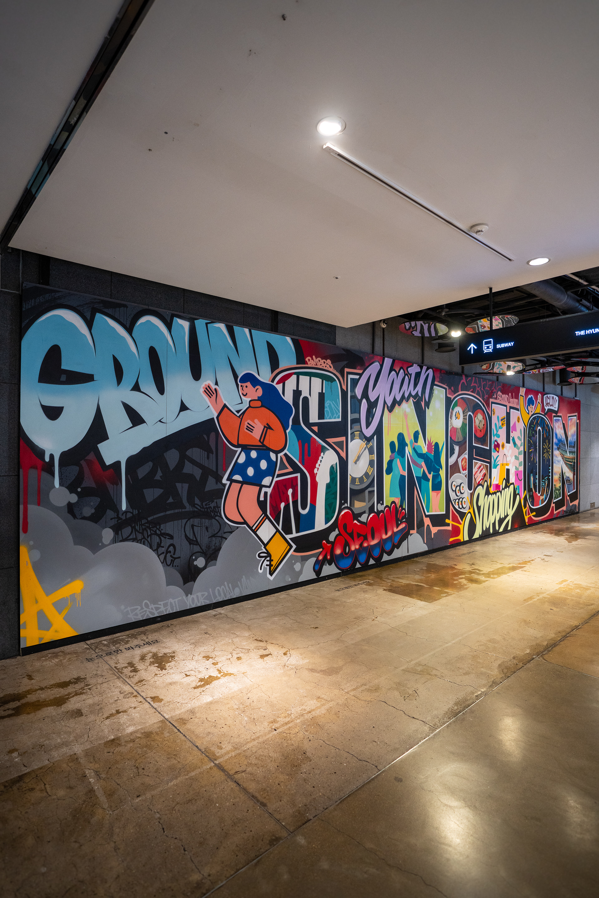
바닥 영역은 벽면의 연장선으로 보되, 운영성과 유지관리를 고려해 그래피티 디자인을 실사 출력 부착 방식으로 적용했다. 이는 실내 상업공간에서 그래피티를 활용하면서도 철거와 복구, 안전, 유지 관리까지 함께 설계한 방식이라는 점에서 중요하다.
The floor zones were treated as an extension of the wall intervention, but executed through printed graphic application rather than direct painting in order to support maintenance and operational practicality. This became an important part of the project: graffiti was not only visualized, but engineered to function within the realities of an indoor commercial site, including removal, restoration, safety, and long-term upkeep.
The floor zones were treated as an extension of the wall intervention, but executed through printed graphic application rather than direct painting in order to support maintenance and operational practicality. This became an important part of the project: graffiti was not only visualized, but engineered to function within the realities of an indoor commercial site, including removal, restoration, safety, and long-term upkeep.
기술적으로 가장 중요한 지점은 대형 패널의 연결성과 현장 안전성이었다. 유동인구가 많은 공간인 만큼, 설치 후에도 패널이 안정적으로 유지될 수 있도록 보강 구조와 고정 방식을 함께 조정했고, 바머스는 이미지 제작과 시공 방식을 하나의 시스템으로 다뤘다.
Technically, the most critical issue was the continuity and safety of the large modular panels. Because the site carried constant pedestrian traffic, the installation system had to be reinforced and adjusted to remain stable over time, and BMBRS treated image-making and installation methodology as a single integrated system.
Technically, the most critical issue was the continuity and safety of the large modular panels. Because the site carried constant pedestrian traffic, the installation system had to be reinforced and adjusted to remain stable over time, and BMBRS treated image-making and installation methodology as a single integrated system.
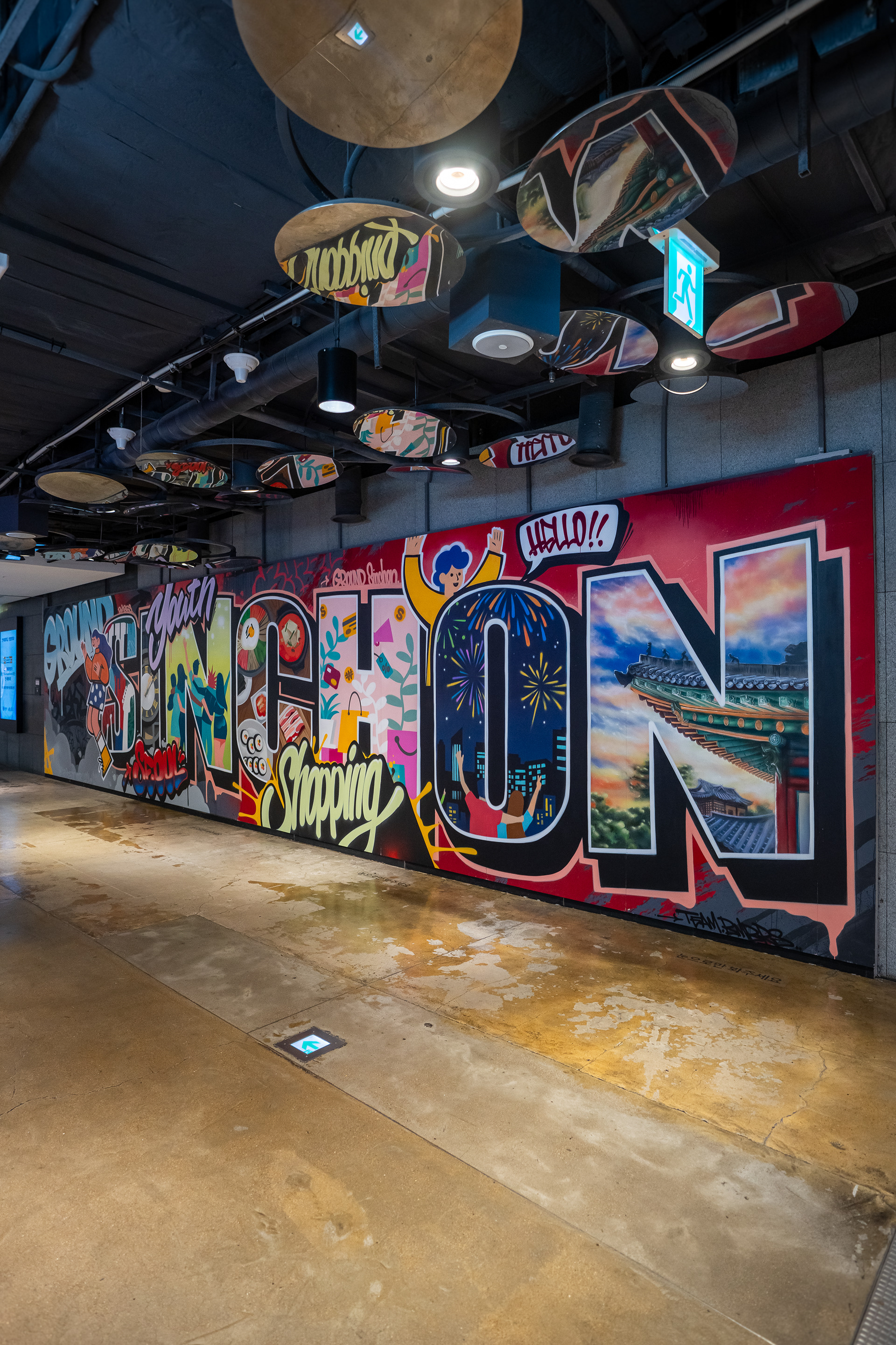
완성 후 이 공간은 단순한 이동 통로가 아니라, 브랜드 메시지와 지역 이미지를 동시에 경험하는 장면으로 전환되었다. 레터 중심의 대형 그래피티는 멀리서도 인식이 가능했고, 가까이에서는 세부 요소를 배경으로 사진 촬영이 가능한 구조를 형성해 포토존, 동선 전환, 공간 기억성이라는 기능을 함께 만들었다.
Once completed, the site shifted from a purely transitional corridor into a visual scene where brand messaging and local identity could be experienced at once. The large-scale lettering remained readable at a distance, while the layered details created a setting that supported photography, visual pause points, and a stronger sense of spatial memory.
Once completed, the site shifted from a purely transitional corridor into a visual scene where brand messaging and local identity could be experienced at once. The large-scale lettering remained readable at a distance, while the layered details created a setting that supported photography, visual pause points, and a stronger sense of spatial memory.
BMBRS / Sinchon, Seoul, Korea / 2024
BMBRS / Sinchon, Seoul, Korea / 2024
BMBRS / Sinchon, Seoul, Korea / 2024
BMBRS / Sinchon, Seoul, Korea / 2024
이 프로젝트는 브랜드를 과하게 전면에 내세우지 않으면서도, 백화점·신촌·서울·한국이라는 키워드를 하나의 그래피티 언어 안에서 정리한 사례다. 동시에 원상복구가 필요한 실내 상업공간에서도 대형 그래피티와 설치형 작업이 충분히 현실적인 방식으로 운영될 수 있음을 보여준 프로젝트이기도 하다.
This project demonstrates how department store branding, Sinchon, Seoul, and Korean identity can be organized within a single graffiti-based visual language without becoming overly promotional. It also serves as a practical case showing that large-scale graffiti and installation-based mural work can operate effectively inside reversible, actively managed commercial interiors.
This project demonstrates how department store branding, Sinchon, Seoul, and Korean identity can be organized within a single graffiti-based visual language without becoming overly promotional. It also serves as a practical case showing that large-scale graffiti and installation-based mural work can operate effectively inside reversible, actively managed commercial interiors.
Ground Sinchon은 바머스의 작업 범주 안에서 브랜드 협업, 공공미술, 공간 연출, 설치형 대형 그래피티가 교차하는 프로젝트로 정리할 수 있다. 그래피티를 단순 장식이 아닌 공간 전략으로 다루며, 현장 조건과 메시지 전달 방식까지 함께 설계하는 바머스의 접근이 분명하게 드러난 사례다.
Within the BMBRS portfolio, Ground Sinchon sits at the intersection of brand collaboration, public art, spatial design, and installation-based large-format graffiti. It is a clear example of BMBRS treating graffiti not as surface decoration, but as a spatial strategy shaped by site conditions, circulation, and message delivery.
Within the BMBRS portfolio, Ground Sinchon sits at the intersection of brand collaboration, public art, spatial design, and installation-based large-format graffiti. It is a clear example of BMBRS treating graffiti not as surface decoration, but as a spatial strategy shaped by site conditions, circulation, and message delivery.