GS Caltex Happy Energy. Cheong Ju, Korea. 2026

Dhal / Remon / Cheong-Ju, Korea / 2026
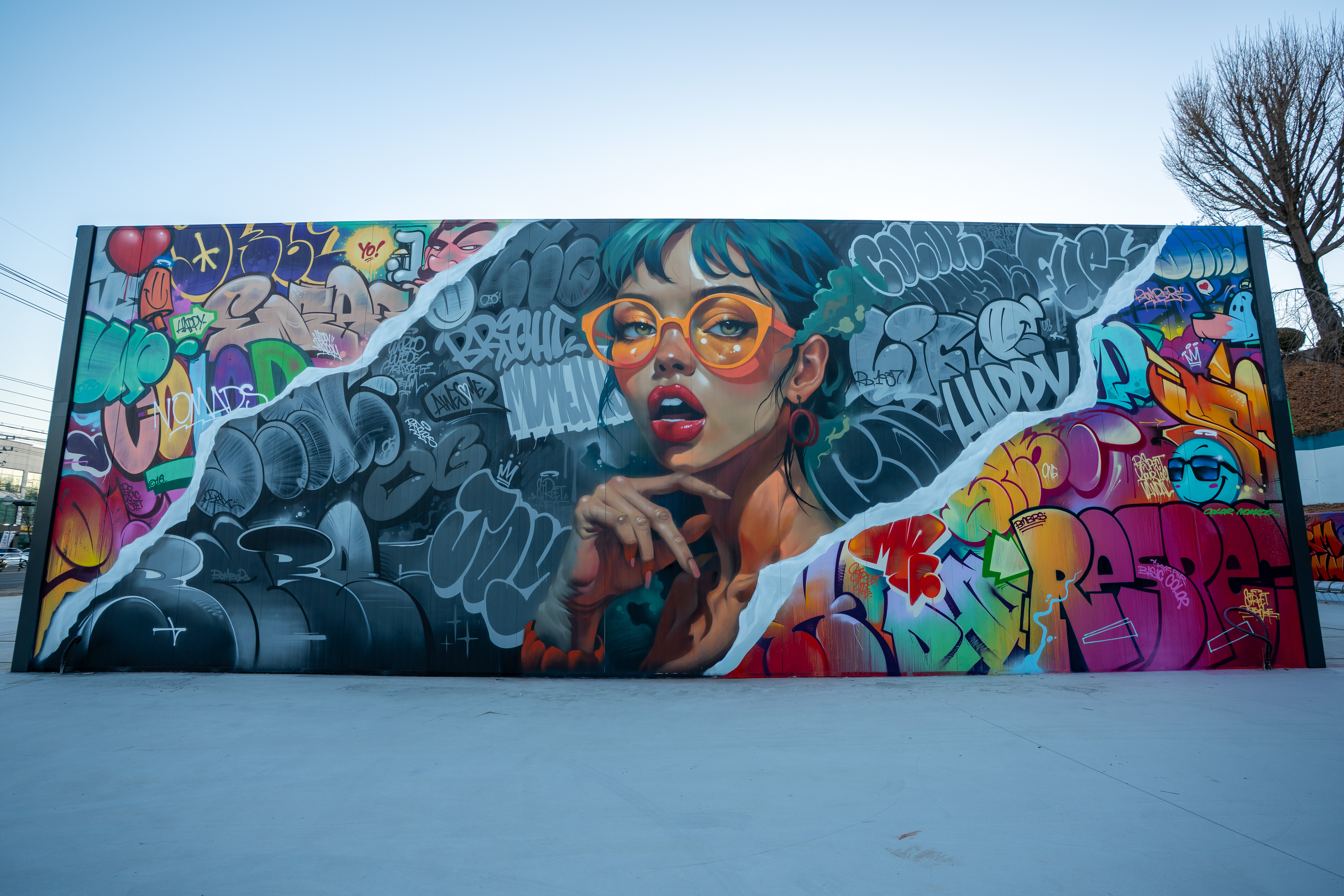
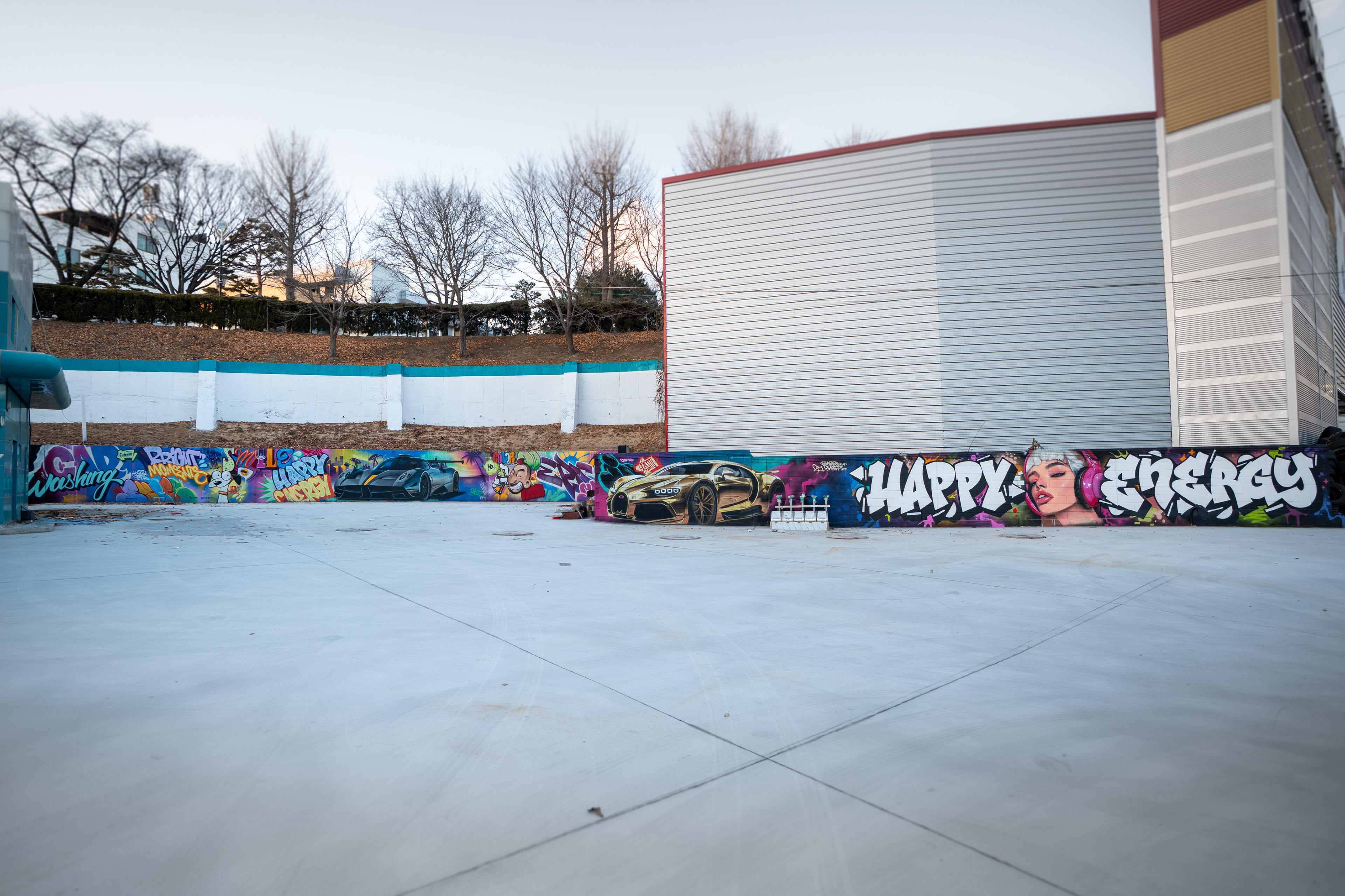
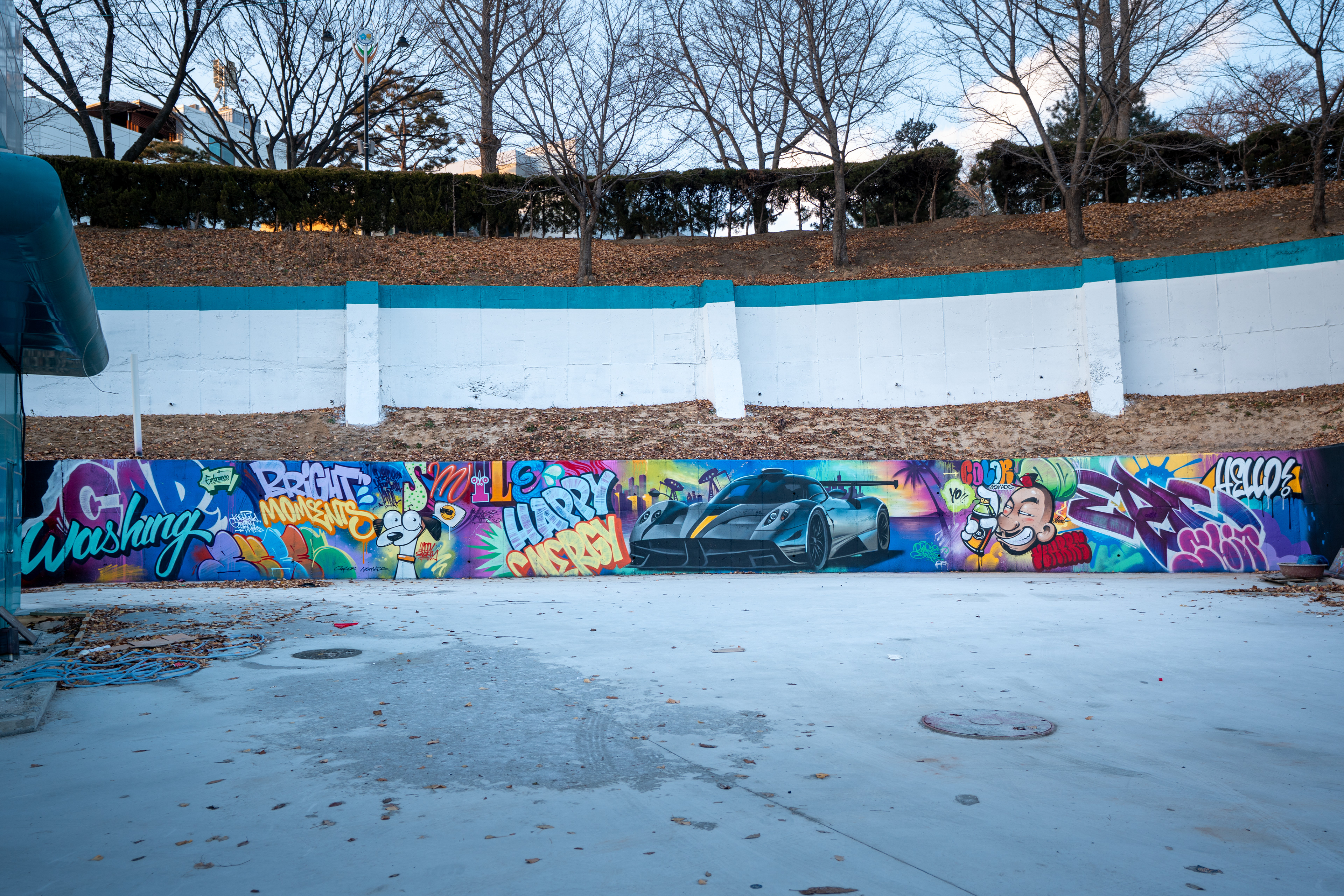
본 프로젝트는 충북 청주 미평동 대로변에 위치한 GS칼텍스 행복주유소 외벽을 대상으로 진행된 대형 그래피티 벽화 작업이다.
긴 담벼락과 자동세차장 외벽이라는 서로 다른 구조의 면을 하나의 시각적 흐름으로 연결하는 것을 목표로 기획되었다.
주유소라는 일상적인 상업 공간에서, 원거리에서도 명확히 인식되는 그래피티의 스케일과 존재감을 구축하는 데 중점을 두었다.
긴 담벼락과 자동세차장 외벽이라는 서로 다른 구조의 면을 하나의 시각적 흐름으로 연결하는 것을 목표로 기획되었다.
주유소라는 일상적인 상업 공간에서, 원거리에서도 명확히 인식되는 그래피티의 스케일과 존재감을 구축하는 데 중점을 두었다.
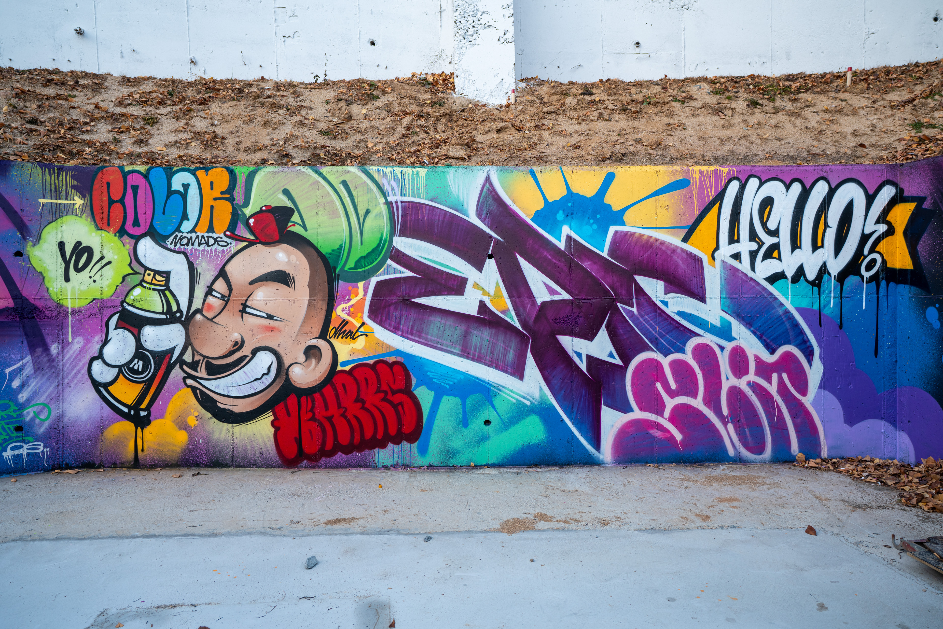
This project is a large-scale graffiti mural created on the exterior walls of GS Caltex Happy Gas Station in Cheongju, South Korea.
The work connects a long roadside wall and a car wash structure into a single visual composition.
The primary focus was to establish strong visibility and scale, allowing graffiti to be clearly read from a distance within an everyday commercial environment.
The work connects a long roadside wall and a car wash structure into a single visual composition.
The primary focus was to establish strong visibility and scale, allowing graffiti to be clearly read from a distance within an everyday commercial environment.
이번 작업은 과거 진행되었던 대형 주유소 벽화 프로젝트를 계기로 의뢰가 이루어졌다.
공간은 대로변에 위치해 차량과 보행자의 유동이 많고, 도로 건너편 대형 상업 시설에서도 시야가 확보되는 구조였다.
클라이언트는 특정한 콘셉트나 표현 방식에 대한 제한을 두지 않았으며, 이는 작업팀이 공간의 특성에 맞춰 가장 적합한 그래피티 언어를 선택할 수 있는 중요한 조건이 되었다.
공간은 대로변에 위치해 차량과 보행자의 유동이 많고, 도로 건너편 대형 상업 시설에서도 시야가 확보되는 구조였다.
클라이언트는 특정한 콘셉트나 표현 방식에 대한 제한을 두지 않았으며, 이는 작업팀이 공간의 특성에 맞춰 가장 적합한 그래피티 언어를 선택할 수 있는 중요한 조건이 되었다.
The project was commissioned following a previous large-scale gas station mural.
Located along a major road, the site receives constant visual exposure from both passing vehicles and nearby commercial areas.
With minimal restrictions from the client, the team was able to respond directly to the spatial characteristics and apply a graffiti language best suited to the environment.
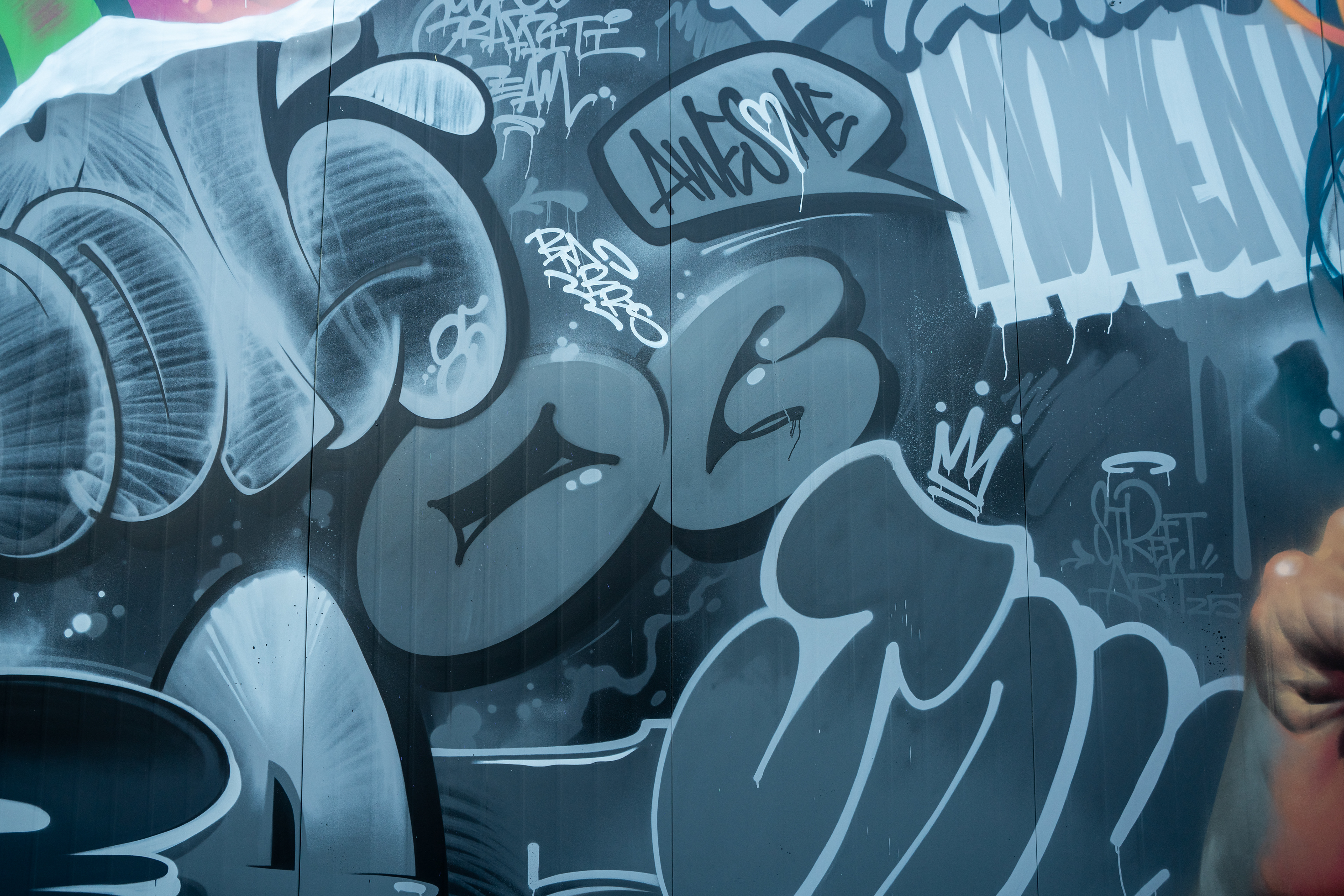
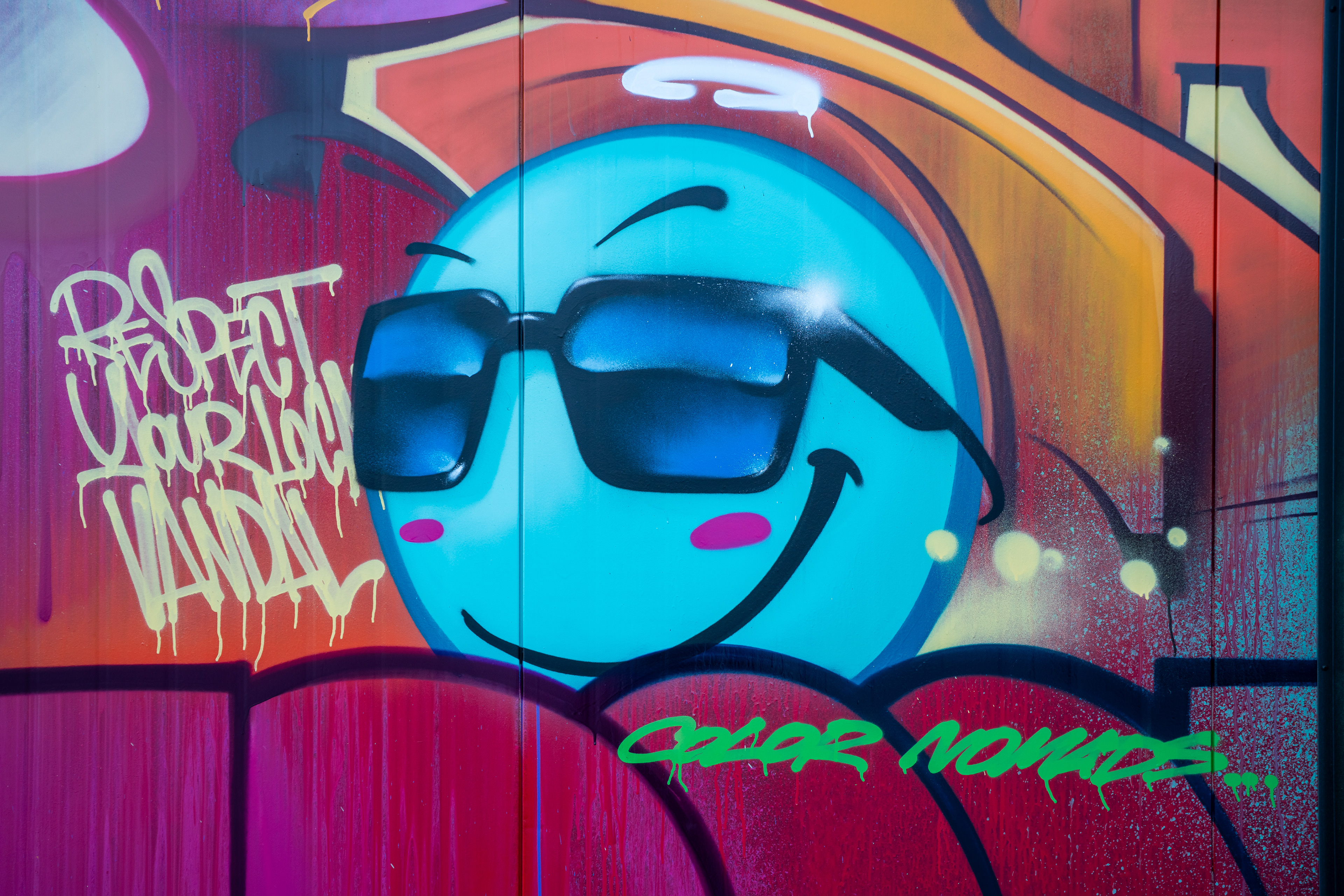
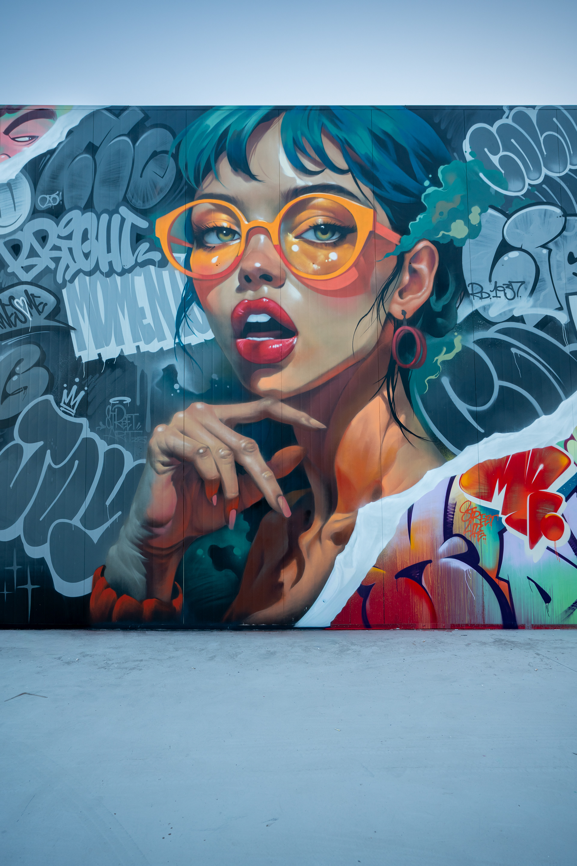
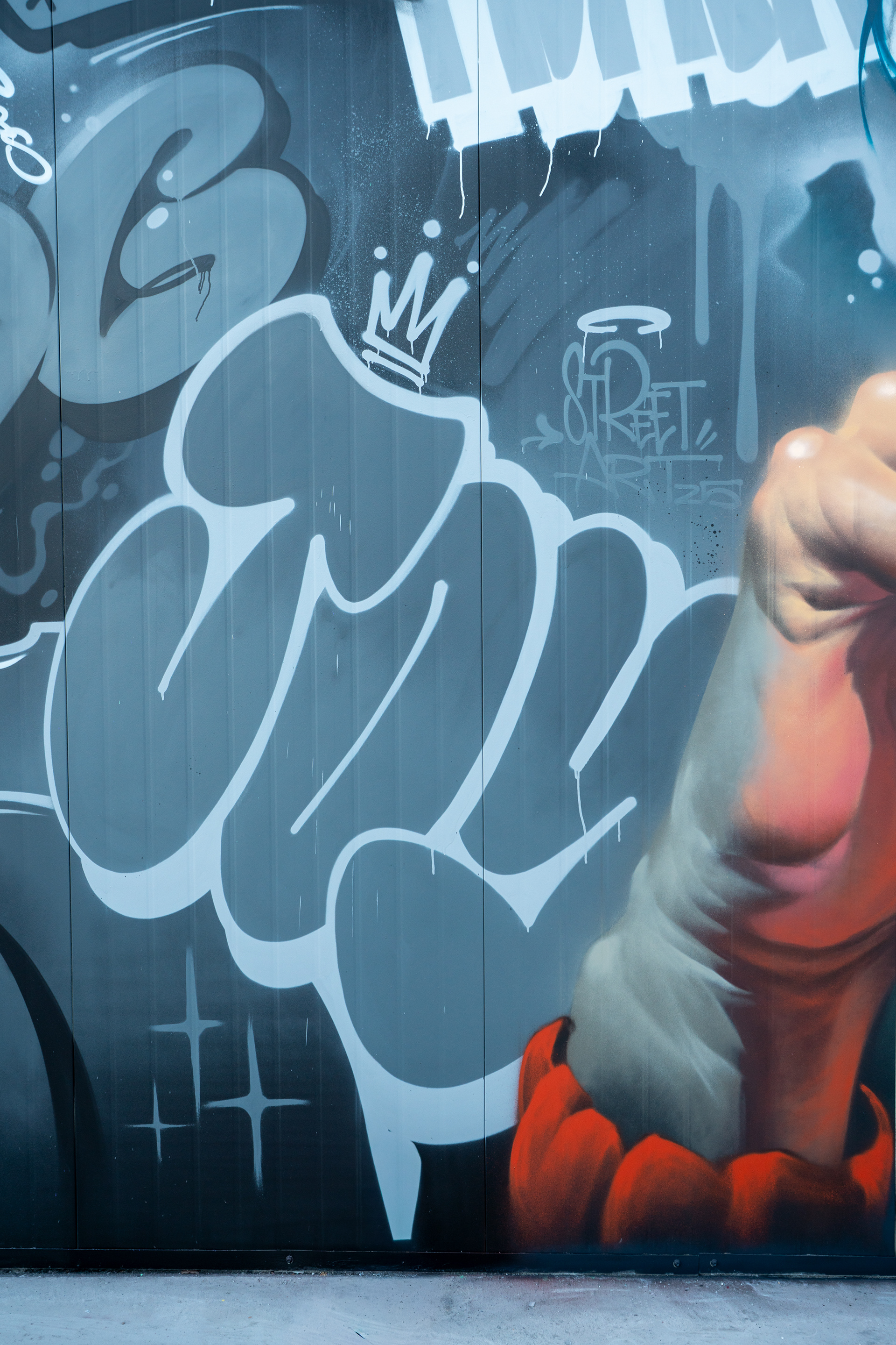
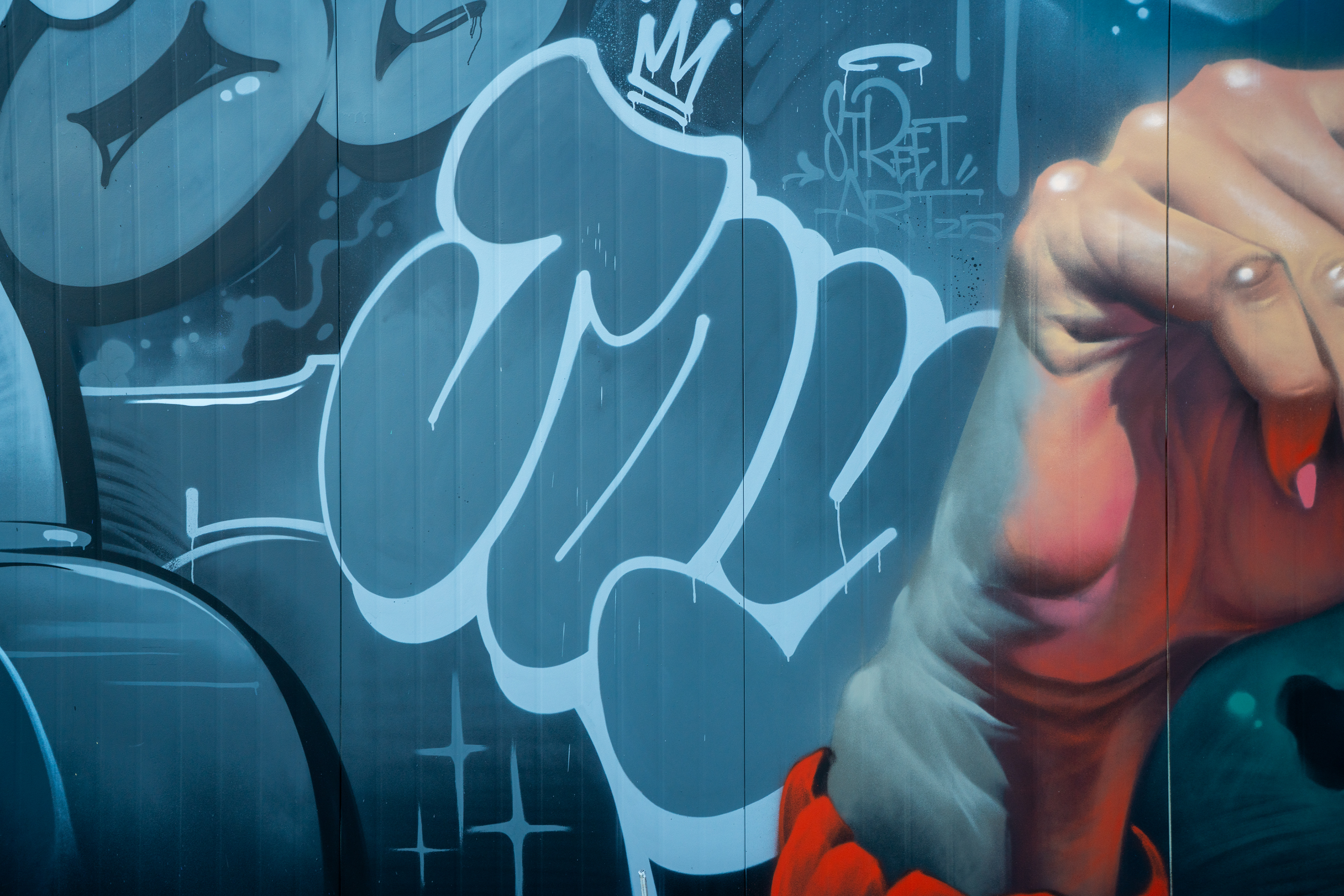
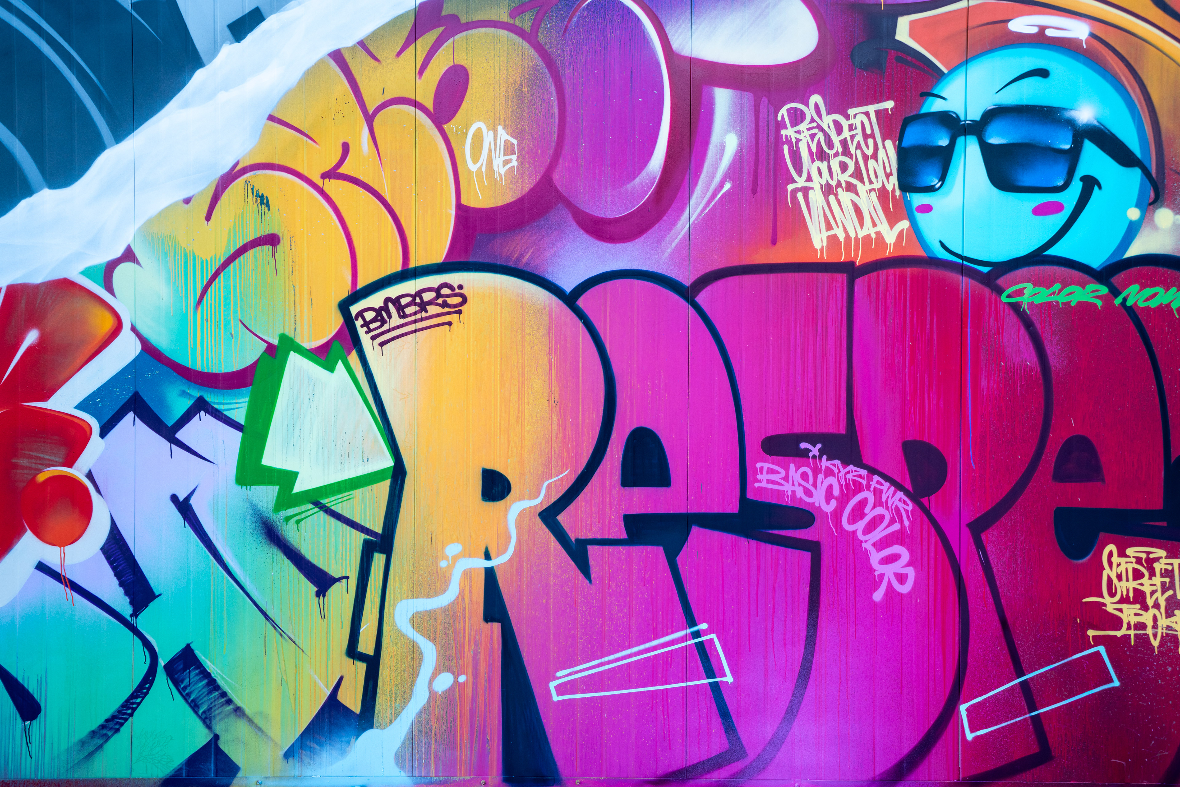
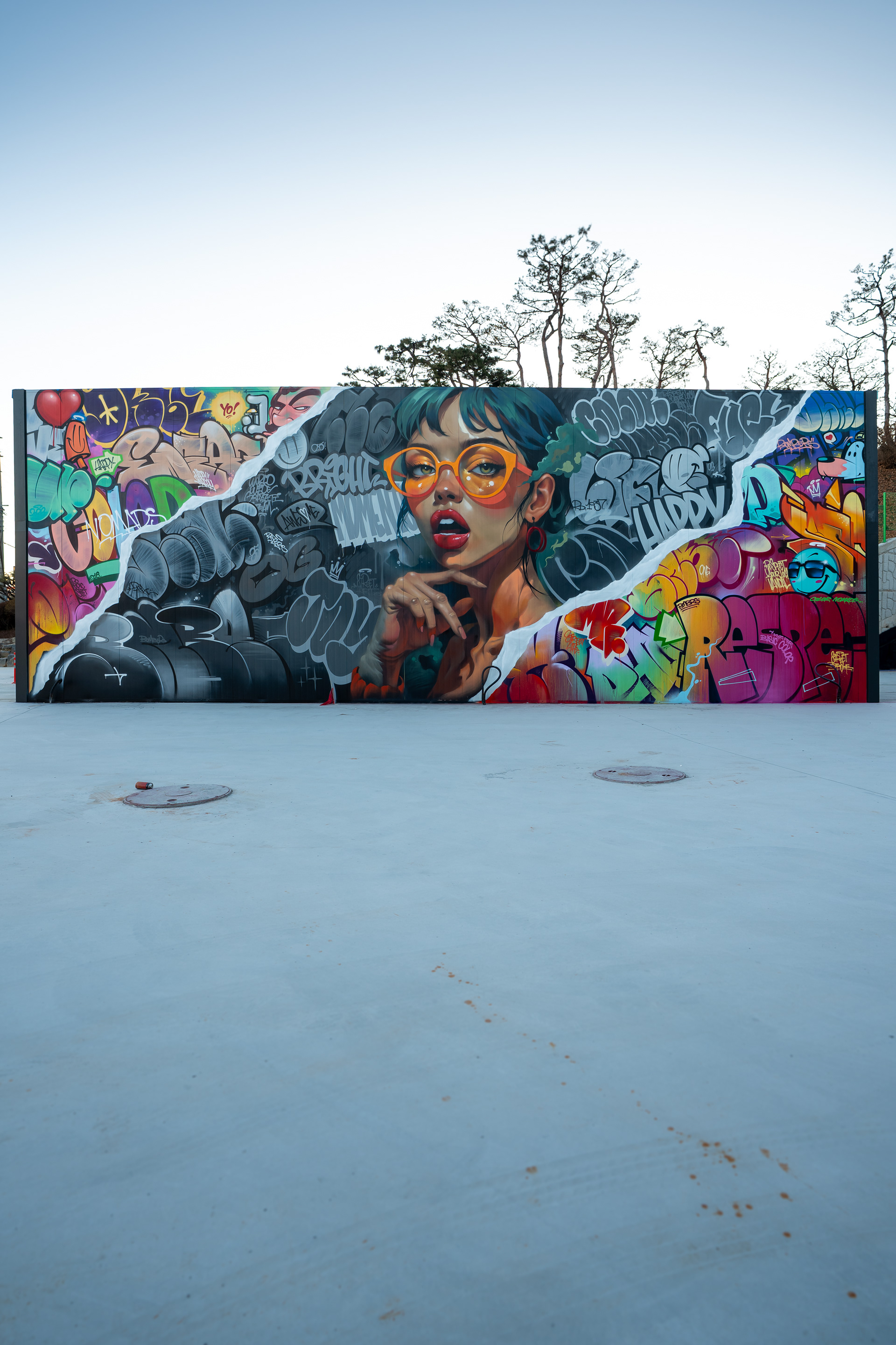
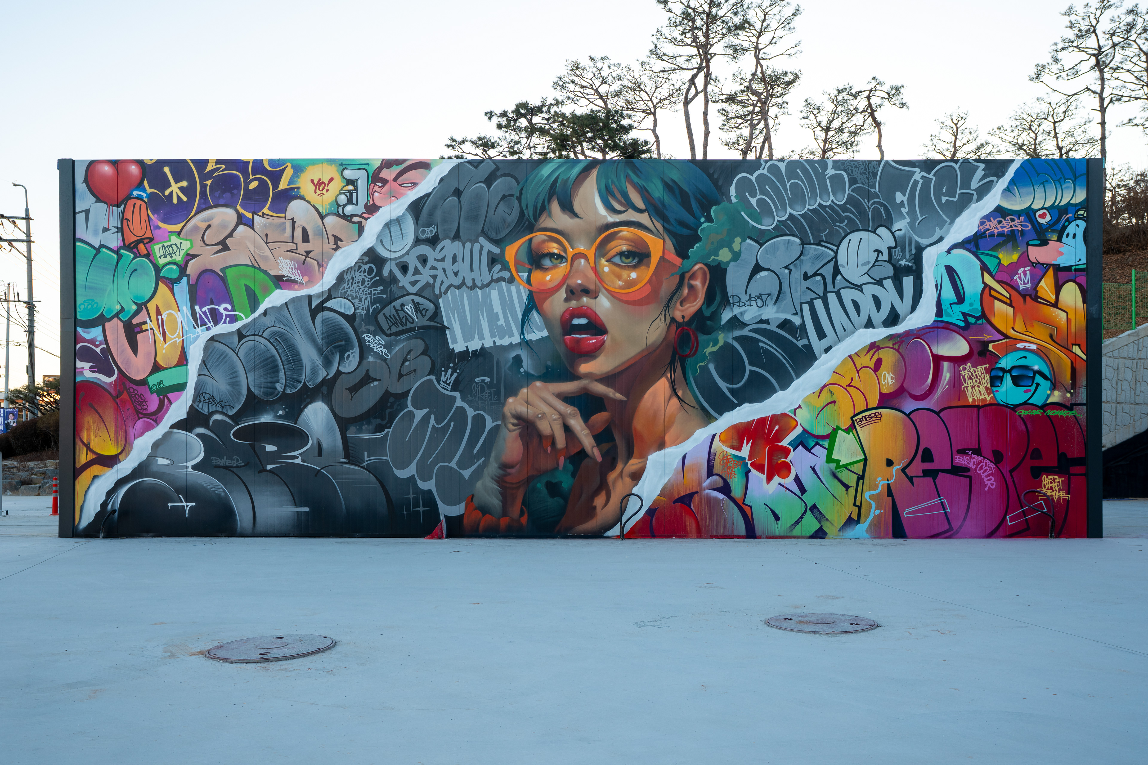
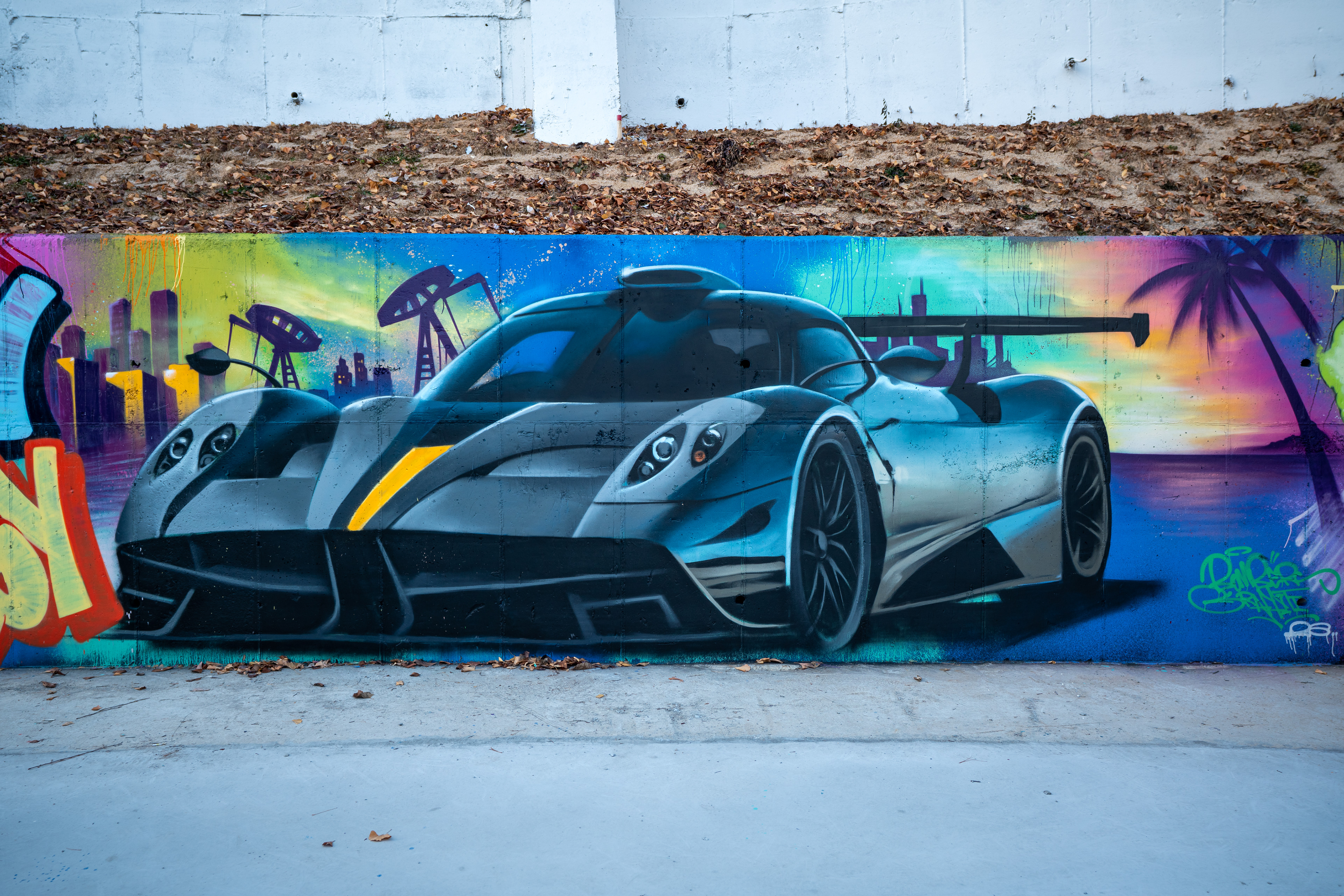
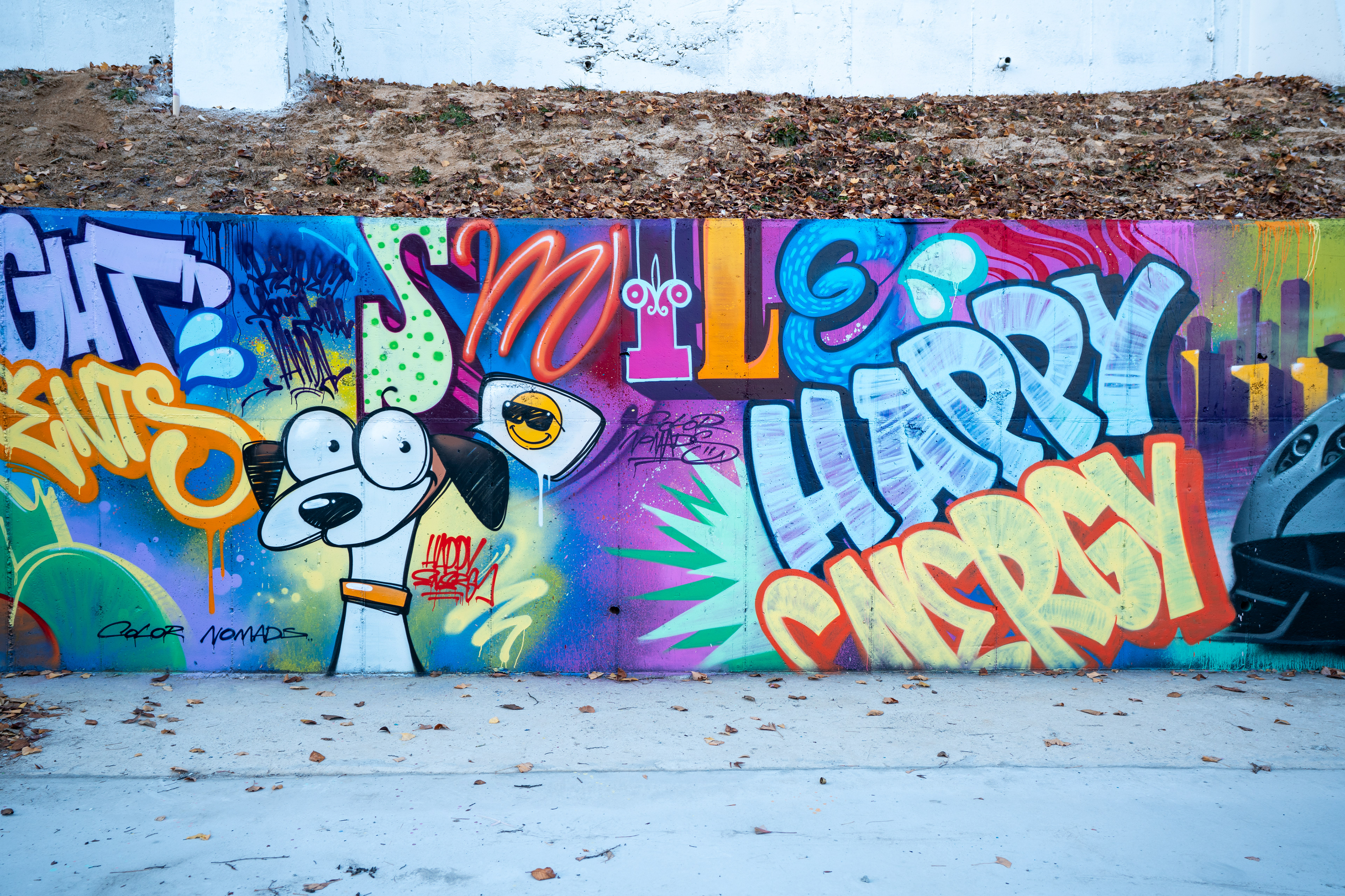
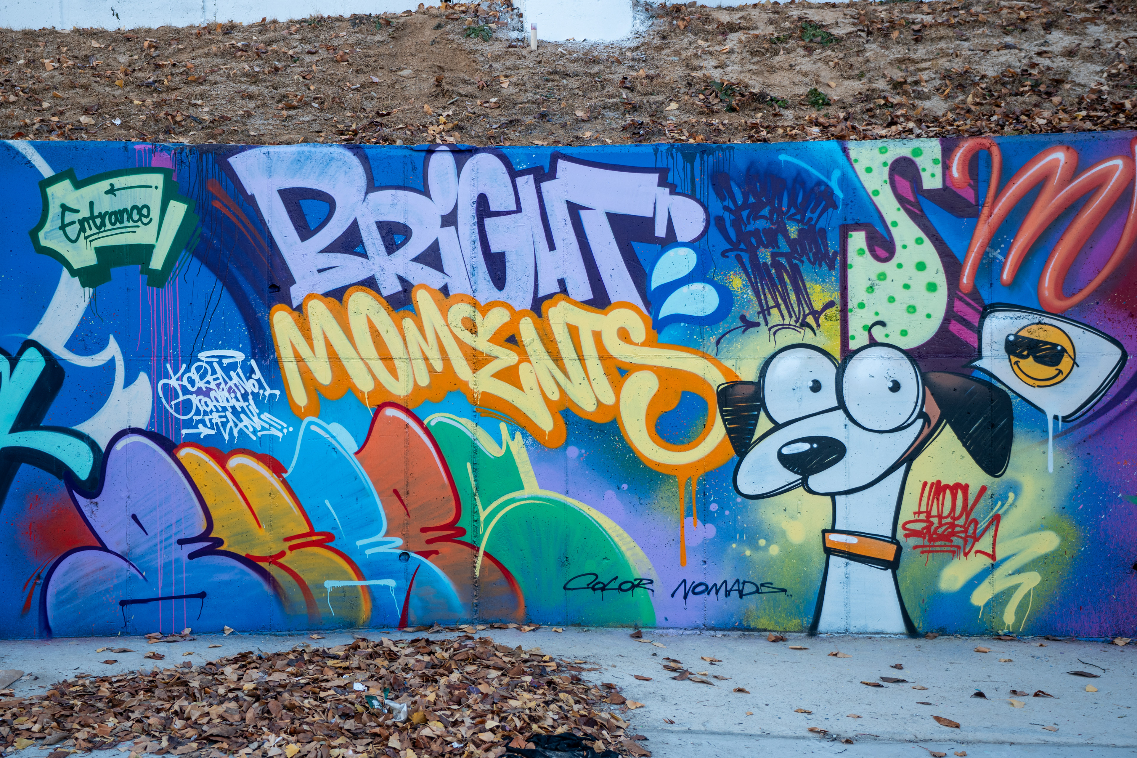
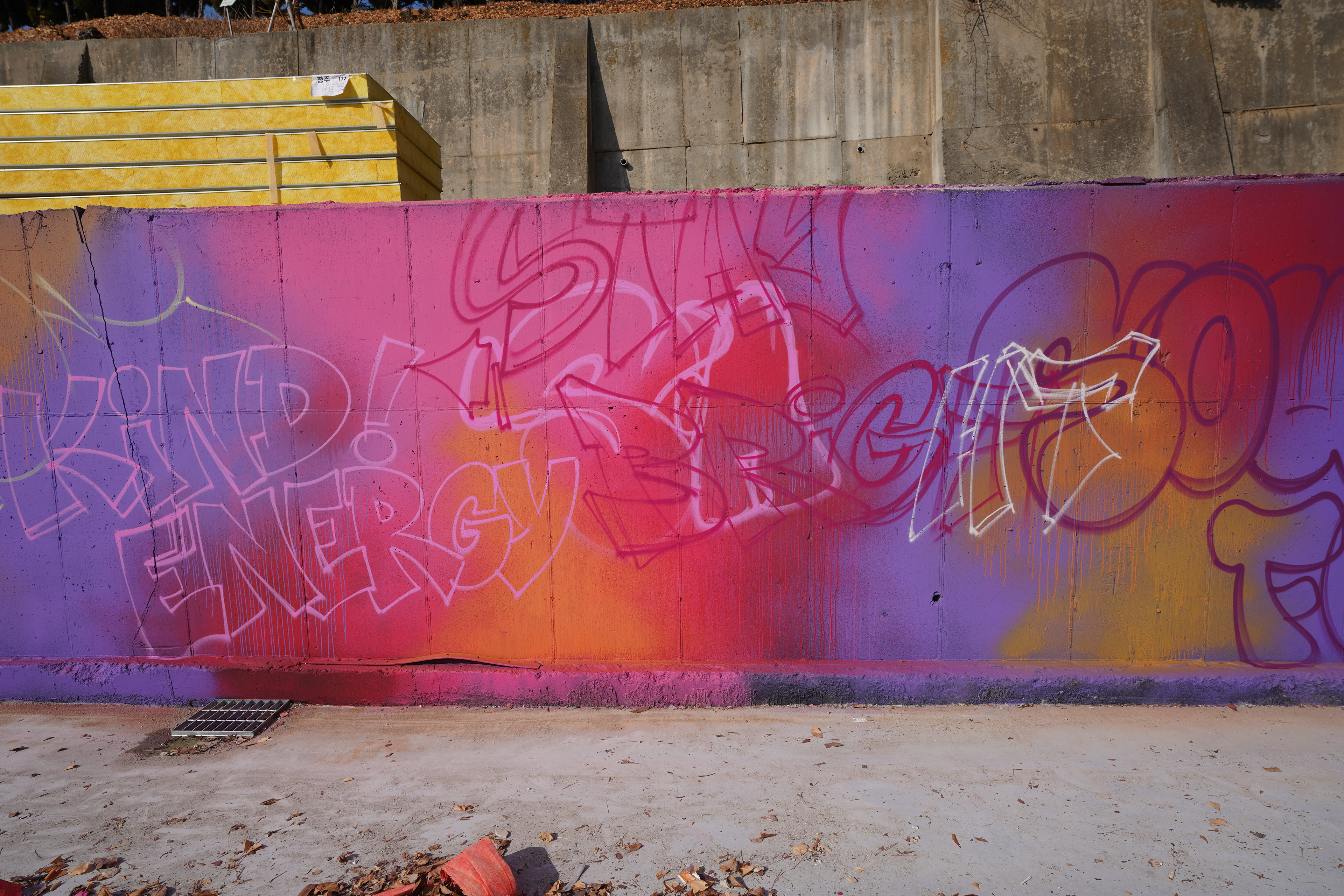
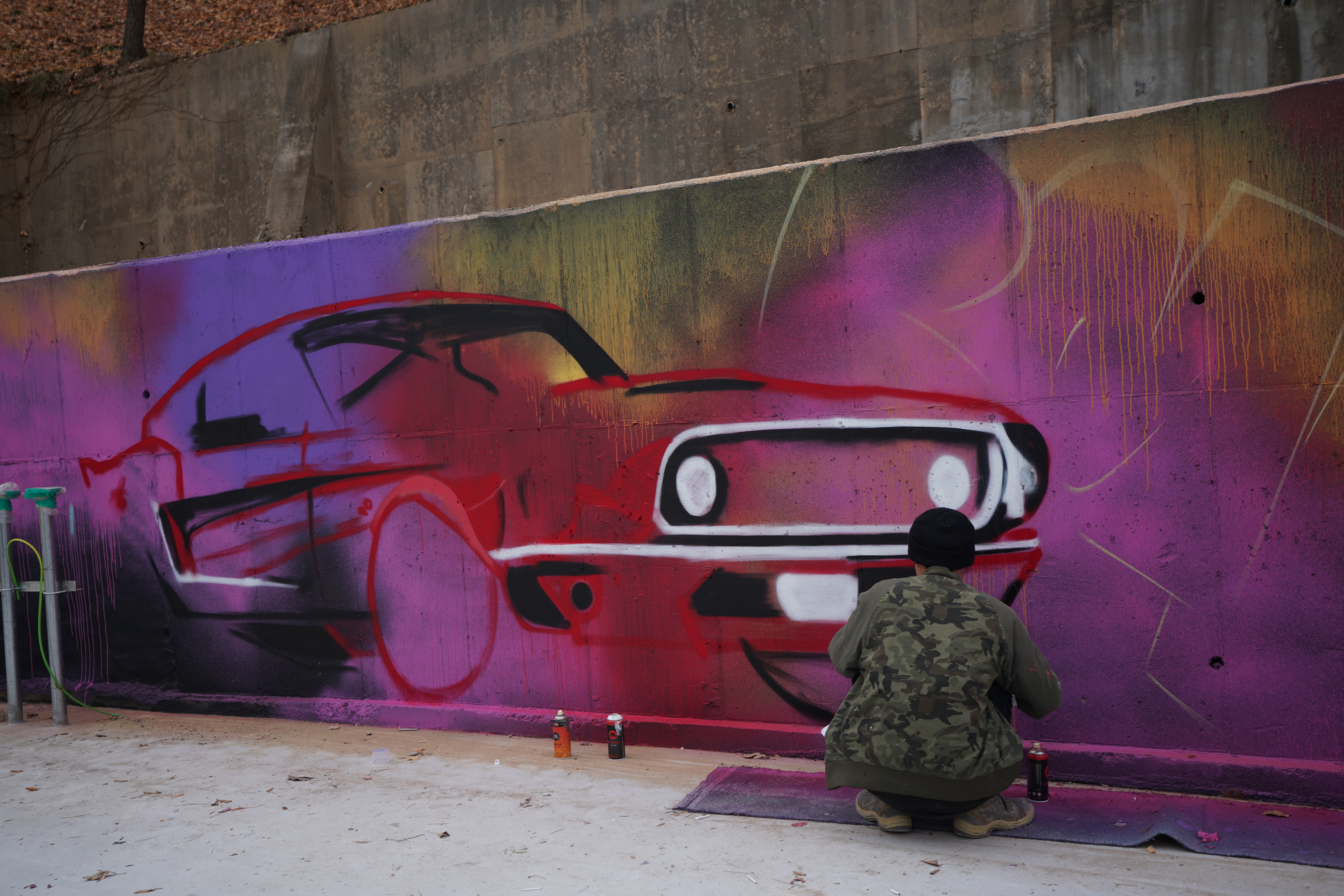
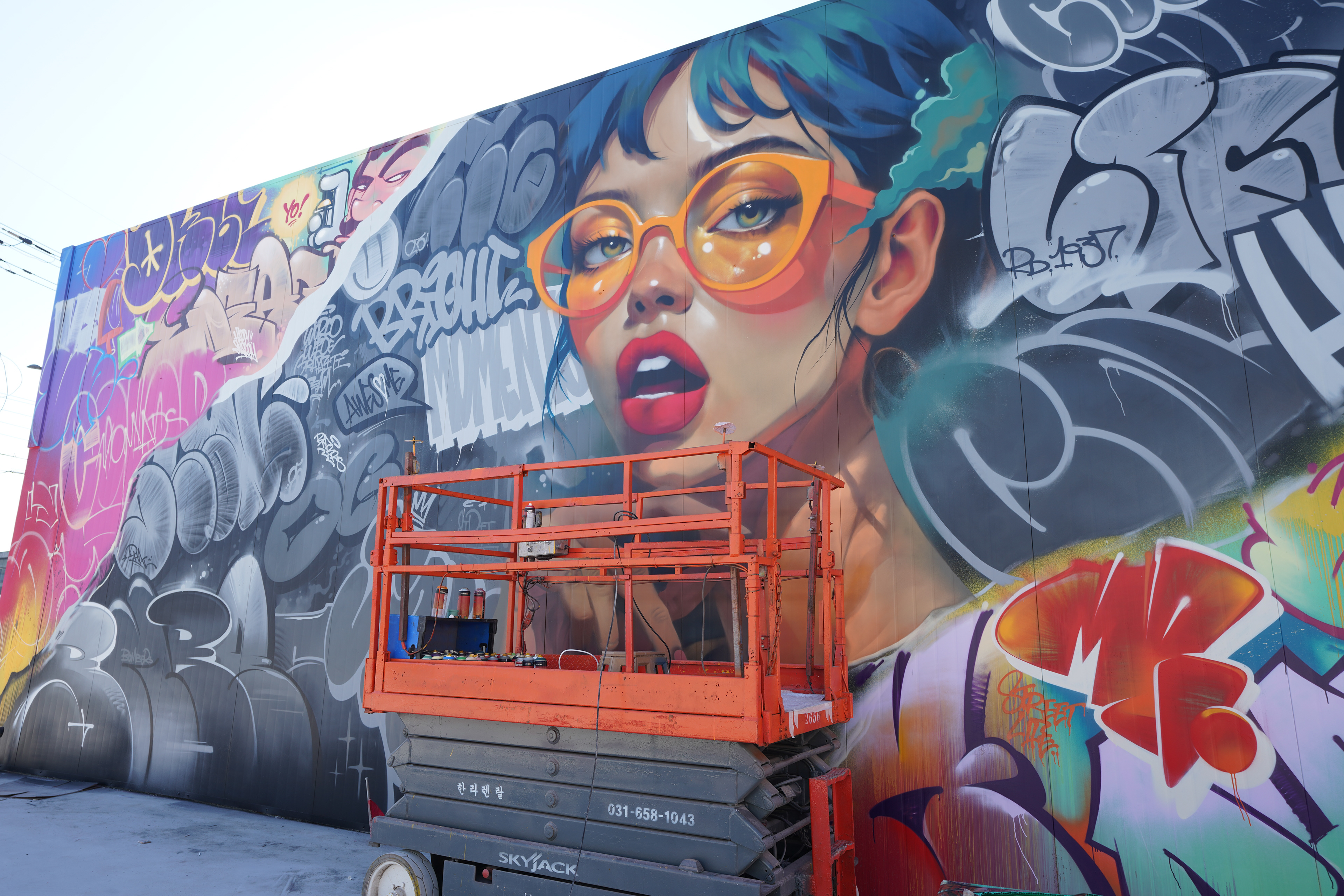
컨셉의 핵심은 ‘멀리서 읽히는 이미지’였다.
세밀한 묘사보다는 대형 인물 중심의 구성과 강한 색 대비를 통해 즉각적인 인식을 유도했다.
그래피티 특유의 레터링과 낙서적 요소를 화면 전반에 배치해 스트릿 감성을 유지하면서도, 전체 구조는 명확하게 정리된 구도로 설계되었다.
세밀한 묘사보다는 대형 인물 중심의 구성과 강한 색 대비를 통해 즉각적인 인식을 유도했다.
그래피티 특유의 레터링과 낙서적 요소를 화면 전반에 배치해 스트릿 감성을 유지하면서도, 전체 구조는 명확하게 정리된 구도로 설계되었다.
The core concept focused on readability from a distance.
Rather than emphasizing fine details, the mural prioritizes large-scale portrait imagery and strong color contrasts.
Graffiti lettering and raw marks were distributed across the surface to retain street energy, while maintaining a clear and structured overall composition.
Rather than emphasizing fine details, the mural prioritizes large-scale portrait imagery and strong color contrasts.
Graffiti lettering and raw marks were distributed across the surface to retain street energy, while maintaining a clear and structured overall composition.
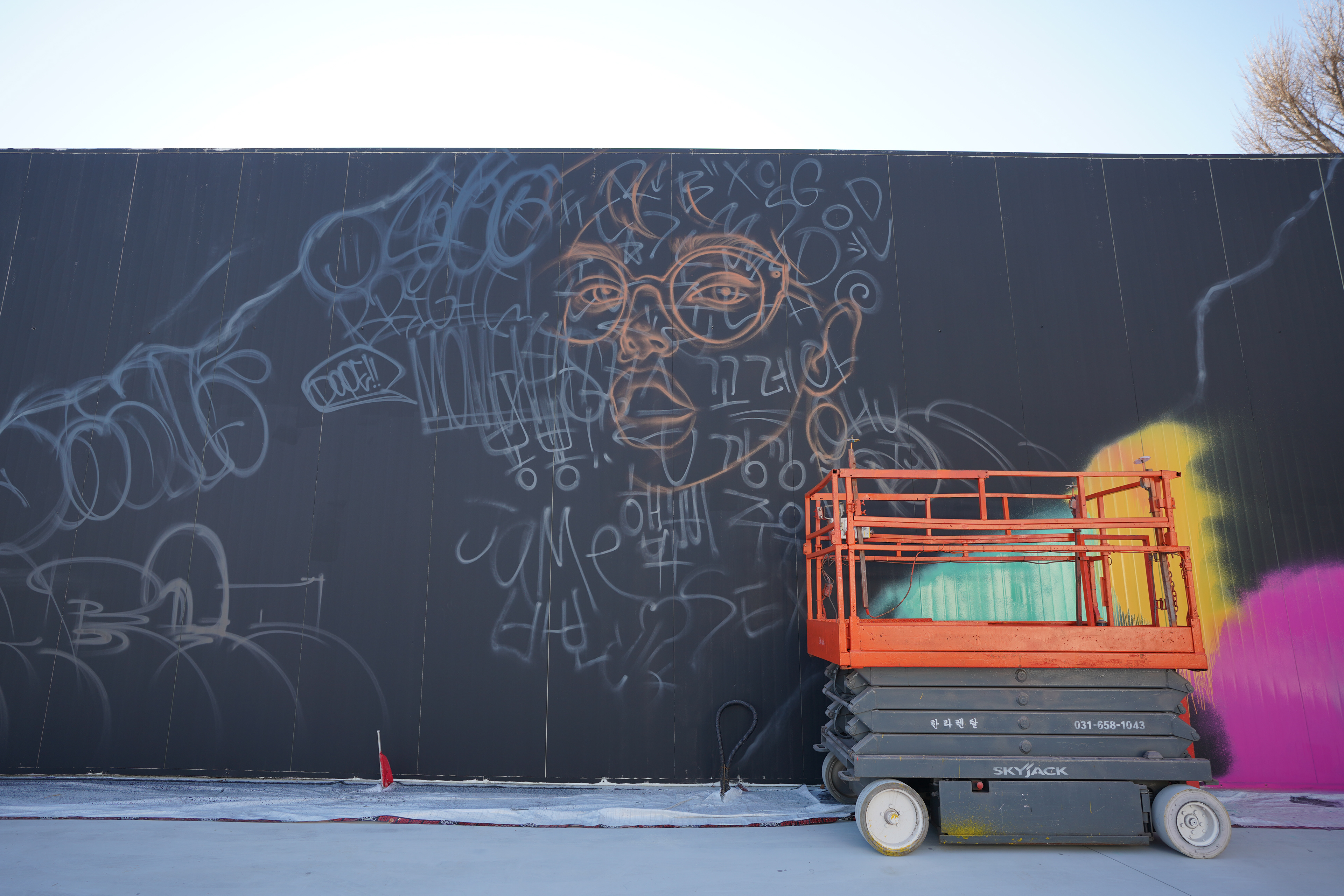
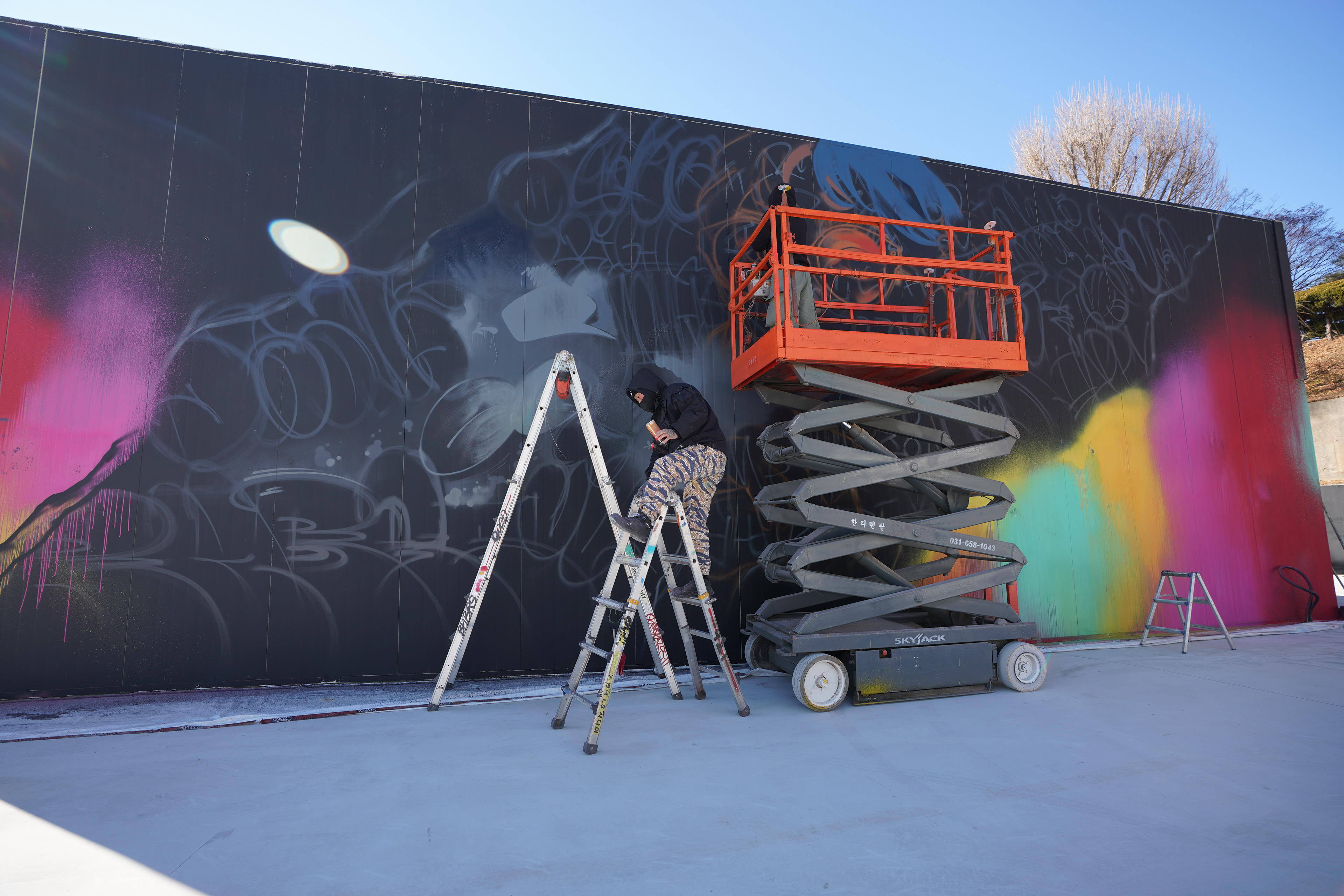
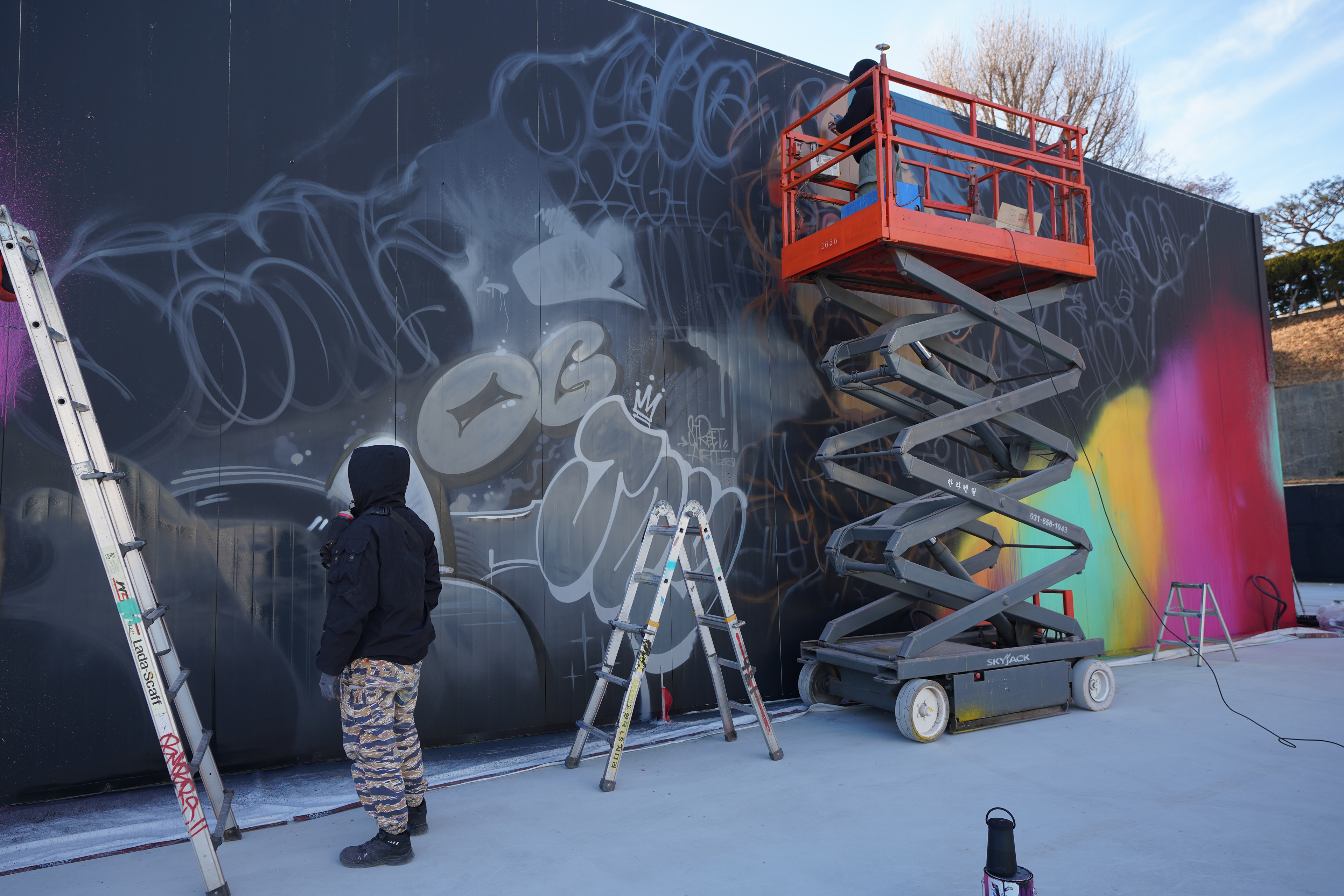
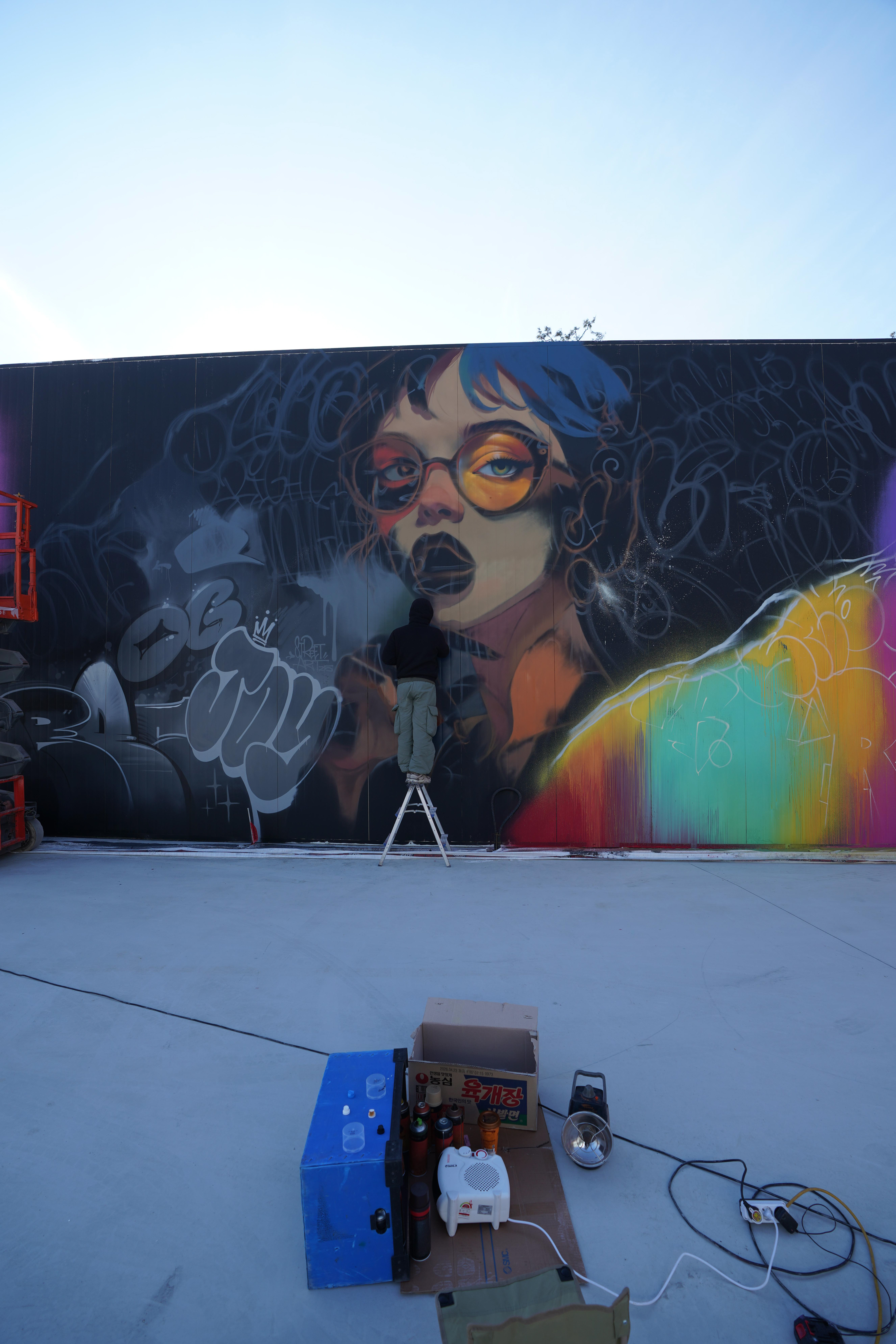
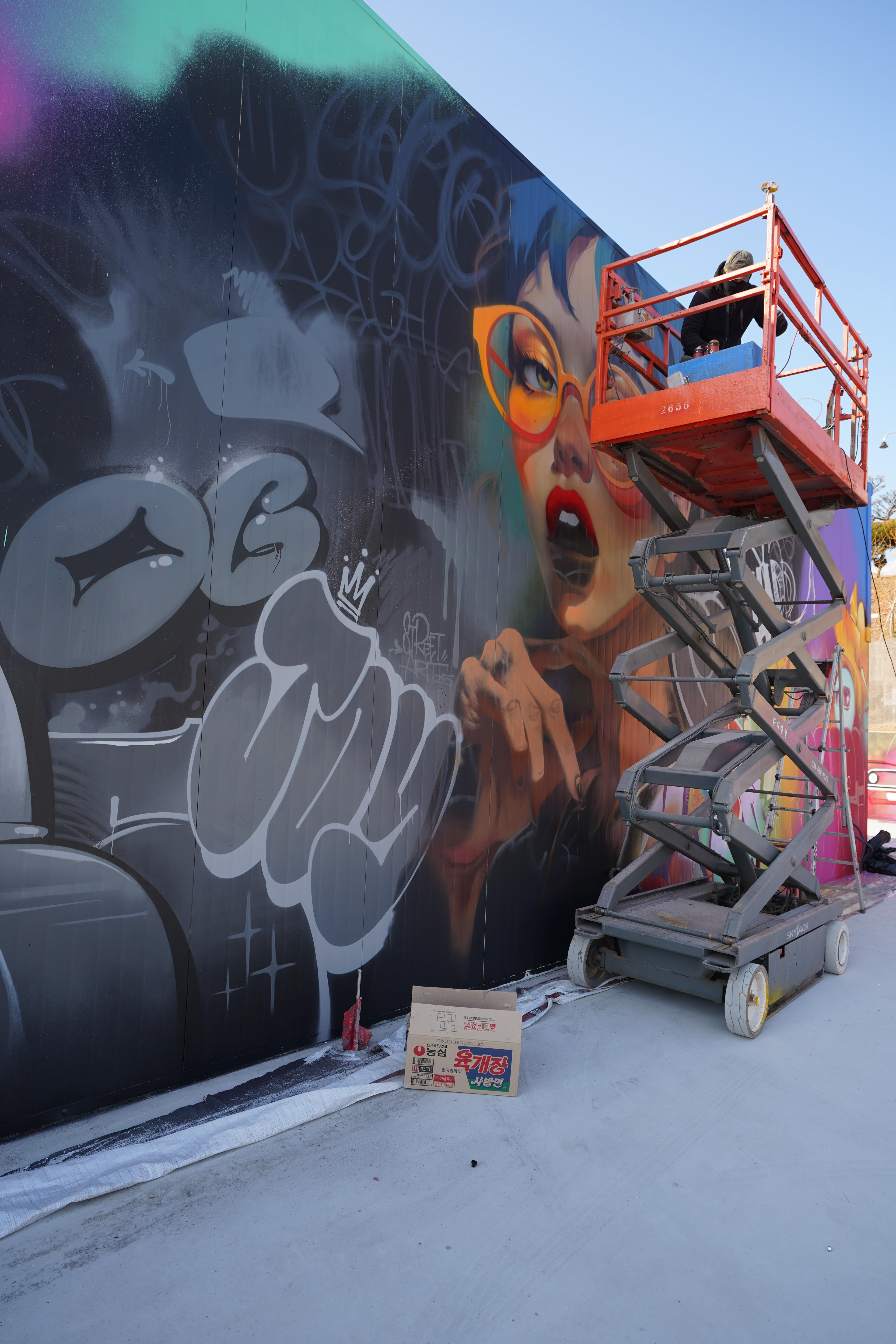
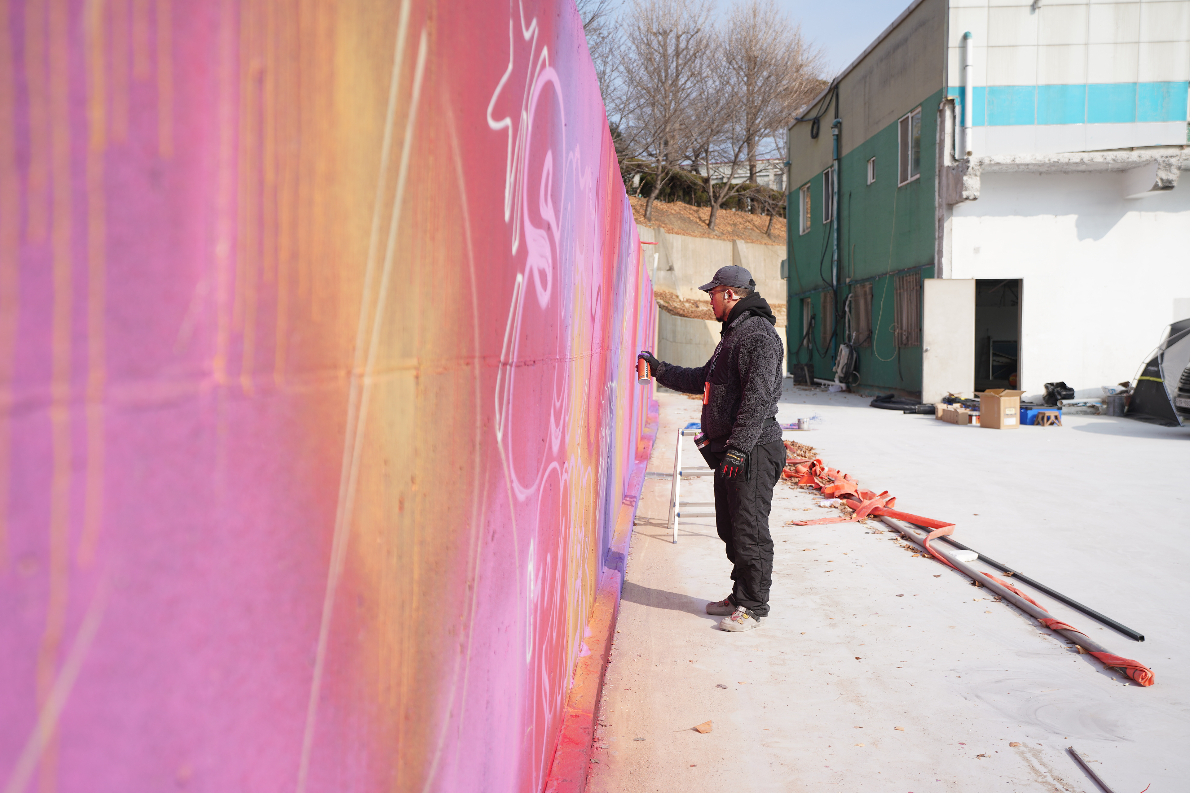
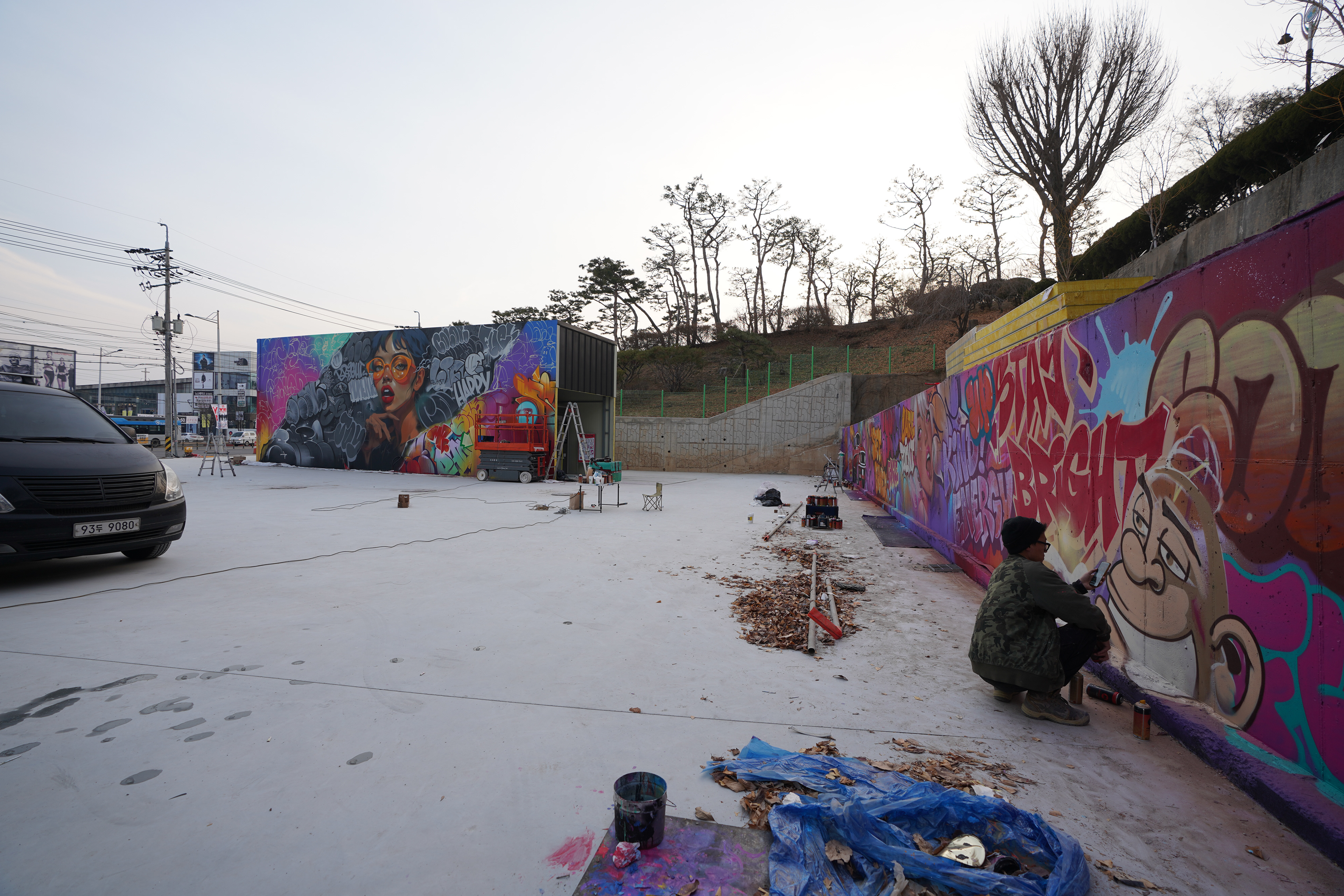
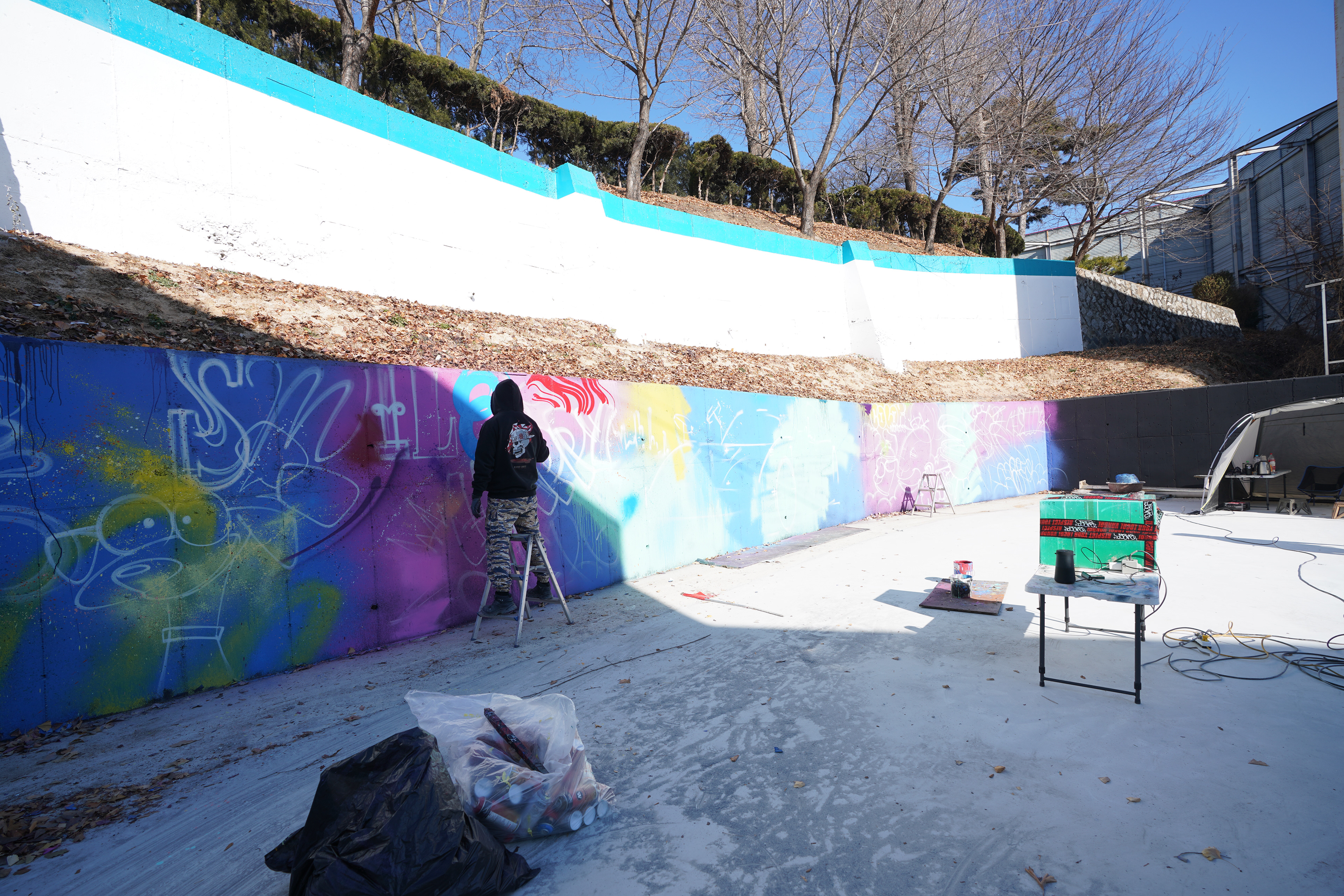
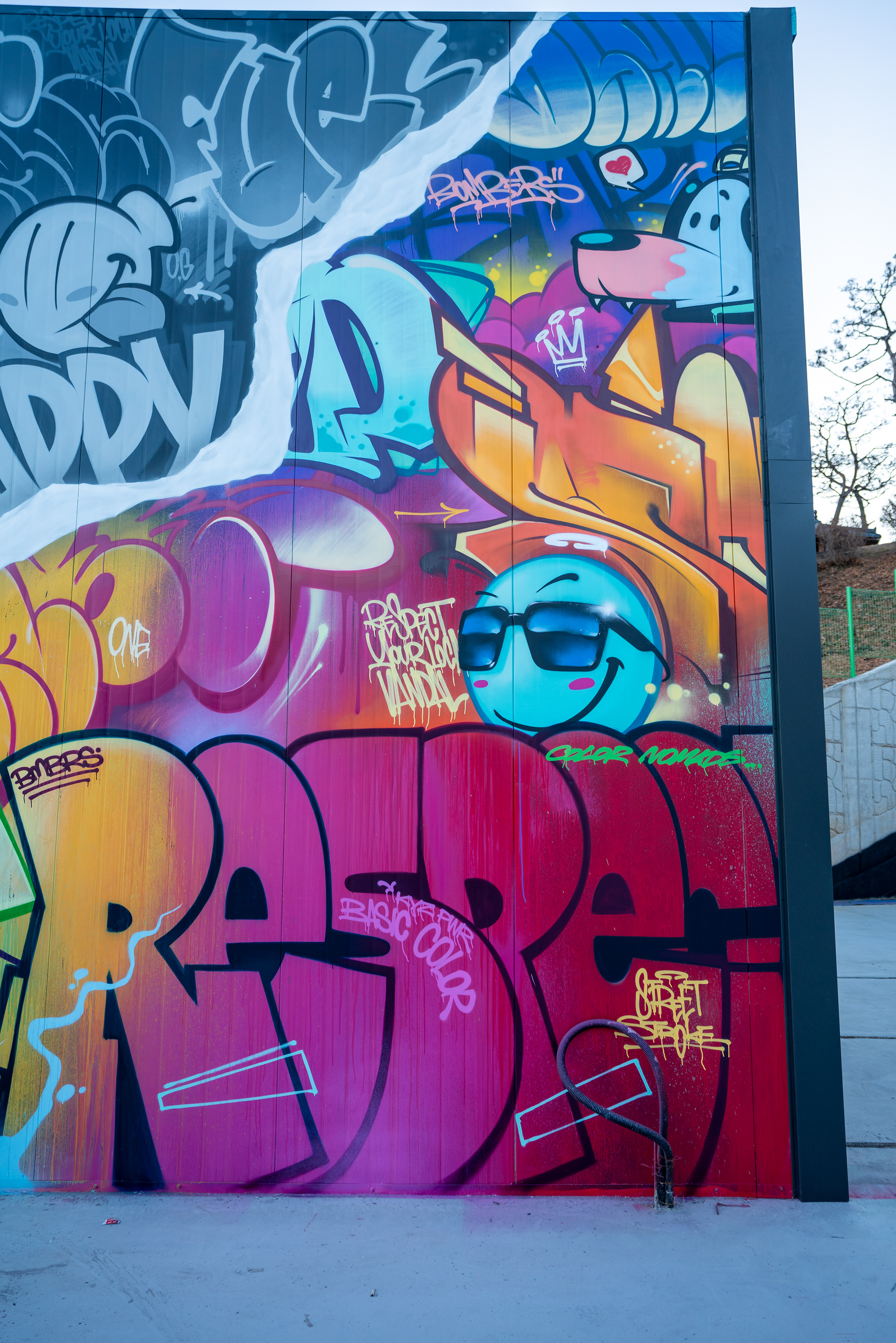
현장은 약 80m에 달하는 담벼락과 높이 약 6m의 자동세차장 외벽으로 구성되어 있었다.
담벼락과 고소 작업이 필요한 구조물은 각각 다른 접근 방식이 필요했으며, 리프트 작업과 동선 관리가 필수적이었다.
영하의 기온과 해가 들지 않는 면은 그래피티 작업에 불리한 조건이었기 때문에, 표면 프라이머 처리와 재료 선택에 각별한 주의를 기울였다.
담벼락과 고소 작업이 필요한 구조물은 각각 다른 접근 방식이 필요했으며, 리프트 작업과 동선 관리가 필수적이었다.
영하의 기온과 해가 들지 않는 면은 그래피티 작업에 불리한 조건이었기 때문에, 표면 프라이머 처리와 재료 선택에 각별한 주의를 기울였다.
The site consisted of an approximately 80-meter-long wall and a car wash structure reaching about 6 meters in height.
Different approaches were required for ground-level and elevated surfaces, including lift operation and careful workflow planning.
Freezing temperatures and limited sunlight posed challenges, making thorough surface preparation and material control essential.
Different approaches were required for ground-level and elevated surfaces, including lift operation and careful workflow planning.
Freezing temperatures and limited sunlight posed challenges, making thorough surface preparation and material control essential.
넓은 면적의 컬러 작업에는 에어건을 활용해 안정적인 색감을 구축했고, 이후 그래피티 레이어를 중첩해 화면의 밀도를 완성했다.
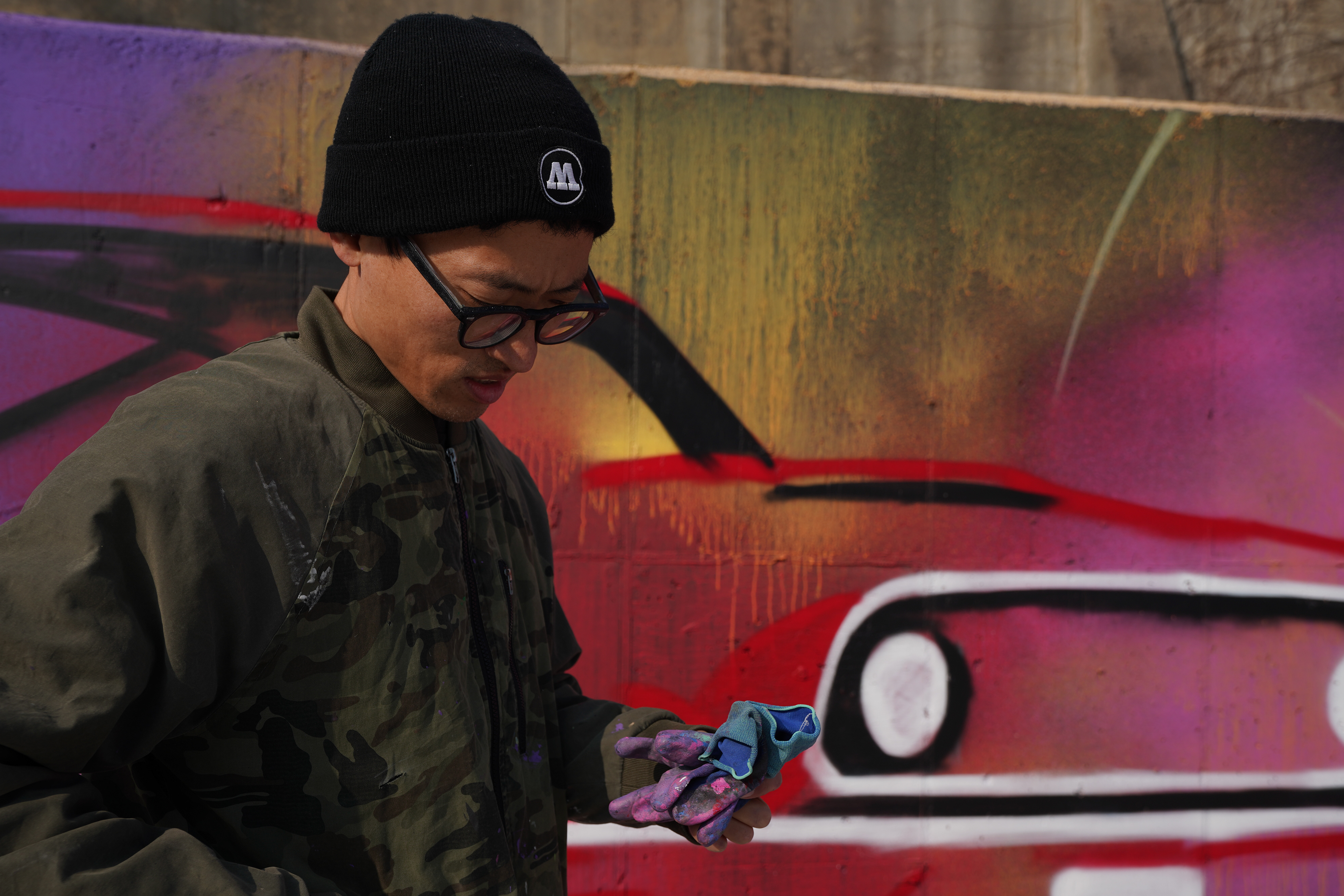
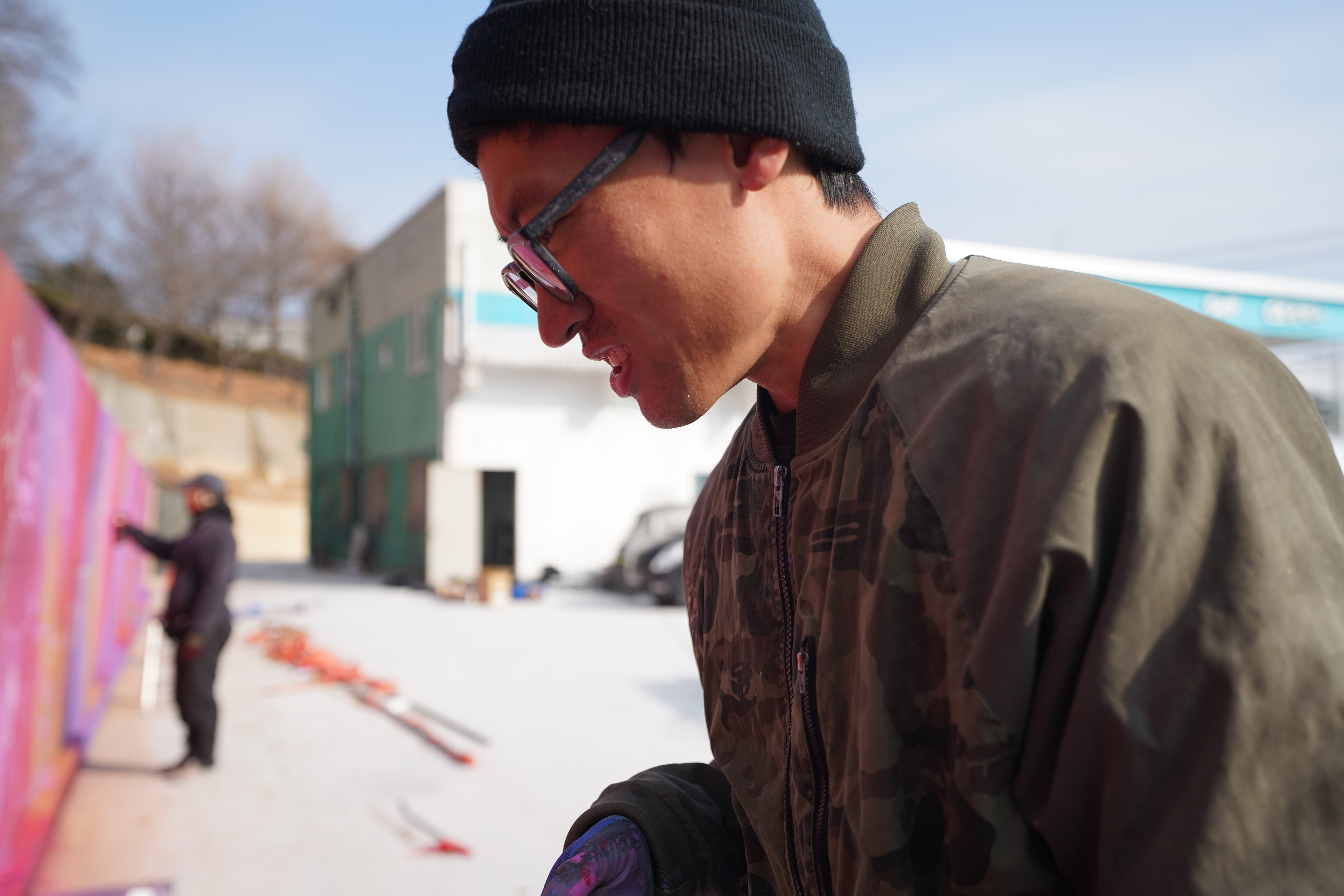
인물 표현에 강점을 지닌 작가와 레터링에 특화된 작가들이 역할을 분담해 협업했으며, 다수의 대형 벽화 경험을 바탕으로 효율적인 작업 흐름을 유지했다.
인물 표현에 강점을 지닌 작가와 레터링에 특화된 작가들이 역할을 분담해 협업했으며, 다수의 대형 벽화 경험을 바탕으로 효율적인 작업 흐름을 유지했다.
Large color fields were built using air guns to ensure consistency, followed by layered graffiti work to add depth and texture.
Artists specializing in portrait work and lettering collaborated through clear role distribution, supported by extensive experience in large-scale murals.
Artists specializing in portrait work and lettering collaborated through clear role distribution, supported by extensive experience in large-scale murals.
완성된 작품은 힙하고 강한 인상을 지니면서도, 공간 전체와 자연스럽게 연결되는 결과물로 완성되었다.
지나가는 차량과 보행자 모두가 쉽게 인식할 수 있는 스케일을 확보했으며, 현장에서는 긍정적인 반응과 관심이 이어졌다.
본 프로젝트는 향후 대형 벽화, 공공미술, 상업 공간 브랜딩 작업으로 확장 가능한 레퍼런스로 기능한다.
지나가는 차량과 보행자 모두가 쉽게 인식할 수 있는 스케일을 확보했으며, 현장에서는 긍정적인 반응과 관심이 이어졌다.
본 프로젝트는 향후 대형 벽화, 공공미술, 상업 공간 브랜딩 작업으로 확장 가능한 레퍼런스로 기능한다.
The completed mural delivers a bold and contemporary presence while integrating seamlessly with the surrounding architecture.
Its scale ensures high visibility for both drivers and pedestrians, generating strong engagement on site.
This project serves as a reference for future large-scale murals, public art initiatives, and commercial branding applications.
Its scale ensures high visibility for both drivers and pedestrians, generating strong engagement on site.
This project serves as a reference for future large-scale murals, public art initiatives, and commercial branding applications.