
Dhal, Remon / Hongdae, Seoul, Korea / 2025
홍대입구역 인근에 위치한 Reclow 홍대 매장 내부 그래피티는, 브랜드의 기존 무드를 해치지 않으면서도 공간에 가벼운 스트릿 감각을 더하기 위해 기획된 작업이다. 매장 입구 안쪽의 작은 벽면을 대상으로 진행되었으며, 벽 자체가 과하게 앞에 나서기보다 공간 안에 자연스럽게 스며드는 개입을 목표로 했다.
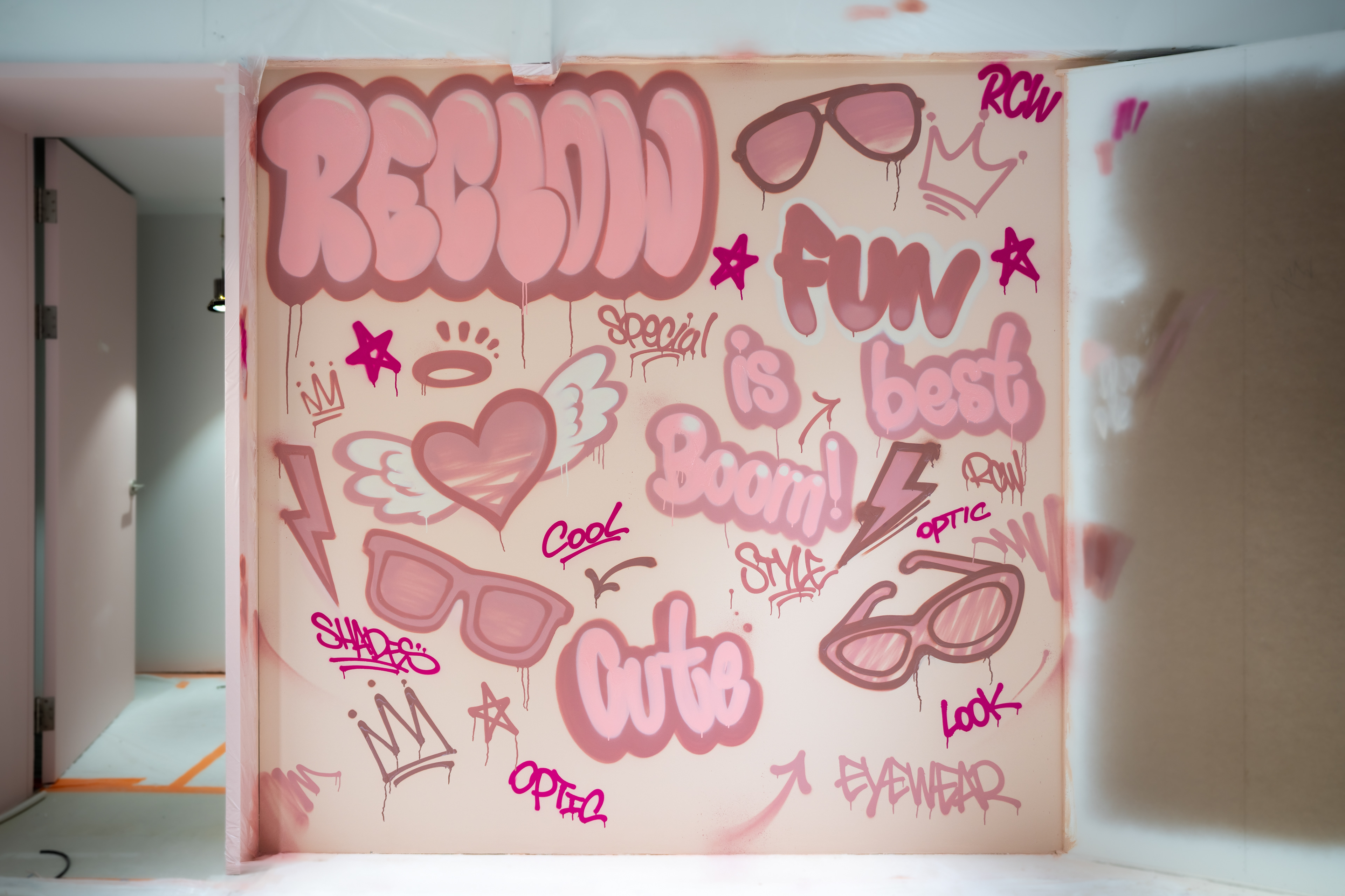
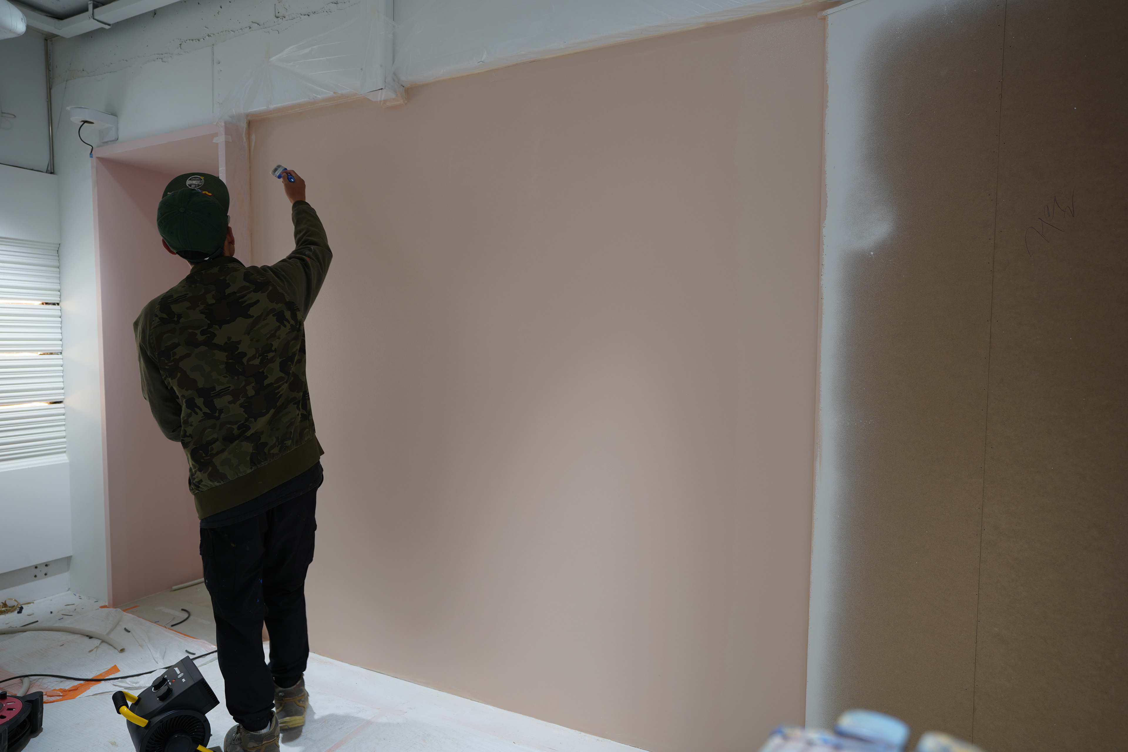
The interior graffiti at Reclow Hongdae Store, located near Hongik University Station in Seoul, was conceived to introduce a subtle street sensibility without disrupting the brand’s existing atmosphere. Applied to a small wall inside the store entrance, the intervention was designed not to dominate the space, but to blend into it with a controlled visual presence.
The interior graffiti at Reclow Hongdae Store, located near Hongik University Station in Seoul, was conceived to introduce a subtle street sensibility without disrupting the brand’s existing atmosphere. Applied to a small wall inside the store entrance, the intervention was designed not to dominate the space, but to blend into it with a controlled visual presence.
이번 프로젝트의 핵심은 그래피티를 얼마나 강하게 드러낼 것인가가 아니라, 브랜드 공간 안에서 어느 정도의 밀도로 개입해야 하는가에 대한 판단이었다. 클라이언트는 Reclow의 톤과 포인트 컬러를 유지하면서 과하지 않은 스트릿 무드를 원했고, 이에 따라 벽면은 독립적인 주인공이 아니라 브랜드와 제품을 보완하는 배경적 장치로 설정되었다.
The core question of this project was not how boldly graffiti should appear, but how much density of intervention was appropriate within a branded retail environment. The client wanted to preserve Reclow’s tone and accent colors while adding a restrained street mood, so the wall was positioned not as a standalone focal point, but as a supporting layer that reinforces both the brand and the products.
The core question of this project was not how boldly graffiti should appear, but how much density of intervention was appropriate within a branded retail environment. The client wanted to preserve Reclow’s tone and accent colors while adding a restrained street mood, so the wall was positioned not as a standalone focal point, but as a supporting layer that reinforces both the brand and the products.
초기에는 브랜드 캐릭터나 보다 직접적인 그래피티 레터링, throw-up 계열의 요소를 포함하는 방향도 검토되었다. 하지만 매장의 전체 인테리어 톤, 제품 진열 구조, 그리고 ‘과하지 않은’ 분위기에 대한 요청을 함께 고려했을 때, 보다 절제된 방향이 적절하다고 판단했다. 그 결과 이번 작업은 그래피티의 외형을 전면에 내세우기보다, 스트릿과 낙서의 감각을 얇고 정돈된 방식으로 남기는 방향으로 정리되었다.
In the early concept phase, options such as brand characters, more direct graffiti lettering, and throw-up inspired elements were also considered. However, when measured against the store’s overall interior tone, product display structure, and the request for a non-overpowering atmosphere, a more restrained direction proved more appropriate. As a result, the project moved away from overt graffiti imagery and instead retained the sensibility of street language and doodling in a thinner, more refined form.
In the early concept phase, options such as brand characters, more direct graffiti lettering, and throw-up inspired elements were also considered. However, when measured against the store’s overall interior tone, product display structure, and the request for a non-overpowering atmosphere, a more restrained direction proved more appropriate. As a result, the project moved away from overt graffiti imagery and instead retained the sensibility of street language and doodling in a thinner, more refined form.
Hongdae, Seoul, Korea / 2025
Hongdae, Seoul, Korea / 2025
작업의 키워드는 street, doodle, simple, pink였다. 이 중 핑크는 단순한 색채 선택이 아니라, Reclow 공간의 포인트 컬러이자 브랜드 인상을 유지하기 위한 중요한 기준이었다. 작업 전에는 컬러표와 벽면 상태, 사용 예정 재료를 비교하며 공간 안에서 가장 자연스럽게 작동하는 톤을 찾았고, 현장에서는 ‘예쁜 핑크’보다 ‘이질감 없이 어울리는 핑크’를 고르는 것이 더 중요한 판단 기준이 되었다.
The project was shaped around the keywords street, doodle, simple, and pink. Among them, pink functioned not merely as a color choice, but as a critical anchor for maintaining the spatial identity and visual memory of Reclow. Before execution, color charts, wall conditions, and paint materials were carefully compared to find the tone that would integrate most naturally into the environment. On site, the priority was not simply selecting an attractive pink, but identifying one that would work seamlessly within the existing interior.
The project was shaped around the keywords street, doodle, simple, and pink. Among them, pink functioned not merely as a color choice, but as a critical anchor for maintaining the spatial identity and visual memory of Reclow. Before execution, color charts, wall conditions, and paint materials were carefully compared to find the tone that would integrate most naturally into the environment. On site, the priority was not simply selecting an attractive pink, but identifying one that would work seamlessly within the existing interior.
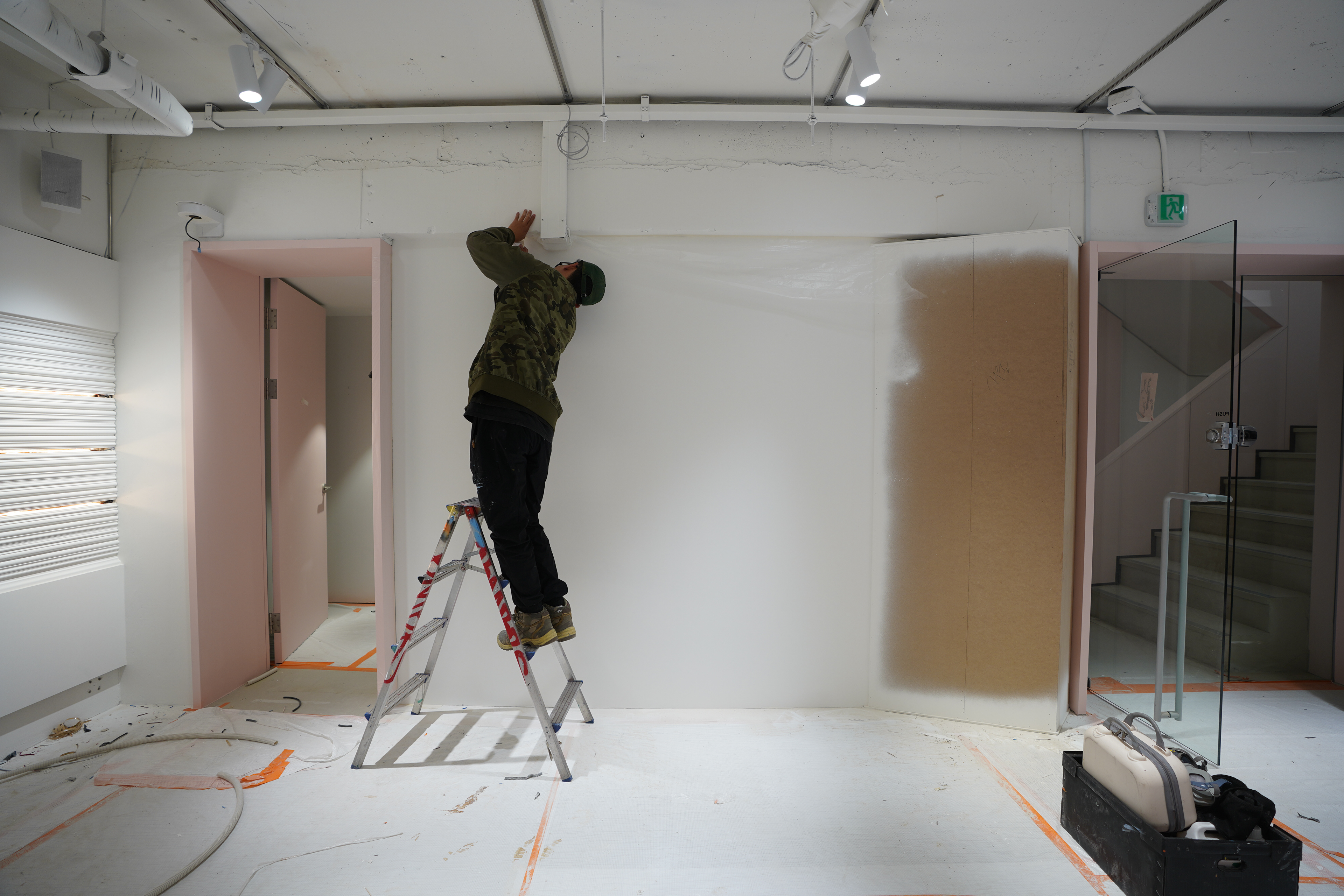
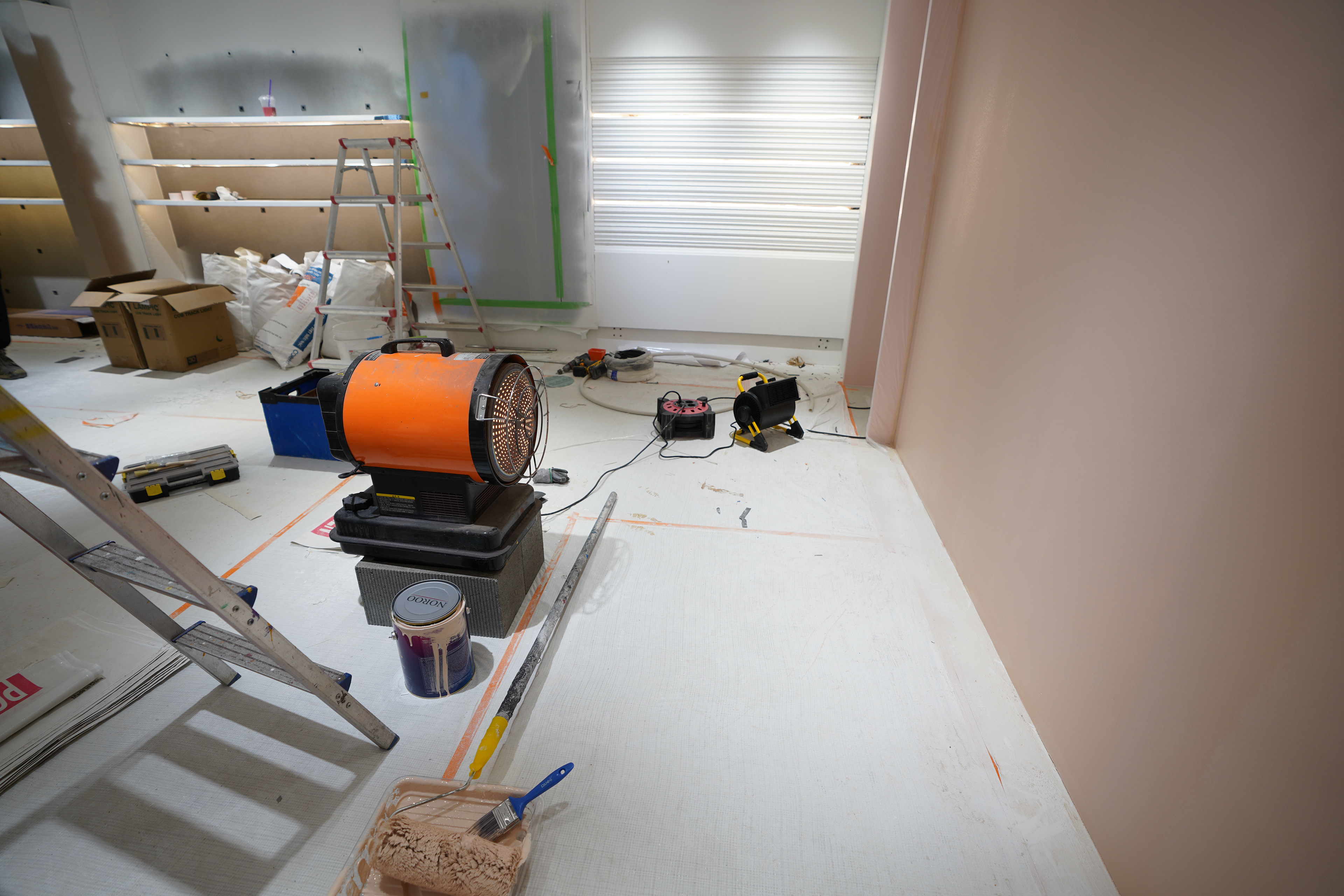
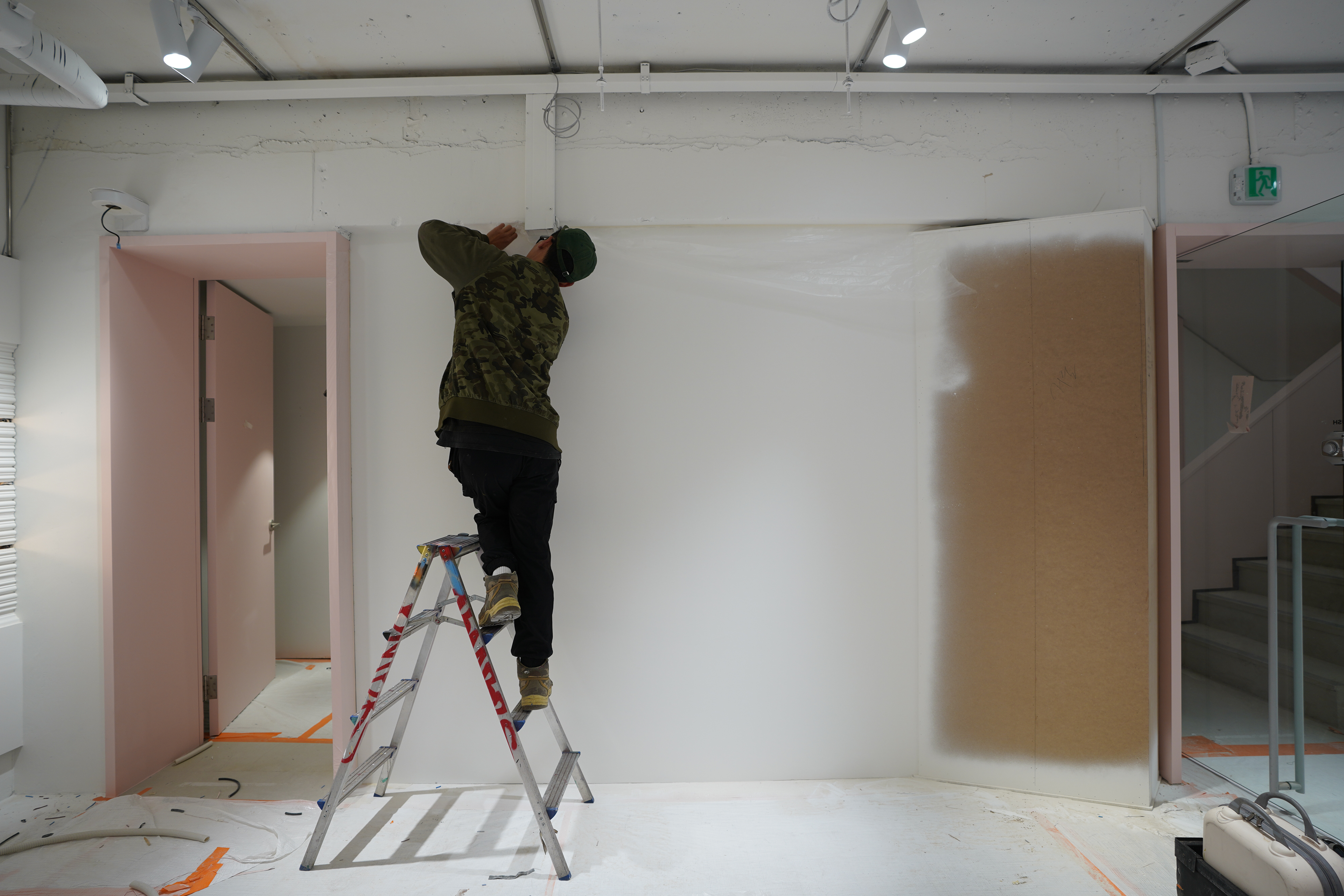
작업이 이루어진 벽면은 매장 입구 내부의 약 2 x 2 meter 규모의 소형 면으로, 인테리어 공사가 거의 마무리된 상태에서 석고 및 퍼티 마감이 완료된 표면 위에 진행되었다. 사용 재료는 페인트와 스프레이이며, 구조적으로 복잡한 현장은 아니었지만, 시야가 빠르게 닿는 위치에 있는 작은 면인 만큼 미세한 차이도 전체 인상에 큰 영향을 주는 공간이었다. 이런 조건에서 중요한 것은 더 많은 표현을 쌓는 기술이 아니라, 어디까지 덜어낼 것인지에 대한 조절이었다.
The work was executed on a compact wall of approximately 2 x 2 meters inside the store entrance, after the interior construction had largely been completed and the plaster and putty finish had already been prepared. Paint and spray were used as the main materials. While the site itself was not structurally complex, the wall sat in a highly visible position within a small spatial frame, meaning even subtle decisions would significantly affect the overall impression. Under these conditions, the key was not adding more visual language, but deciding what to leave out.
The work was executed on a compact wall of approximately 2 x 2 meters inside the store entrance, after the interior construction had largely been completed and the plaster and putty finish had already been prepared. Paint and spray were used as the main materials. While the site itself was not structurally complex, the wall sat in a highly visible position within a small spatial frame, meaning even subtle decisions would significantly affect the overall impression. Under these conditions, the key was not adding more visual language, but deciding what to leave out.
Hongdae, Seoul, Korea / 2025
Hongdae, Seoul, Korea / 2025
완성된 벽면은 심플한 인상을 유지하면서도, 낙서적인 결감과 스트릿 무드를 분명히 남긴다. 그래피티의 성격을 약화시킨 것이 아니라, 상업 공간의 목적과 브랜드의 성격에 맞게 그 언어를 조정한 결과에 가깝다. 벽면은 결과적으로 제품보다 앞서지 않으면서도, 공간에 리듬과 성격을 부여하는 배경적 요소로 기능하게 되었다.
The completed wall maintains a simple overall impression while still carrying a clear sense of doodled texture and street energy. Rather than diminishing the nature of graffiti, the project translates its language into a form calibrated for a commercial interior and for the character of the brand itself. In the end, the wall does not compete with the products, but functions as a background element that gives the space rhythm and identity.
The completed wall maintains a simple overall impression while still carrying a clear sense of doodled texture and street energy. Rather than diminishing the nature of graffiti, the project translates its language into a form calibrated for a commercial interior and for the character of the brand itself. In the end, the wall does not compete with the products, but functions as a background element that gives the space rhythm and identity.
이 프로젝트는 강한 그래피티를 선언적으로 보여주는 작업이라기보다, 상업 공간 안에서 그래피티적 감각을 어느 정도까지 남길 수 있는지 조율한 사례에 가깝다. 작가의 스타일을 일방적으로 밀어붙이기보다, 브랜드 환경과 시선 흐름, 제품 디스플레이의 맥락까지 함께 고려해 그래피티를 기능적으로 번역한 작업이라는 점에서 의미가 있다.
Rather than presenting graffiti as a bold declaration, this project can be understood as a study in how much graffiti sensibility can be retained within a commercial setting. Its significance lies in the functional translation of graffiti—not as an imposed artistic gesture, but as an intervention carefully adjusted to the brand environment, the movement of the viewer’s eye, and the context of product display.
Rather than presenting graffiti as a bold declaration, this project can be understood as a study in how much graffiti sensibility can be retained within a commercial setting. Its significance lies in the functional translation of graffiti—not as an imposed artistic gesture, but as an intervention carefully adjusted to the brand environment, the movement of the viewer’s eye, and the context of product display.
Youtube [BMBRS Graffiti]
결과적으로 Reclow 홍대 매장 내부 그래피티는 작은 벽면 하나를 채우는 작업을 넘어, 브랜드 공간 안에서 그래피티의 톤과 밀도를 어떻게 조정할 수 있는지 보여주는 프로젝트가 되었다. 스트릿의 언어를 강하게 선언하기보다 정제된 방식으로 스며들게 함으로써, Reclow의 컬러와 무드를 유지하면서도 공간에 분명한 인상과 분위기를 더하는 장치로 완성되었다.
Ultimately, the Reclow Hongdae Store interior graffiti became more than a small wall intervention. It serves as a project that demonstrates how the tone and density of graffiti can be calibrated within a branded environment. By allowing street language to enter in a refined and measured way, the piece preserves Reclow’s color identity and atmosphere while adding a distinct visual rhythm and spatial character.