
Dhal, Remon / Hongdae, Seoul, Korea / 2025
홍대 삼거리포차 인근에 새로 오픈한 무인 전자담배 판매점 VAPE Bridge 내부에 진행한 그래피티 프로젝트다. 제한된 예산과 협소한 공간 안에서, 벽면 그래픽만으로도 매장의 분위기와 정체성을 분명하게 만드는 것을 목표로 했다. 작업은 2025년 12월 7일 하루 동안 진행되었으며, DHAL, REMON, DZ, James가 참여했다.
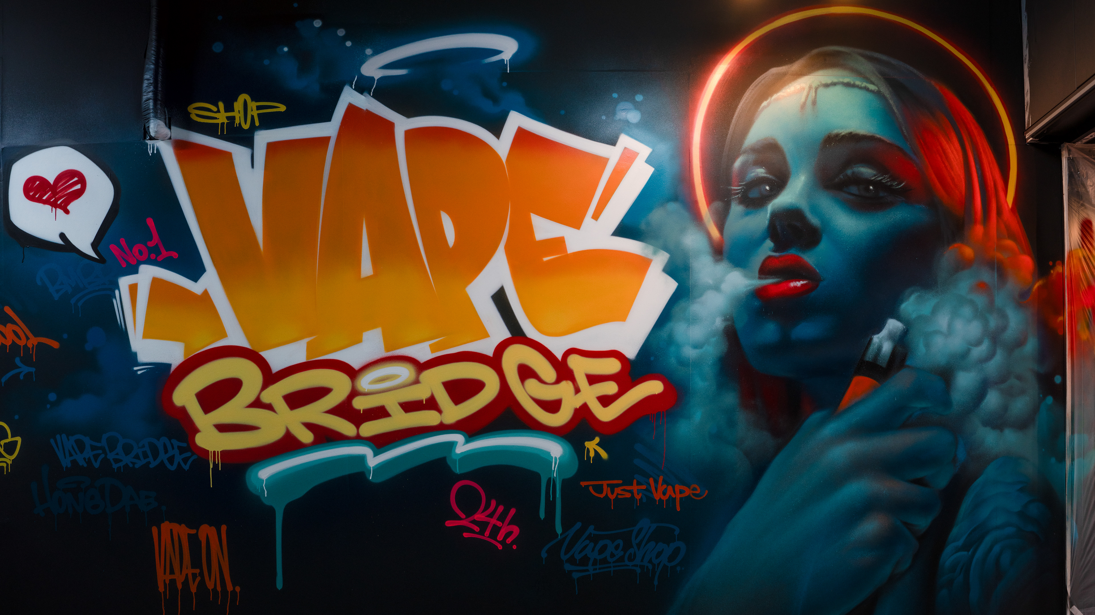
This graffiti project was created for VAPE Bridge, a newly opened unmanned vape shop near Hongdae Samgeori Pocha in Seoul. The goal was to establish a clear atmosphere and identity for the store through wall graphics alone, within the constraints of a limited budget and a very compact interior. The work was completed in a single day on December 7, 2025, with DHAL, REMON, DZ, and James participating.
This graffiti project was created for VAPE Bridge, a newly opened unmanned vape shop near Hongdae Samgeori Pocha in Seoul. The goal was to establish a clear atmosphere and identity for the store through wall graphics alone, within the constraints of a limited budget and a very compact interior. The work was completed in a single day on December 7, 2025, with DHAL, REMON, DZ, and James participating.
이번 프로젝트의 핵심은 단순히 벽을 채우는 것이 아니라, 작은 무인점포가 가진 한계를 시각적 장점으로 전환하는 데 있었다. 약 4~5평 규모의 깊은 구조를 가진 공간은 일반적인 인테리어 요소만으로는 인상이 약해질 수 있었고, 별도의 공사보다 직접적이고 효과적인 시각 개입이 필요했다. 클라이언트는 스트릿한 분위기를 원했지만, 그 표현은 장식적인 수준을 넘어 외부에서 보아도 매장의 성격이 한 번에 읽히는 방향이어야 했다.
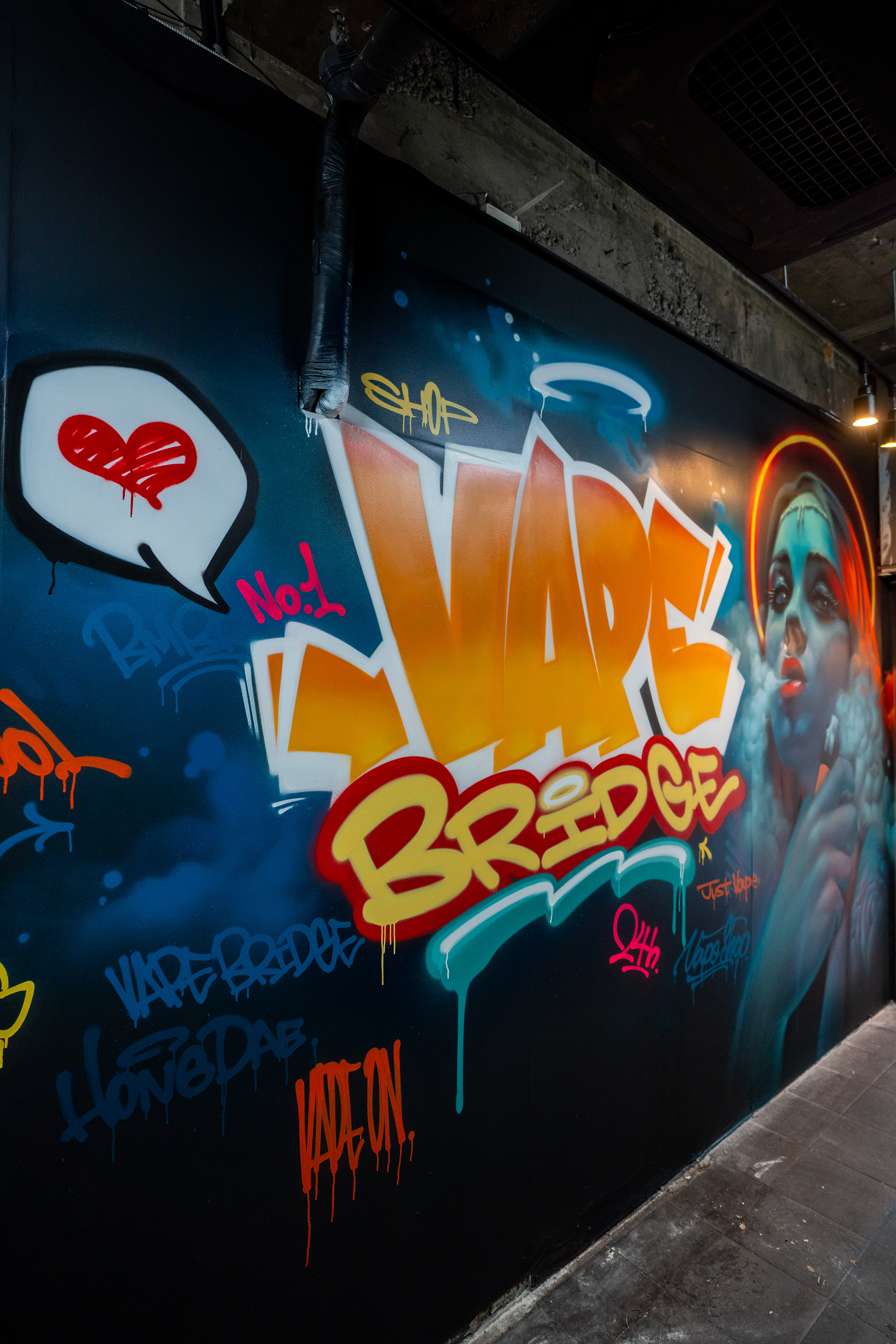
The core of this project was not simply to fill the walls, but to turn the limitations of a small unmanned shop into a visual advantage. The store, approximately 4 to 5 pyeong in size with a narrow and deep layout, required a direct and efficient visual intervention, as standard interior elements alone would not have been enough to define the space. The client wanted a street-inspired atmosphere, but the result also needed to communicate the store’s identity clearly, even from the outside.
The core of this project was not simply to fill the walls, but to turn the limitations of a small unmanned shop into a visual advantage. The store, approximately 4 to 5 pyeong in size with a narrow and deep layout, required a direct and efficient visual intervention, as standard interior elements alone would not have been enough to define the space. The client wanted a street-inspired atmosphere, but the result also needed to communicate the store’s identity clearly, even from the outside.
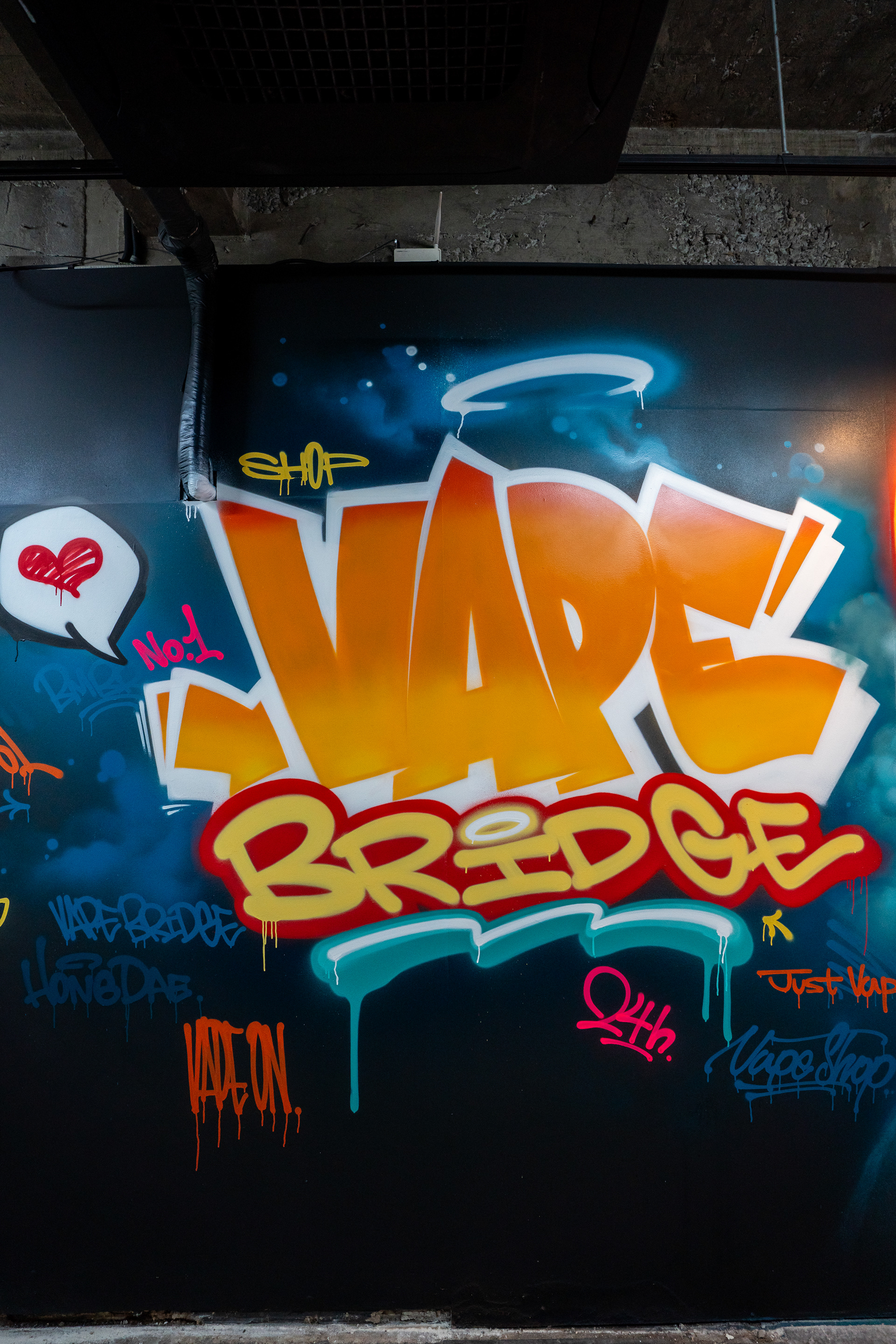
작업의 기본 컨셉은 전자담배, 홍대, 무인점포, 스트릿 감성, 그리고 포인트 컬러 중심의 아이덴티티로 정리되었다. 주요 색상은 다크 민트와 오렌지로 설정했고, 이를 검정 배경 위에서 선명하게 떠오르게 해 공간의 인상을 강하게 고정했다. 초기에는 작은 면적 안에 집중된 구성을 통해 강한 인상을 주는 방향을 생각했지만, 현장에서 확인한 실제 시야에서는 작업 범위 바깥이 비어 보이며 오히려 공간이 더 좁게 느껴졌다. 이에 따라 중심 이미지는 강하게 유지하되, 주변 벽면과 면 분할 구조까지 그래피티 요소를 분산 배치해 공간 전체가 하나의 장면처럼 읽히도록 조정했다.
The project concept was organized around vaping, Hongdae, unmanned retail, street sensibility, and an identity built around key brand colors. Dark mint and orange were selected as the main tones, designed to stand out strongly against a black background and define the overall mood of the space. The initial idea was to create a concentrated composition within the limited wall area, but on site, the surrounding blank areas made the space feel even narrower. As a result, the final approach kept the central image strong while distributing graffiti elements across adjacent surfaces so that the entire interior could read as one connected scene.
The project concept was organized around vaping, Hongdae, unmanned retail, street sensibility, and an identity built around key brand colors. Dark mint and orange were selected as the main tones, designed to stand out strongly against a black background and define the overall mood of the space. The initial idea was to create a concentrated composition within the limited wall area, but on site, the surrounding blank areas made the space feel even narrower. As a result, the final approach kept the central image strong while distributing graffiti elements across adjacent surfaces so that the entire interior could read as one connected scene.
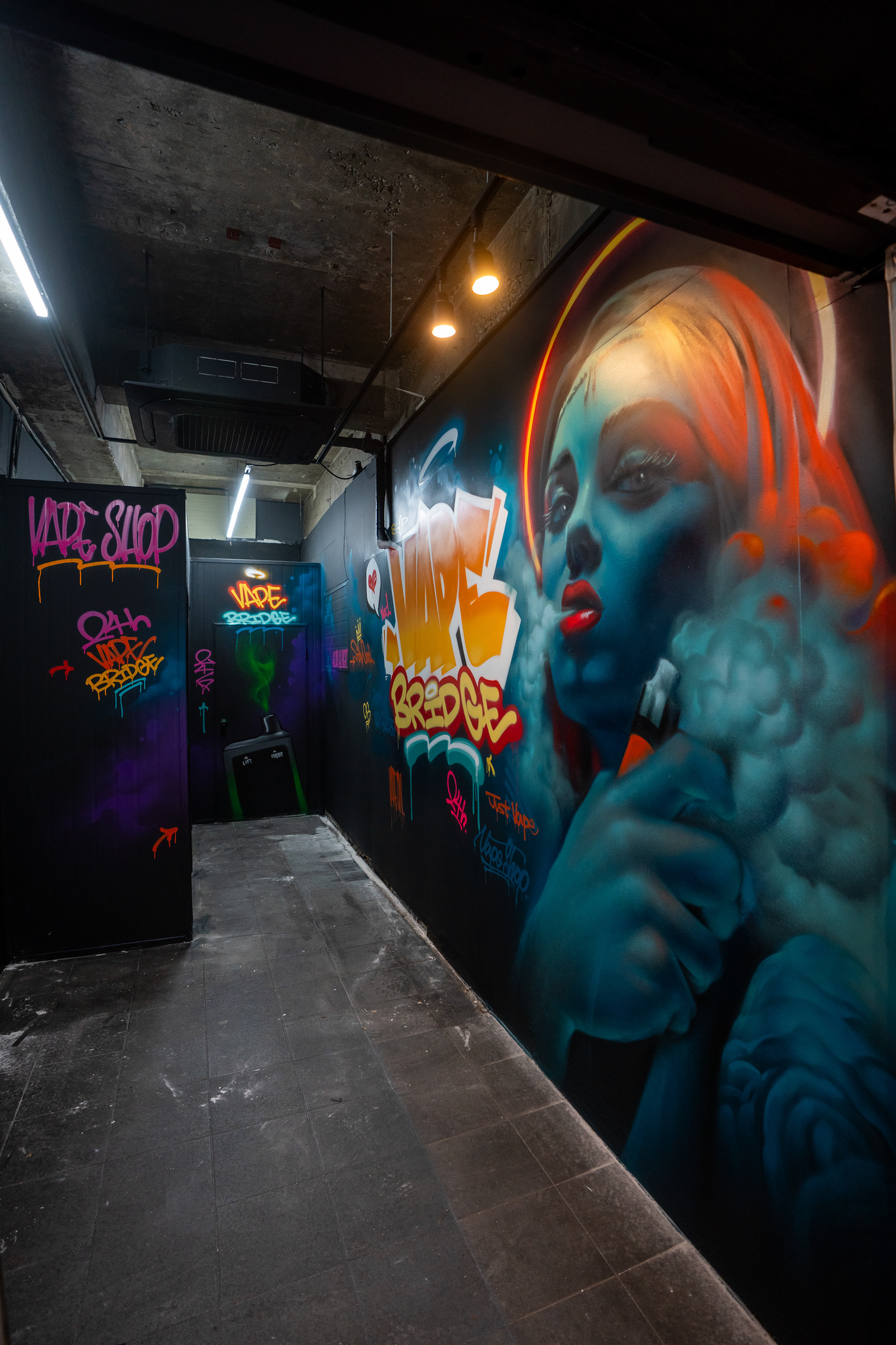
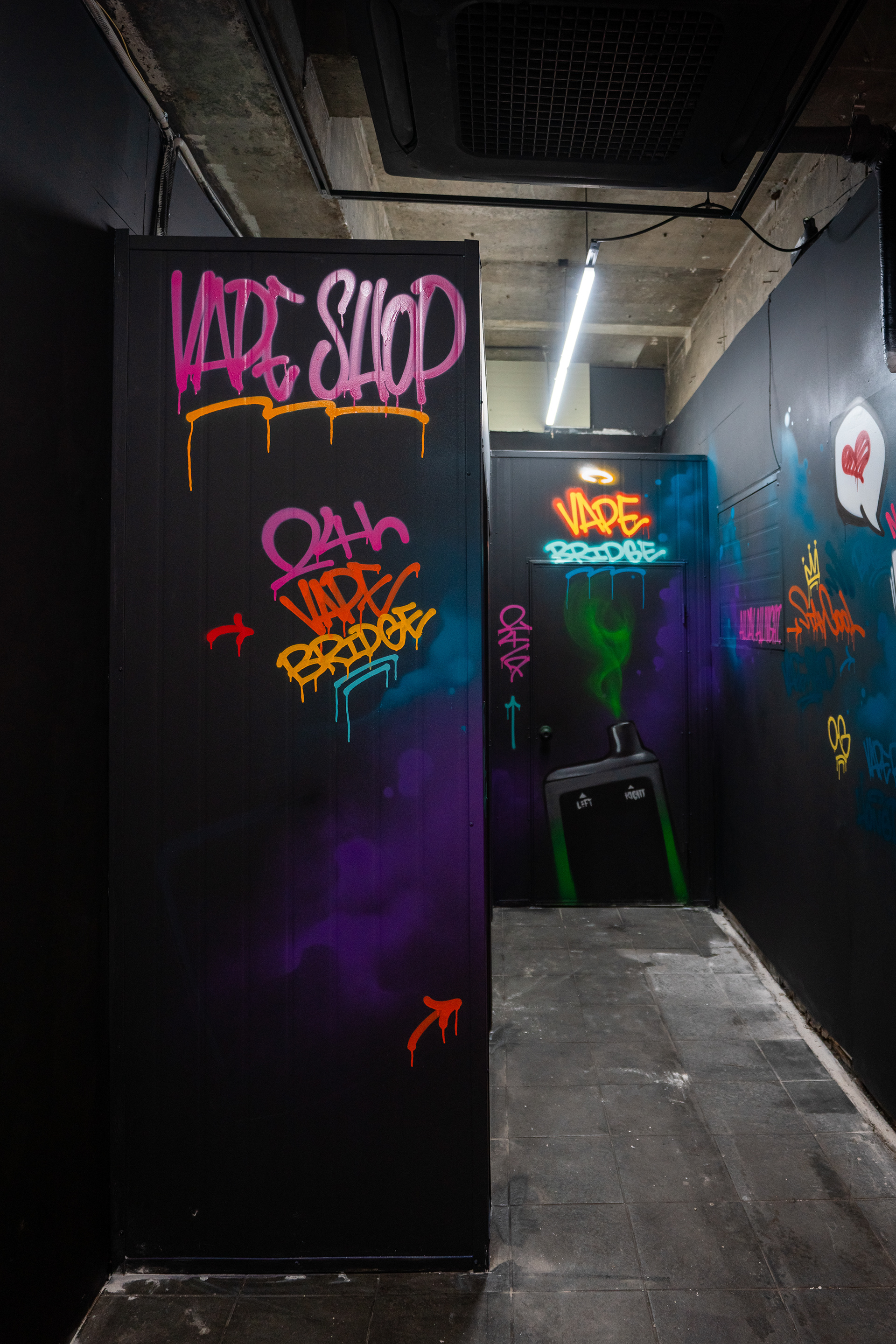
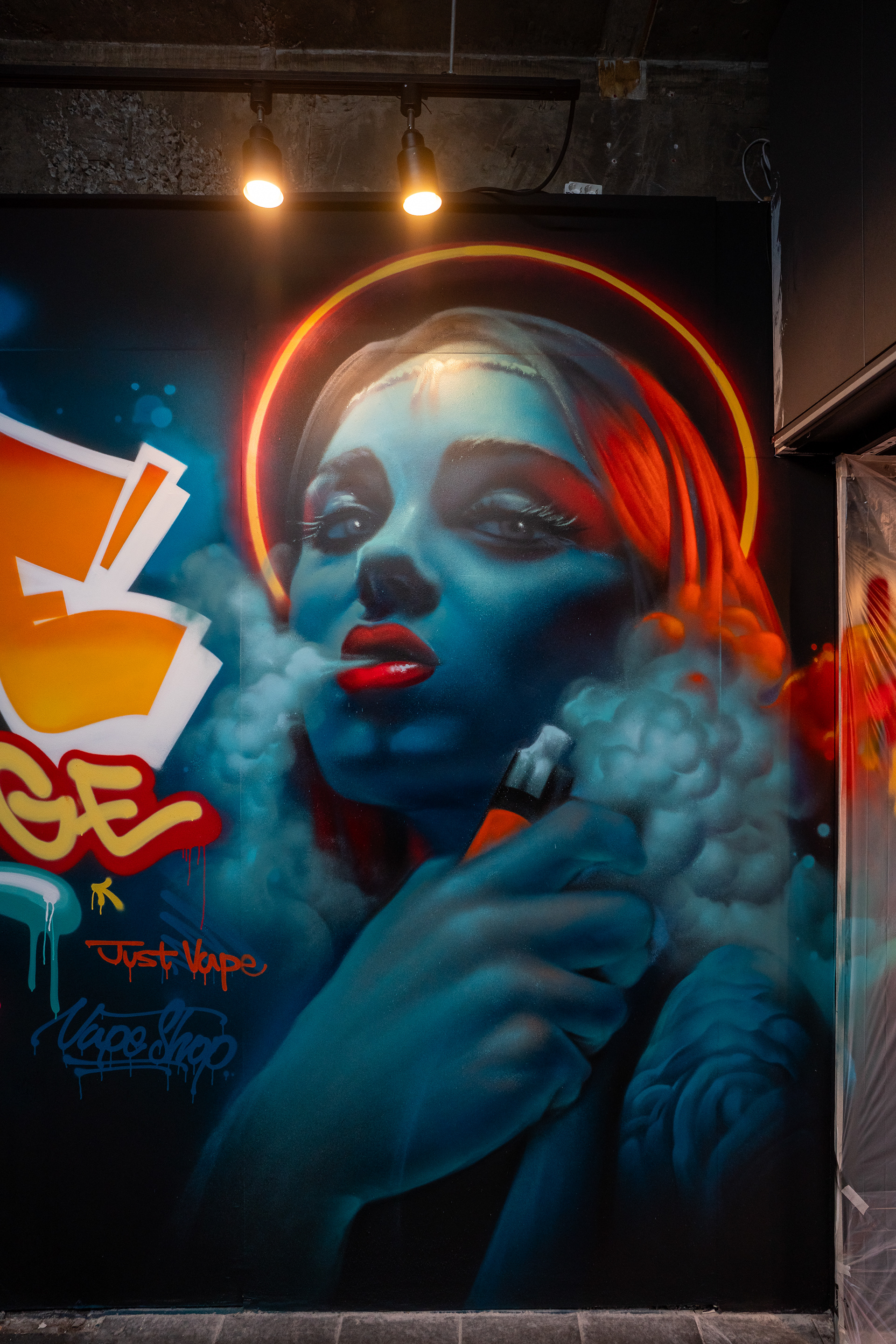
이 판단은 작은 공간 안에서 중심과 주변의 밀도를 다르게 설계하는 방식으로 이어졌다. 메인 벽면에는 ‘VAPE BRIDGE’ 레터링과 인물 이미지를 크게 배치해 대표 이미지를 만들고, 주변 벽면과 파티션, 내부 동선에는 태그, 드립, 심벌, 보조 레터 요소를 분산시켜 시선이 공간 전체로 이어지도록 구성했다. 이는 장식 요소를 추가하는 방식이라기보다, 실제 면적보다 더 넓고 입체적으로 느껴지게 만드는 시각적 전략에 가까웠다.
This decision led to a composition that treated the center and the surrounding surfaces with different levels of visual density. The main wall was built around a large VAPE BRIDGE lettering piece and a portrait, while tags, drips, symbols, and supporting letter elements were distributed across side walls, partitions, and the interior path to extend the viewer’s eye through the whole space. Rather than functioning as decorative additions, these elements were used as a visual strategy to make the shop feel larger and more dimensional than its actual size.
This decision led to a composition that treated the center and the surrounding surfaces with different levels of visual density. The main wall was built around a large VAPE BRIDGE lettering piece and a portrait, while tags, drips, symbols, and supporting letter elements were distributed across side walls, partitions, and the interior path to extend the viewer’s eye through the whole space. Rather than functioning as decorative additions, these elements were used as a visual strategy to make the shop feel larger and more dimensional than its actual size.
공간 조건 역시 작업 방식에 직접적인 영향을 주었다. 벽면은 철거 이후 별도의 마감 공정 없이 클라이언트가 직접 배경을 칠해 둔 상태였고, 기존 영업장에서 사용하던 합판 표면이 그대로 남아 있었다. 평탄화 작업이 이루어지지 않아 표면의 흠집과 거친 결이 그대로 드러나는 조건이었기 때문에, 이를 감추고 전체 밀도를 안정적으로 묶기 위해 검정 배경을 선택했다. 결과적으로 검정 바탕은 벽면의 결함을 뒤로 숨기는 동시에, 밝은 색과 형광 계열 포인트를 더욱 강하게 부각시키는 역할을 했다.
The physical condition of the site directly affected the execution. After demolition, the walls had been roughly painted by the client without any additional finishing process, and the plywood surfaces from the previous business remained in place. Because the walls were not leveled and still showed scratches and rough texture, a black background was chosen to absorb these imperfections and stabilize the overall visual field. In the end, the black surface not only concealed flaws but also intensified the brighter and more fluorescent accent colors layered above it.
The physical condition of the site directly affected the execution. After demolition, the walls had been roughly painted by the client without any additional finishing process, and the plywood surfaces from the previous business remained in place. Because the walls were not leveled and still showed scratches and rough texture, a black background was chosen to absorb these imperfections and stabilize the overall visual field. In the end, the black surface not only concealed flaws but also intensified the brighter and more fluorescent accent colors layered above it.
Remon / Hongdae, Seoul, Korea / 2025
기술적으로는 배경 페인트와 스프레이를 병행해 작업했다. 넓은 바탕과 전체 톤은 페인트로 정리하고, 레터링, 태그, 인물 표현, 연기 효과, 하이라이트 등은 스프레이 중심으로 풀어내며 그래피티 특유의 속도감과 레이어를 살렸다. 특히 메인 벽면에서는 대형 레터, 인물 초상, 전자담배의 연기, 네온을 연상시키는 후광, 주변 태그가 함께 작동하도록 구성해, 단순한 제품 판매 공간을 넘어 장면성과 몰입감을 가진 내부 환경을 만들고자 했다.
Technically, the project combined background paint and spray paint. The broader surfaces and overall tonal control were handled with paint, while the lettering, tags, portrait work, smoke effects, and highlights were developed primarily with spray to preserve the speed, layering, and energy associated with graffiti. On the main wall in particular, the composition brought together large lettering, a portrait, vapor imagery, a neon-like halo, and surrounding tags to create an interior scene that felt more immersive than a standard retail wall treatment.
Technically, the project combined background paint and spray paint. The broader surfaces and overall tonal control were handled with paint, while the lettering, tags, portrait work, smoke effects, and highlights were developed primarily with spray to preserve the speed, layering, and energy associated with graffiti. On the main wall in particular, the composition brought together large lettering, a portrait, vapor imagery, a neon-like halo, and surrounding tags to create an interior scene that felt more immersive than a standard retail wall treatment.
이번 작업의 중요한 공간 포인트는 작은 점포 안에서도 중심 이미지를 강하게 유지하면서, 주변 요소를 분산시켜 공간 전체의 흐름을 만드는 데 있었다. 무인점포는 사람의 응대나 장식 장치가 제한적이기 때문에, 벽면 그래픽이 공간의 첫인상과 체류 경험을 더 직접적으로 결정한다. 이번 프로젝트에서는 그래피티를 단순한 장식이 아니라, 작은 공간의 체감 규모와 분위기, 장소성을 조정하는 공간 전략으로 활용했다.
A key spatial point in this project was maintaining a strong central image while distributing supporting elements to shape the flow of the entire interior. In an unmanned store, where human interaction and decorative devices are limited, wall graphics have a much more direct role in shaping both first impression and visitor experience. Here, graffiti was used not as decoration alone, but as a spatial strategy to adjust the perceived scale, atmosphere, and sense of place within a compact commercial setting.
A key spatial point in this project was maintaining a strong central image while distributing supporting elements to shape the flow of the entire interior. In an unmanned store, where human interaction and decorative devices are limited, wall graphics have a much more direct role in shaping both first impression and visitor experience. Here, graffiti was used not as decoration alone, but as a spatial strategy to adjust the perceived scale, atmosphere, and sense of place within a compact commercial setting.
완성된 결과는 작은 면적에 비해 훨씬 큰 스케일감과 분위기를 만들어냈다. 입구에서부터 매장의 성격이 직관적으로 읽히고, 내부에서는 레터링과 인물, 태그와 색의 흔적이 이어지며 하나의 장면처럼 작동한다. 이 프로젝트는 적은 비용의 개입만으로도 상업 공간의 개성과 현장감을 분명하게 구축할 수 있음을 보여준다. 동시에 협소한 실내 공간에서 그래피티가 장식이 아니라 아이덴티티와 경험을 설계하는 방식으로 작동할 수 있음을 보여주는 사례이기도 하다.
The finished result created a sense of scale and atmosphere far beyond the actual size of the shop. From the entrance, the store’s character becomes immediately readable, and inside, the lettering, portrait, tags, and traces of color work together as one continuous scene. This project demonstrates how even a relatively modest intervention can establish clear identity and presence within a commercial interior. It also shows how graffiti can function not merely as decoration, but as a method of shaping identity and experience in a highly compact indoor space.
The finished result created a sense of scale and atmosphere far beyond the actual size of the shop. From the entrance, the store’s character becomes immediately readable, and inside, the lettering, portrait, tags, and traces of color work together as one continuous scene. This project demonstrates how even a relatively modest intervention can establish clear identity and presence within a commercial interior. It also shows how graffiti can function not merely as decoration, but as a method of shaping identity and experience in a highly compact indoor space.