
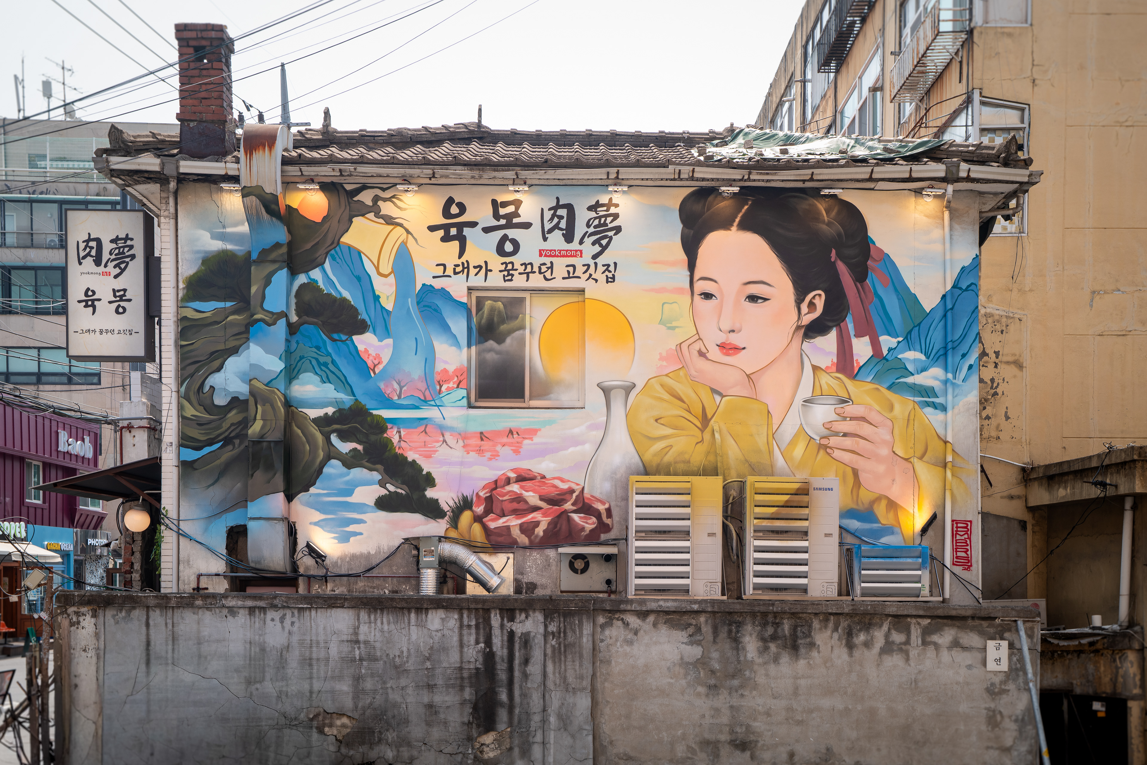
Exterior wall graffiti for Yookmong BBQ restaurant, Yongsan Seoul
MyPortfolio 업로드 텍스트 — 육몽 (Yookmong)
제목
Yookmong — Korean Minhwa Style Brand Graffiti
첫 이미지 캡션
Exterior wall graffiti for Yookmong BBQ restaurant, Yongsan Seoul
본문
작업 개요 서울 용산구 용리단길 고깃집 육몽 외벽에 진행한 민화 스타일 브랜드 그래피티 작업이다. 신용산역에서 용리단길로 진입하는 길목에 크게 노출된 외벽을 간판 대신 활용하는 것이 작업의 출발점이었다. 가로 약 8m, 높이 약 3.5m 규모이며, 스프레이 그래피티와 스텐실 기법을 병행해 이틀간 진행했다.
This project involved painting a brand graffiti mural on the exterior wall of Yookmong, a Korean BBQ restaurant located along Yongridangil in Yongsan, Seoul. The starting point was using a large wall directly facing the approach from Sinyongsan Station as a substitute for a conventional sign. The work measured approximately 8 meters wide by 3.5 meters high and was completed over two days using a combination of spray graffiti and stencil techniques.
배경 & 컨셉 매장이 협소하고 건물이 노후되어 외부에서 인지하기 어려운 구조였으나, 도로 방향으로 크게 열린 외벽이 있었다. 클라이언트의 브랜드 테마인 '주지육림'을 모티브로 하되, 직접적 묘사는 선정성 우려로 배제했다. 대신 한국 민화 미인도 형식을 중심에 두고, 아름다운 풍경 속 여성 인물에 고기와 술의 요소를 자연스럽게 배치하는 방향으로 컨셉을 전환했다. 면적 대비 정보량이 많아지면 시각적으로 산만해진다는 판단에 따라 내용을 압축하고 산수화 계열의 화풍으로 통일했다.
Although the storefront was small and the building aged, the exterior wall opened directly toward the street with strong visibility. The client's brand concept was rooted in a traditional Korean phrase about indulgence, but a literal interpretation was set aside due to concerns about unwanted associations. Instead, the concept was redirected through the format of Korean minhwa beauty painting — placing a female figure within a landscape, with food and liquor elements woven in naturally. To avoid visual clutter within the limited surface area, the composition was kept restrained and unified under a landscape painting aesthetic.
작업 과정 원거리에서 인물 얼굴이 먼저 시선을 끌고, 가까이 다가올수록 상호와 브랜드 요소가 읽히도록 시선 흐름을 이중으로 설계했다. 인접한 삼각맨션 외벽 컬러를 기준으로 전체 팔레트를 구성해 벽화가 주변 건물과 충돌하지 않도록 했다. 당초 아랫부분은 사다리로 처리할 계획이었으나 주차장 담벼락이 불안정하여 스카이 렌탈을 하루 연장했다. 팀 역할은 DHAL이 디자인·컨셉·컬러링, REMON이 인물 및 디테일 묘사, DZ가 서브 컬러링·스텐실·촬영, JAMES가 촬영 및 작업 보조를 담당했다.
The composition was designed so the figure's face draws attention from a distance, while brand details — the restaurant name and supporting elements — become readable as viewers approach. The overall color palette was developed in reference to the adjacent residential building to avoid visual conflict. A scissor lift was initially planned only for the upper section, but an unstable partition wall below required extending the rental by one day. Team roles were divided as follows: DHAL handled design, concept, and color; REMON executed the figure and detail work; DZ managed secondary coloring, stenciling, and filming; JAMES covered filming and general assistance.
기술 / 공간 포인트 벽면은 개화기 시절 건물로 노후 상태였으며, 에어컨 실외기와 굴뚝 구조물로 인해 실질 사용 가능 면적이 제한됐다. 유동인구가 많은 길목이라 원거리 가독성과 근거리 디테일을 동시에 설계해야 했다. 삼각지 방향에서도 벽면이 멀리서 보이는 위치였기 때문에 인물 얼굴의 크기와 배치가 전체 구성의 핵심 판단 기준이 됐다.
The wall was part of a building dating from the late Joseon / early modern period, and the usable surface was limited by an air conditioning unit and chimney structure. Given the high foot traffic along the approach route, the composition had to work at both distance and close range simultaneously. Because the wall is also visible from the Samgakji direction further down the road, the scale and placement of the figure's face became the central compositional decision.
결과 & 활용 맥락 완성된 벽화는 주변 오래된 건물들과 컬러·분위기 면에서 이질감 없이 융합됐다. 인물 얼굴이 원거리에서 시선을 끄는 포인트로 작동하며, 포토존으로서의 기능도 생겼다. 아파트 주민과 주변 상인들로부터 지역 분위기와 맞는다는 반응이 있었다. 벽 노후화로 인한 향후 도료 탈거 가능성이 있으나, 클라이언트는 이를 빈티지한 결과로 수용하고 있다.
The completed mural integrated into the surrounding buildings without visual conflict in terms of color or atmosphere. The figure functions as a long-distance focal point, and the wall has also become usable as a photo spot. Residents of the adjacent apartment and nearby business owners responded positively, noting that the mural fits the character of the area. While the aging wall carries some risk of paint separation over time, the client has accepted this as part of the intended aesthetic.
프로젝트 성격 요약 이 프로젝트는 한국 민화의 시각 언어를 상업 공간 외벽 브랜딩에 적용한 사례로, 장식보다 기능과 공간 맥락을 우선한 작업이다. BMBRS는 브랜드 테마 재해석, 주변 환경과의 컬러 조화, 동선 기반 시선 설계를 동시에 고려했다. 본 작업은 그래피티 기반 상업 공간 연출, 외벽 브랜딩, 한국 전통 화풍 적용 사례 범주 안에서 이해할 수 있다.
This project applies the visual language of Korean minhwa painting to exterior brand communication for a commercial space, prioritizing function and spatial context over surface decoration. BMBRS considered the reinterpretation of the brand concept, color harmony with the surrounding environment, and movement-based sightline design simultaneously. The work can be positioned within BMBRS's broader practice of graffiti-based spatial direction, exterior branding, and the application of Korean traditional visual references.
마지막 이미지 캡션 (완성 컷 반복 시)
Completed exterior view — Yookmong, Yongridangil, Yongsan Seoul
하단 링크
https://www.instagram.com/bmbrs.graffiti/
https://www.youtube.com/@bmbrsgraffiti